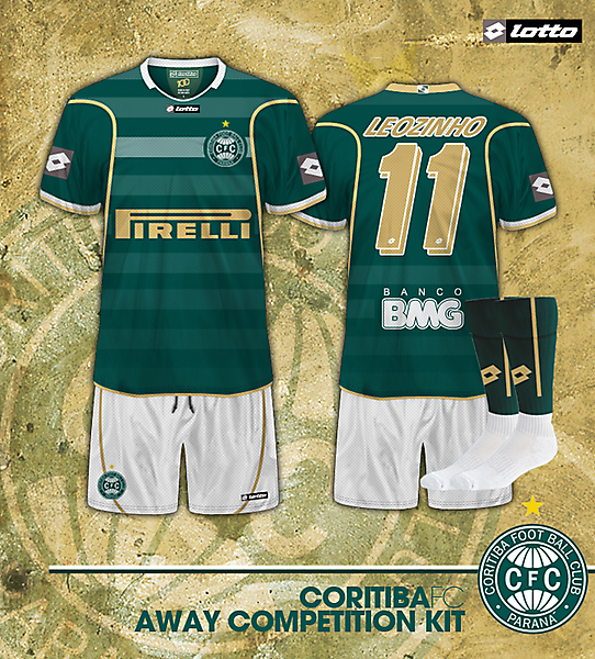
CANT SEE RED ANYWHERE HAHA JUST GREEN GOLD WHITE AND GRAY
Guest
and a deep faded red
Ironbolt
I can't see how its red either, just looks grey to me. Would look much nicer with just the white (or gold) logo but it does make it more realistic.
Quality design by the way, got to be the away kit winner shirley?
MW FROM WIDEOPEN
Not really, In Brazil (and Im not sure why they only do it here) Lotto remove their corporate colours from the shirt logo if its the colour of a rival club.
Just checked the colour on the logos, and its Red - 86 Green 76 blue 77 - Grey with a reddish tinge. On my monitor settings, and a few other settings, it looks red
Ill announce the winners soon. All my designs were crap, so Ill pick the winners.
Guest
dude thats gray! if you look at it at RGB MODE THEN IT WILL OBVIOUSLY HAVE RED HAHA, so theno look at it at CMYK and voila! not red! check your monitor cuz that is gray here and in china! hope you wont dismiss this amazing kit from Ruiz-Esparza, cuz ITS NOT RED HAHA
MW FROM WIDEOPEN
I know it wil have red in RGB mode, because its Grey, but if the Red is a higher number than the green or the blue, then it will have a reddish tinge. This does, as the red is 10 more than the green and 9 more than the blue.
Anyway, if it looked grey on his monitor, then Ill accept this entry.
Away kit position 2 - Ruiz Espana - Great green design, despite some issues with the huge lotto logos, the rest of the kit makes up for it. Great use of fade away stripes, the gold on the shirt was used to good effect and the flag of Parana on the back gave it a quality feel. good job
MW FROM WIDEOPEN
This is a great design, except for one thing - The huge red lotto logos on the sleeves, which spoil the design, and are so large they have to be considered part of it, not separate from the design.
Except for that part of the design, this is a great kit
Ruiz-Esparza
red????
MW FROM WIDEOPEN
Well, faded red, but still red.
Just that in Brazil, Lotto has for its teams removed colours from logos that would not be acceptable to rival fans - For Bahia and Fortaleza, no black on the logo, and for Goias and Coritiba, no red on the logo (both have big rivals who play in red)
Apart from that, its is very good, as are most of your designs
Guest
JUST GREEN GOLD WHITE AND GRAY
Guest
Ironbolt
Quality design by the way, got to be the away kit winner shirley?
MW FROM WIDEOPEN
Just checked the colour on the logos, and its Red - 86 Green 76 blue 77 - Grey with a reddish tinge. On my monitor settings, and a few other settings, it looks red
Ill announce the winners soon. All my designs were crap, so Ill pick the winners.
Guest
MW FROM WIDEOPEN
Anyway, if it looked grey on his monitor, then Ill accept this entry.
Away kit position 2 - Ruiz Espana - Great green design, despite some issues with the huge lotto logos, the rest of the kit makes up for it. Great use of fade away stripes, the gold on the shirt was used to good effect and the flag of Parana on the back gave it a quality feel. good job
MW FROM WIDEOPEN
Except for that part of the design, this is a great kit
Ruiz-Esparza
MW FROM WIDEOPEN
Just that in Brazil, Lotto has for its teams removed colours from logos that would not be acceptable to rival fans - For Bahia and Fortaleza, no black on the logo, and for Goias and Coritiba, no red on the logo (both have big rivals who play in red)
Apart from that, its is very good, as are most of your designs