
Top 100 last commented images
Fiorentina
- Category Football Kits
- Author: MW FROM WIDEOPEN
- Hits: 4032
- wrote Rabbi on Tuesday, 03 December 2013 Good work as one could expect from you.
LFC Crest Inspired by Kitster29
- Category Football Crests
- Author: brokr151
- Hits: 8833
- wrote Steevo on Saturday, 17 August 2013 what font have you used on these? is it the same as the current badge?
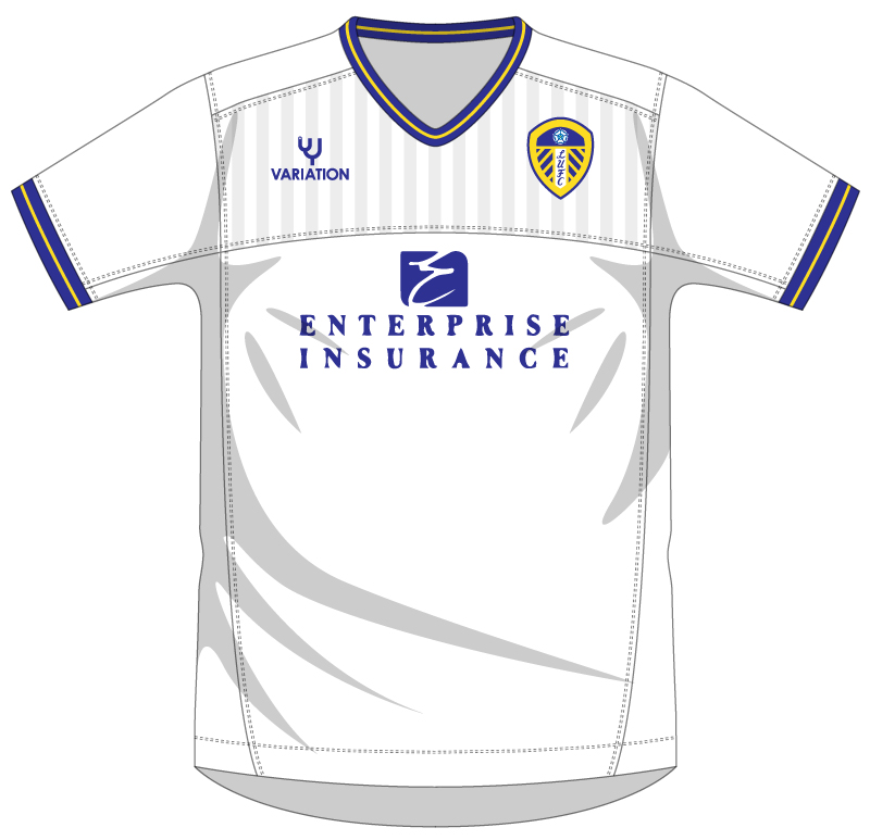
Leeds
- Category Football Kits
- Author: MartinLeRoy
- Hits: 3444
- wrote MartinLeRoy on Saturday, 10 August 2013 Just noticed this template isn't too dissimilar to this one here...
[img]http://worldsoccertalk.com/wp-c- ontent/uploads/2009/07/birmingham-city-h- ome-shirt.jpg[/img]
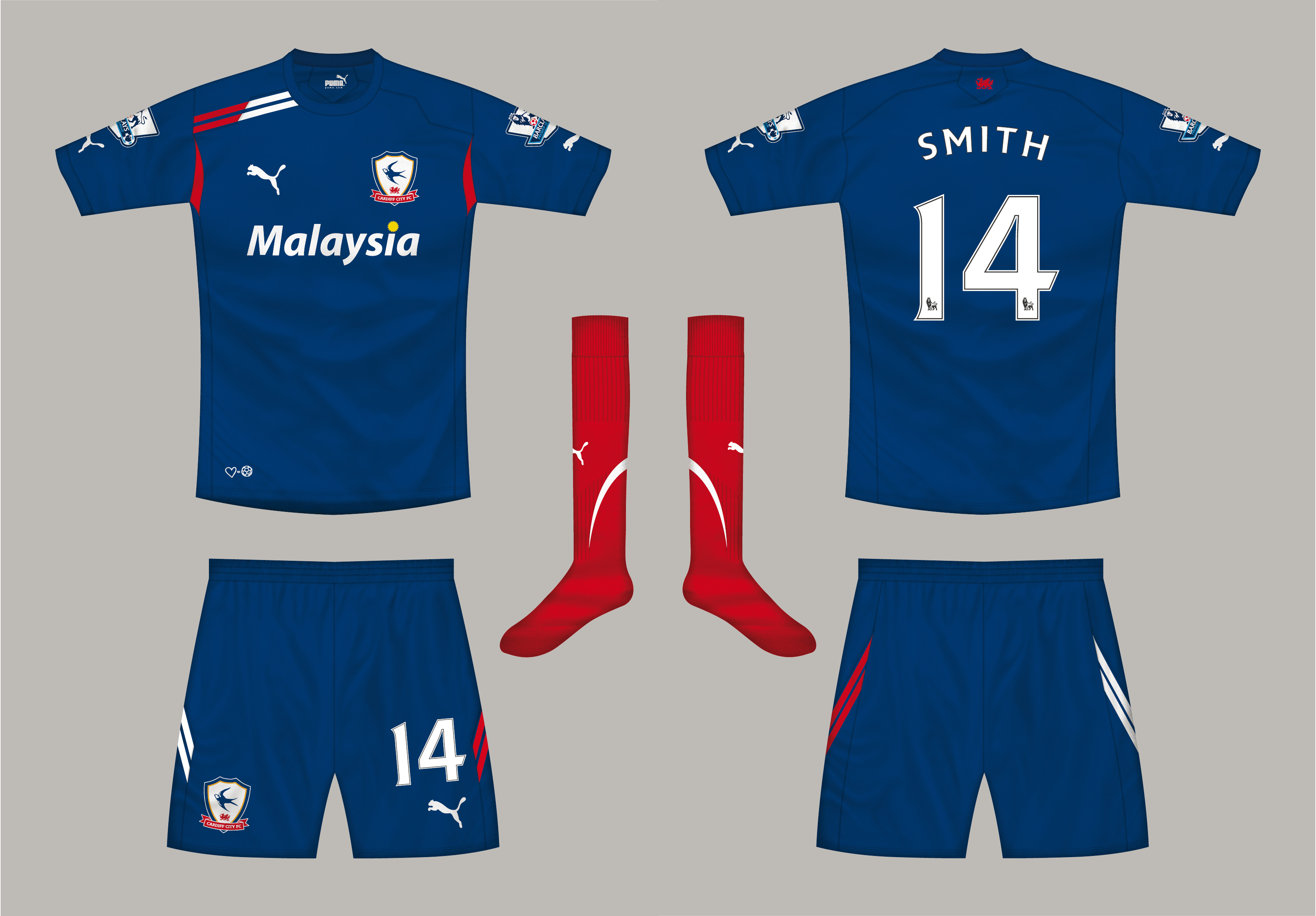
Cardiff Home
- Category Football Kits
- Author: Steevo
- Hits: 3629
- wrote julian121 on Friday, 09 August 2013 Really nice, especially the shirt. The shorts are throwing me off though. The shorts are throwing me off though. I think the stripes need to be red, changing to white on the back, like the shoulder
Cardiff Home
- Category Football Kits
- Author: Steevo
- Hits: 3629
- wrote Rey on Friday, 09 August 2013 Really great design! ;)
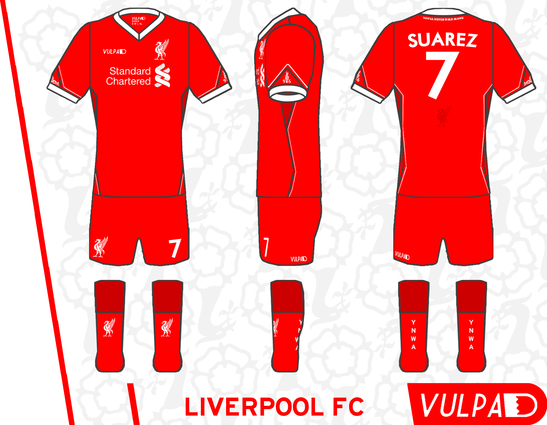
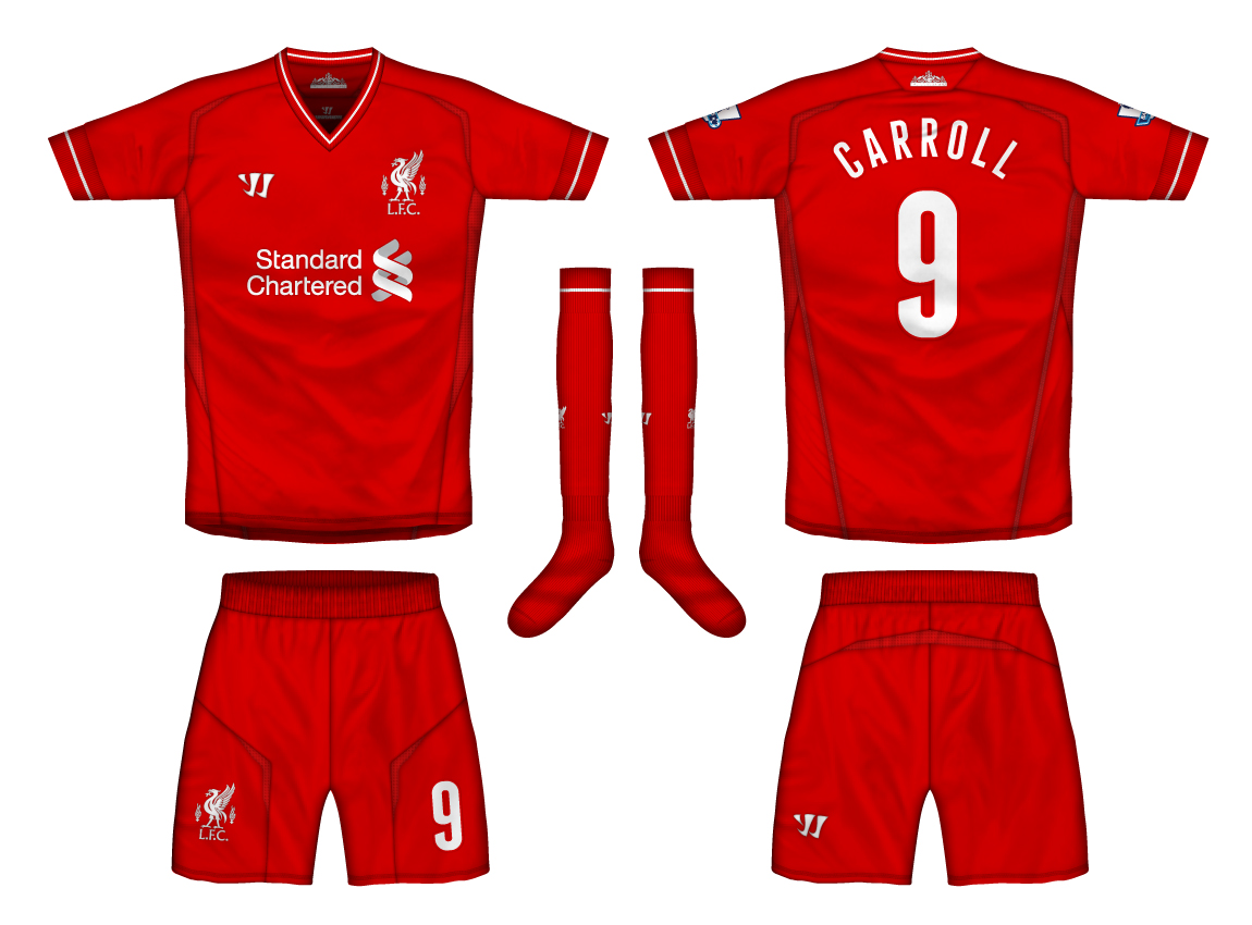
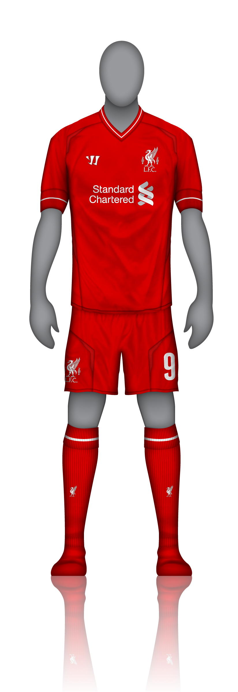
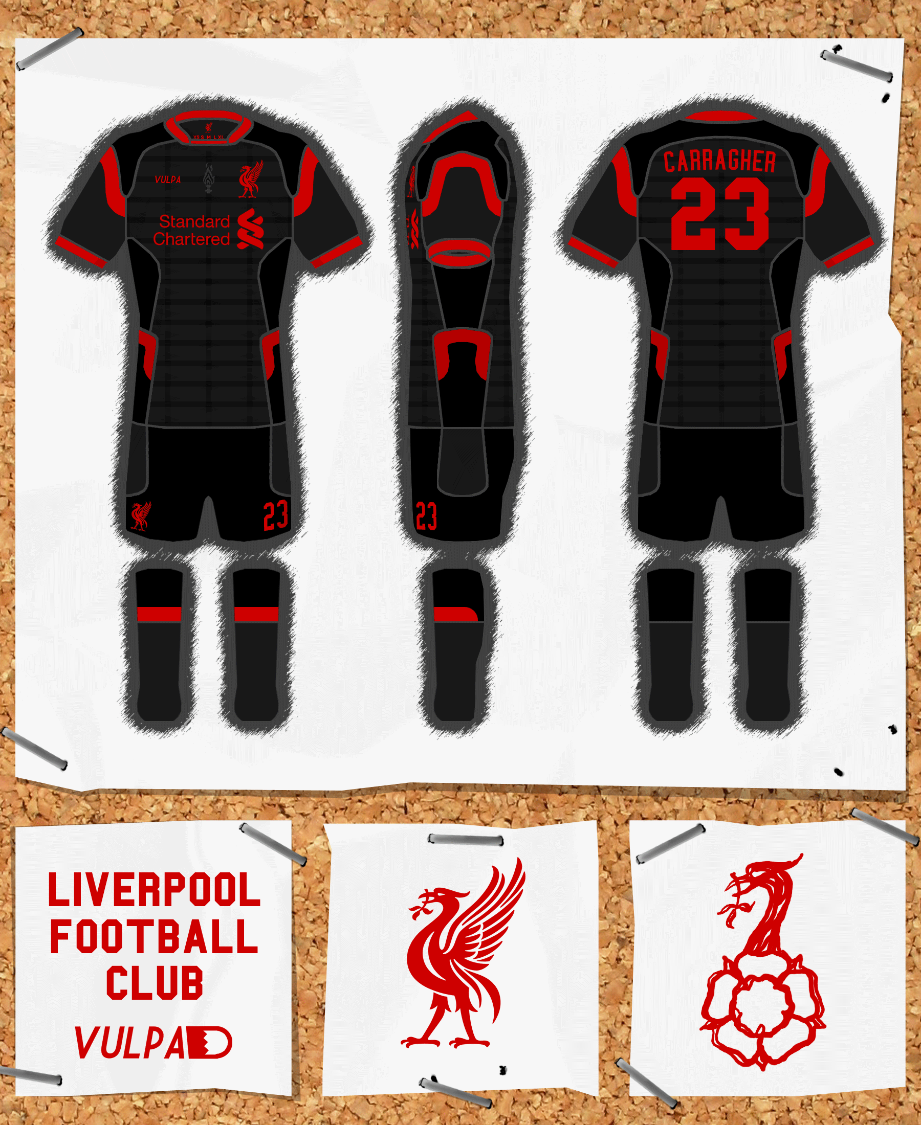
Liverpool Home Kit
- Category Football Kits
- Author: Donnypool
- Hits: 3995
- wrote Steevo on Friday, 09 August 2013 Thanks to the search function I found this beauty again.
I've changed my mind about this now. The shirt doesn't need changing.

Marceltipool Kit
- Category Football Kits
- Author: Donnypool
- Hits: 4301
- wrote Jay29ers on Monday, 29 July 2013 Absolutely superb. Could perhaps be an away in the same way that Celtic are going to be wearing similar colours to the home kit on their new away.
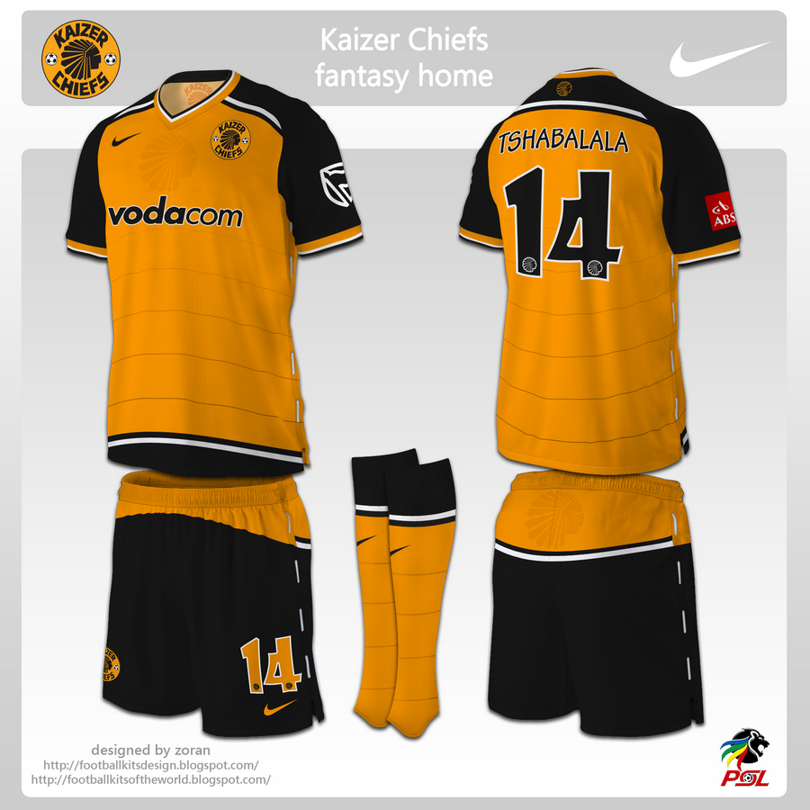
Kaizer Chiefs fantasy home
- Category Football Kits
- Author: zoran
- Hits: 13388
- wrote Guest on Monday, 01 July 2013 This is a beautiful piece of work, I would love to see it on the pitch, it's just beautiful
UKFA Crest
- Category Football Crests
- Author: Spongebob
- Hits: 4636
- wrote Guest on Wednesday, 15 May 2013 More chance of the IFA being part of this 'Political Borders Shambles' than joining up with the FAI - Ye Feckin' Eejit Ye!
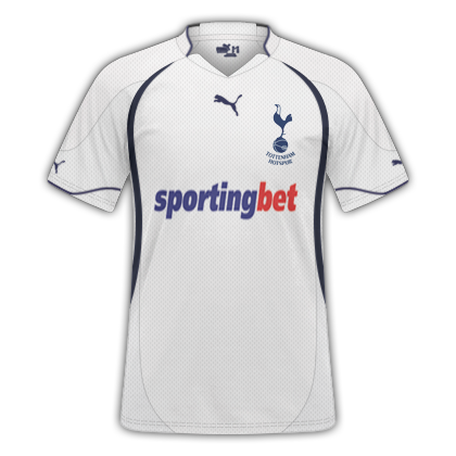
Tottenham Hotspurs 11/12 Home Kit
- Category Football Kits
- Author: DonCorleone
- Hits: 12040
- wrote curswine on Friday, 03 May 2013 No it's still Puma for 11/12, the Under Armour deal doesn't kick in till 12/13.
Tottenham Hotspurs 11/12 Home Kit
- Category Football Kits
- Author: DonCorleone
- Hits: 12040
- wrote Guest on Wednesday, 13 March 2013 this is too fake... no tottenham kits have ever had the words tottenham hotspur written under the emblem
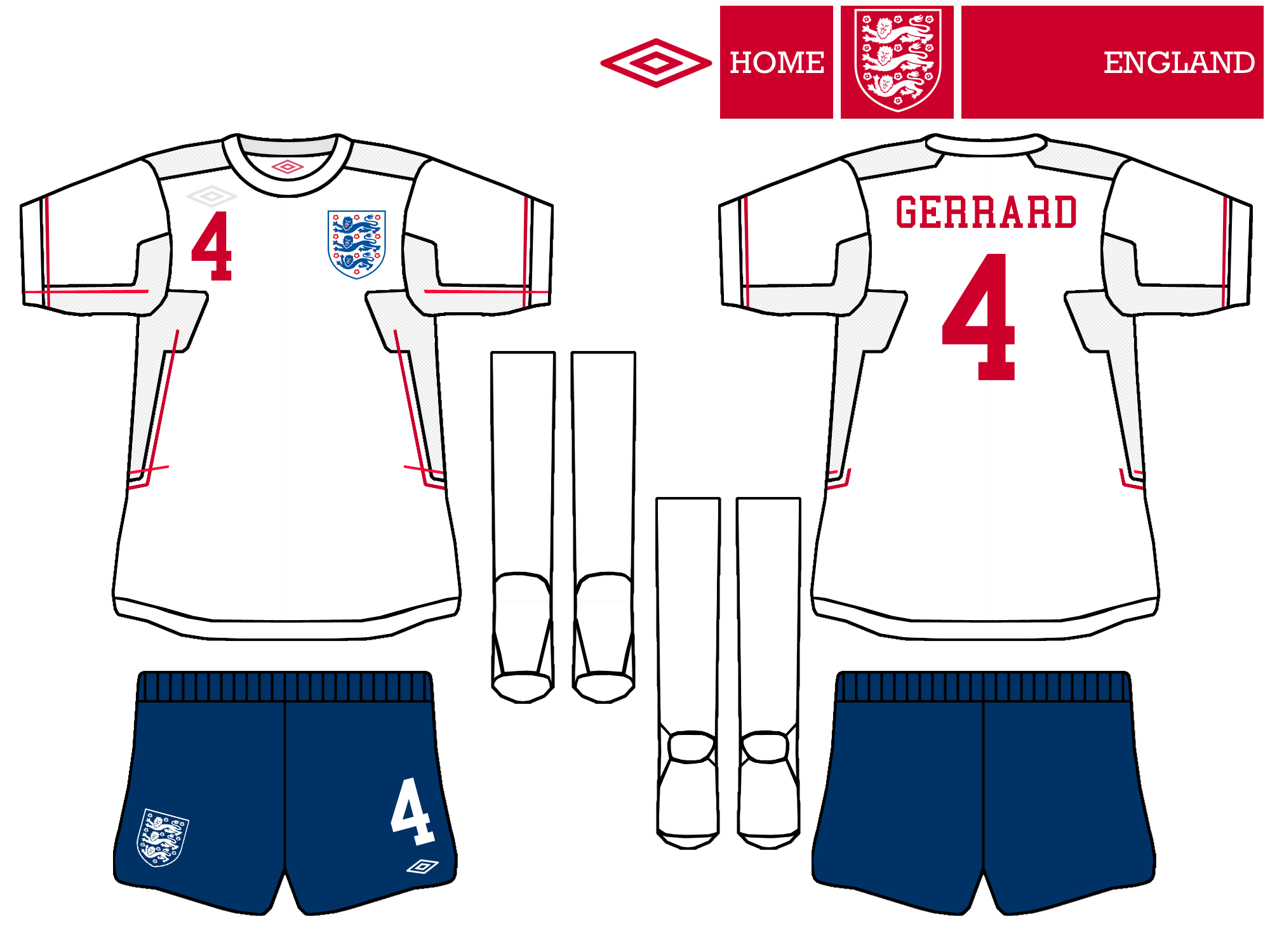
England GK Concept
- Category Football Kits
- Author: morpher
- Hits: 6239
- wrote Guest on Saturday, 23 February 2013 Thanks!!!! :D
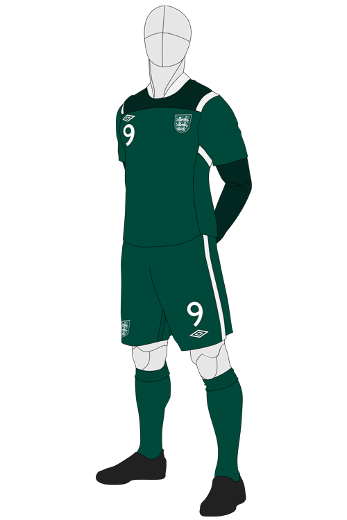
England Home
- Category Football Kits
- Author: Steevo
- Hits: 3383
- wrote Steevo on Monday, 30 November -0001 Thanks. I aimed to design a simple,clean kit like Umbro would do.
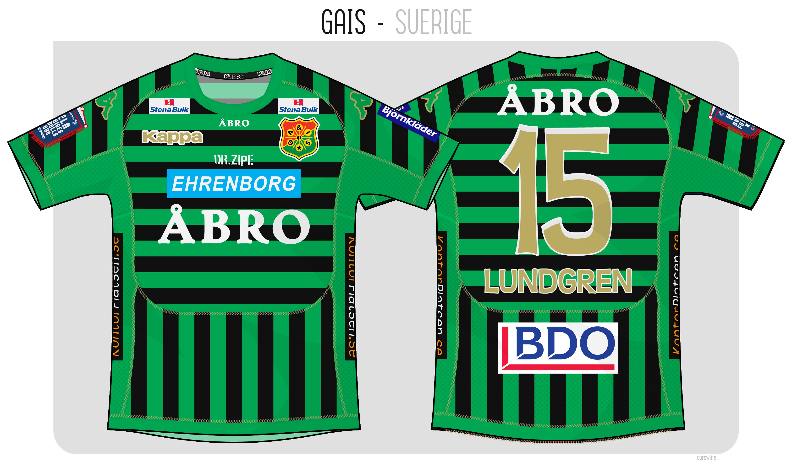
GAIS
- Category Football Kits
- Author: curswine
- Hits: 4444
- wrote curswine on Monday, 30 November -0001 Ha, fair enough, I knew this wasn't gonna be everyone's cup of tea but I was just trying to escape a couple of the self imposed boundaries I think people have when making kits these days such as the notion of hoops and stripes together must never happen. I didn't try that but that was mainly because all the stripes are different layers, 4 to be exact, left and right sleeve, chest and abdomen and basically it just never crossed my mind to try it like that. I did try it hoops at the bottom and vertical stripes on the sleeves with vertical stripes on the chest i just prefered this mainly because of the rectangular sponsor logos looking better.
GAIS
- Category Football Kits
- Author: curswine
- Hits: 4444
- wrote Steevo on Monday, 30 November -0001 ambitious shirt. not sure I'm too keen. Did you try having the horizontal stripes vertical but offset against the ones underneath? (green to black/black to green) I think that might work better.
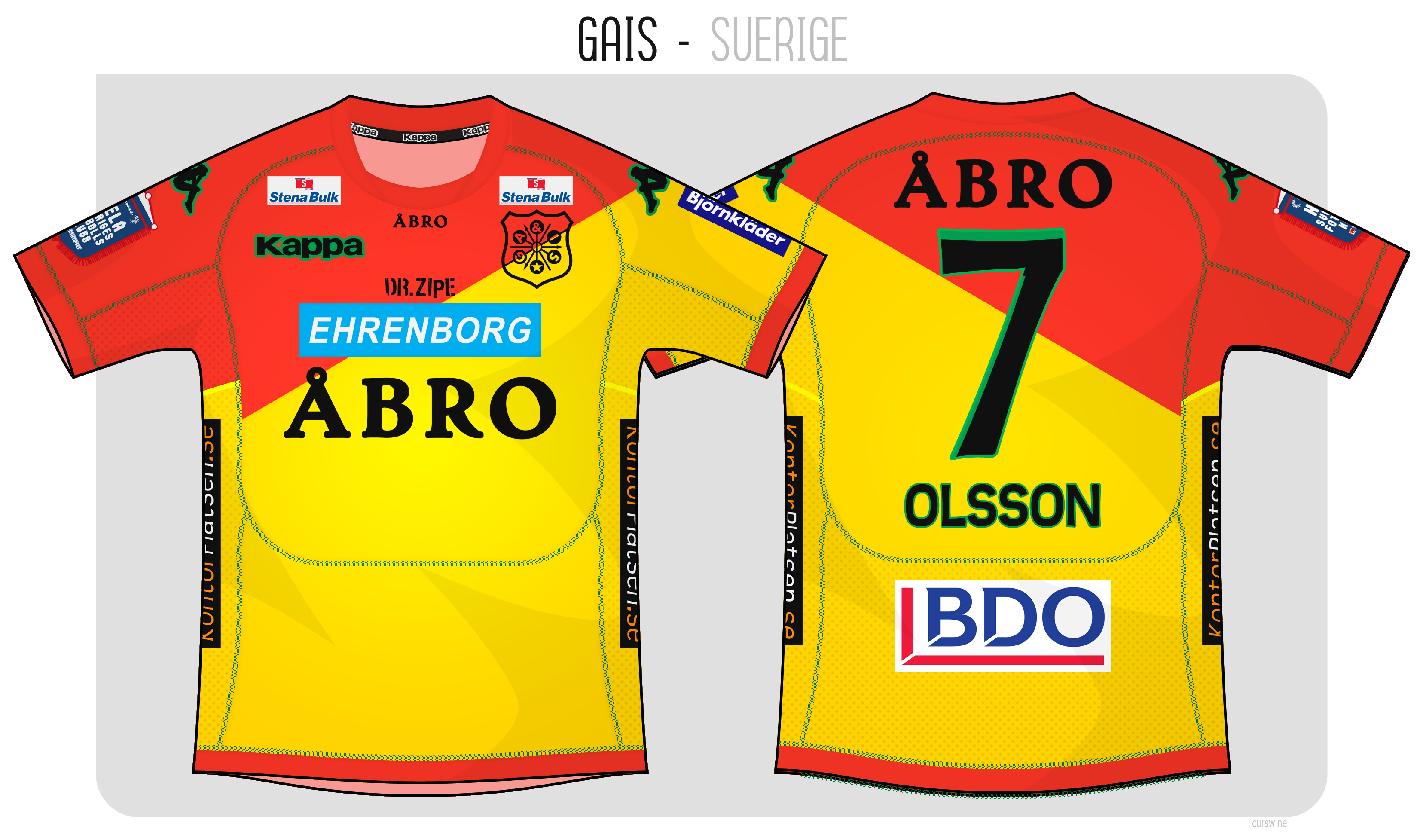
GAIS
- Category Football Kits
- Author: curswine
- Hits: 3436
- wrote curswine on Monday, 30 November -0001 When I was deciding what to do with this away shirt I had the bottom half all green instead of yellow, I thought it looked decent but didn't have enough contrast from the home shirt to make a legit away even though I know this is fantasy. :razz: Cheers for the comments.
GAIS
- Category Football Kits
- Author: curswine
- Hits: 3436
- wrote Donnypool on Monday, 30 November -0001 Love the treatment of the crest and the diagonal. The green doensn't sit right with me, but it does make the colours less random in relation to the club.
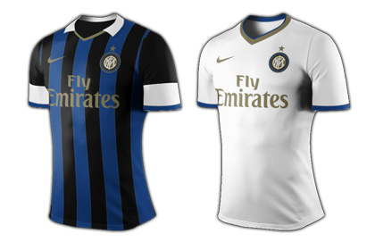
Inter Milan home & away
- Category Football Kits
- Author: MikeDale20
- Hits: 4417
- wrote VSync32 on Monday, 30 November -0001 Very nice kits, they could easily be a franchise success upon the club's marketing.
Inter Milan home & away
- Category Football Kits
- Author: MikeDale20
- Hits: 4417
- wrote jamescampbelltaylor on Monday, 30 November -0001 Yeah, not sure about the Milan sponsor. I know the armbands are Nike's motif for the 2012-13 season but personally I think Inter's kit should have no white on it (except for the numbers obviously).
Inter Milan home & away
- Category Football Kits
- Author: MikeDale20
- Hits: 4417
- wrote MikeDale20 on Monday, 30 November -0001 Thanks. Fly Emirates because a) I'd already saved a Fly Emirates sponsor template to the kit for own use, and b) it was late and couldn't be bothered to make another sponsor lol
Inter Milan home & away
- Category Football Kits
- Author: MikeDale20
- Hits: 4417
- wrote Donnypool on Monday, 30 November -0001 Kit looks great, white really makes inter kits look good. But Emirates?
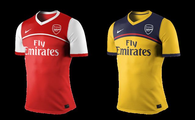
Arsenal home & away
- Category Football Kits
- Author: MikeDale20
- Hits: 4645
- wrote VSync32 on Monday, 30 November -0001 Nice kits, got a question for you: If you had to make a third/alternate kit for this set, what colours would you choose?
Arsenal home & away
- Category Football Kits
- Author: MikeDale20
- Hits: 4645
- wrote cgorac on Monday, 30 November -0001 Lover the Arsenal kits way better then the inter kits...
Arsenal home & away
- Category Football Kits
- Author: MikeDale20
- Hits: 4645
- wrote zeruch on Monday, 30 November -0001 nice!!! :) I like them, just increase your masking skills and would be amazing your work ;) I love yellow one
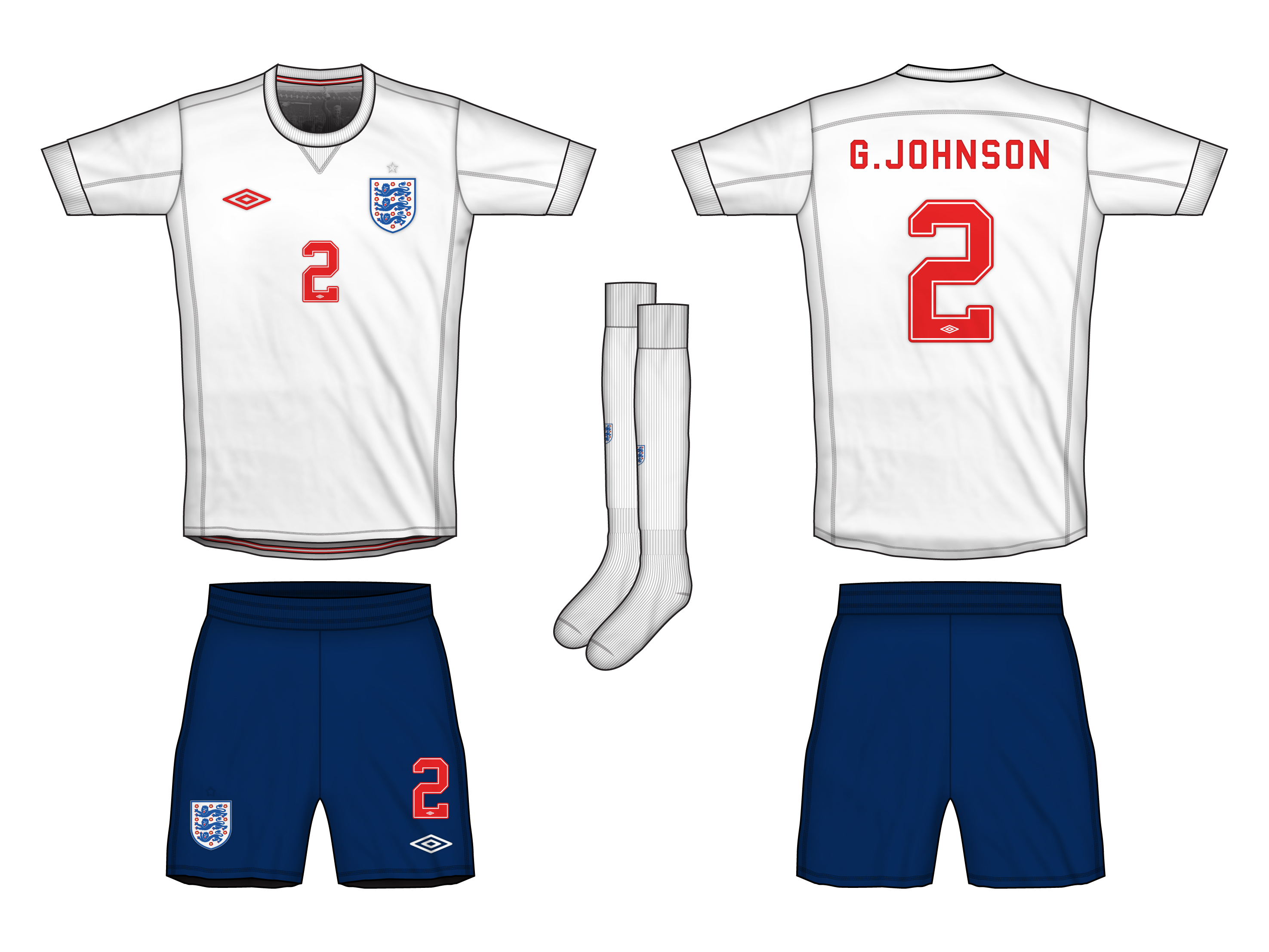
England Home
- Category Football Kits
- Author: Donnypool
- Hits: 3433
- wrote jamescampbelltaylor on Monday, 30 November -0001 If only England would revert to red numbers and navy shorts...
England Home
- Category Football Kits
- Author: Donnypool
- Hits: 3433
- wrote Steevo on Monday, 30 November -0001 I like it particularly the amount of thought gone into the cut of the shirt. Looks very modern/futuristic. I think it needs the same level of detail in the shorts and socks.
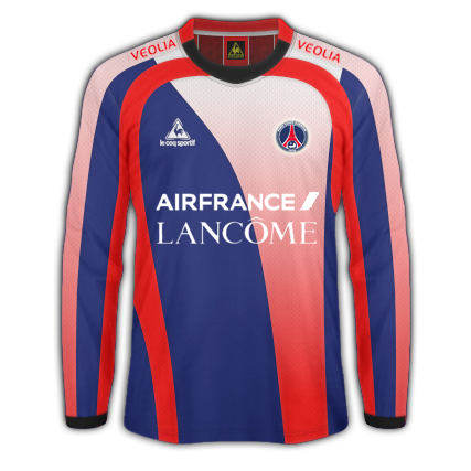
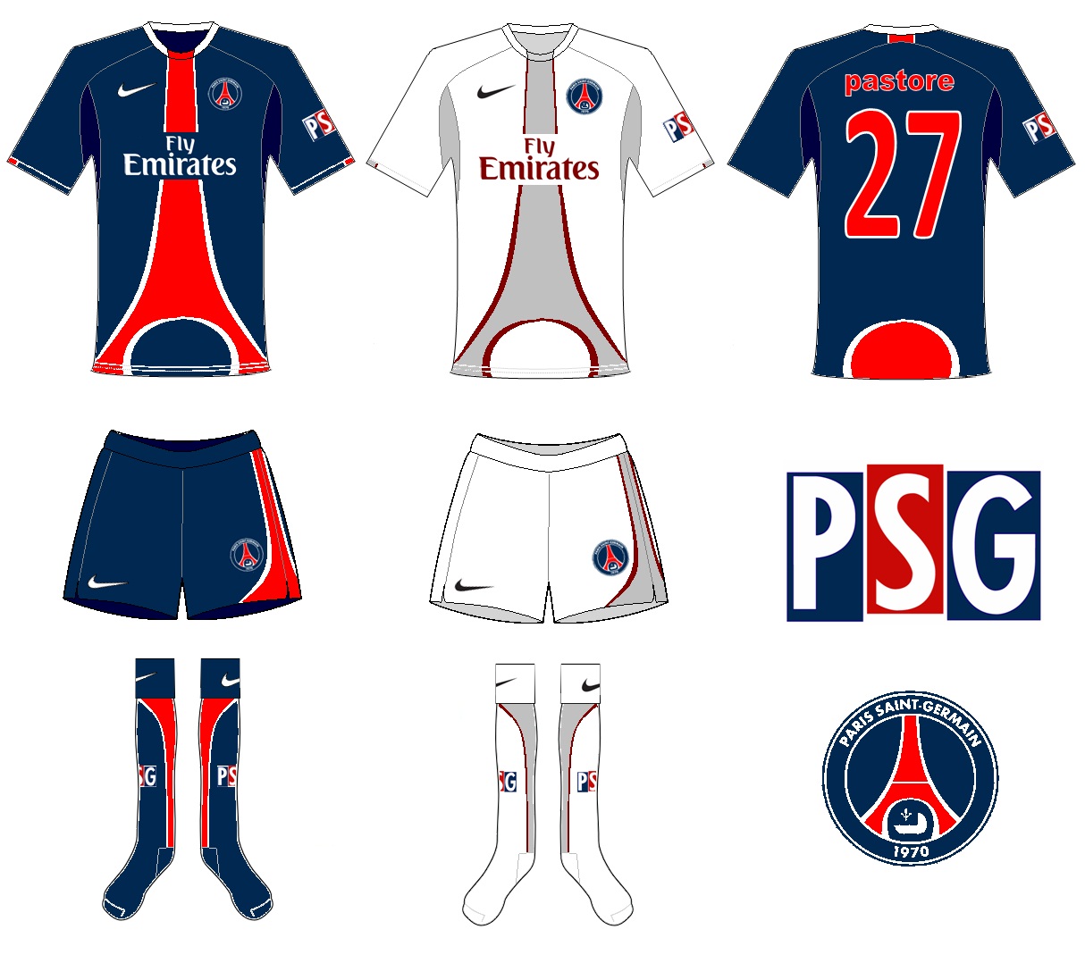
PSG Fantasy Shirt
- Category Football Kits
- Author: dames11
- Hits: 3344
- wrote Donnypool on Monday, 30 November -0001 Harsh! But: - Why two sponsors? And why not the right one? - Gradients are normally a big no, and here it makes half the kit look pink - it looks more Stade Francais than PSG. - PSG should only have the red stripe down the middle with the white fimbration. Doing anything else is like messing about with Ajax or Sampdoria - it can't be done. - Black collar and cuffs?
PSG Fantasy Shirt
- Category Football Kits
- Author: dames11
- Hits: 3344
- wrote curswine on Monday, 30 November -0001 I really don't know if you're trolling with this.

Manchester UTD Special Edition (Kappa)
- Category Football Kits
- Author: dames11
- Hits: 3801
- wrote zeruch on Monday, 30 November -0001 emmm... borussia dormund deja vu... also is kappa XD come on guy...
Manchester UTD Special Edition (Kappa)
- Category Football Kits
- Author: dames11
- Hits: 3801
- wrote curswine on Monday, 30 November -0001 Special edition? For what reason would United wear a yellow and black shirt that would warrant it being called special edition? It's not really that special either tbh.
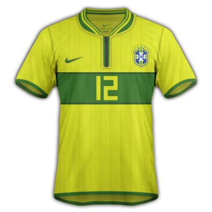
Brazil Home
- Category Football Kits
- Author: gonzales
- Hits: 3214
- wrote zeruch on Monday, 30 November -0001 maybe... by the way, looks nice
Brazil Home
- Category Football Kits
- Author: gonzales
- Hits: 3214
- wrote gonzales on Monday, 30 November -0001 maybe, because this is a retro neck
Brazil Home
- Category Football Kits
- Author: gonzales
- Hits: 3214
- wrote zeruch on Monday, 30 November -0001 I'm the only one that think the neck is the one used on italia by puma?
PSG
- Category Football Kits
- Author: emmekappa
- Hits: 3736
- wrote VSync32 on Monday, 30 November -0001 God you are genious...
PSG
- Category Football Kits
- Author: emmekappa
- Hits: 3736
- wrote jamescampbelltaylor on Monday, 30 November -0001 Haha, very nice idea.
1978 Nike France Alternate Concept
- Category Football Kits
- Author: moom
- Hits: 3431
- wrote zeruch on Monday, 30 November -0001 I guess it's because that day they didn't they shirts and used some of a local team with white/green stripes right? looks nice, different being france, but... well, thats why is third kit
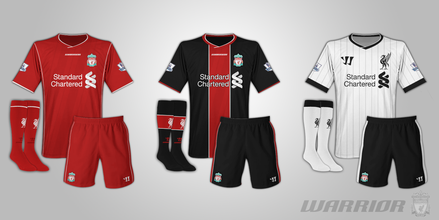
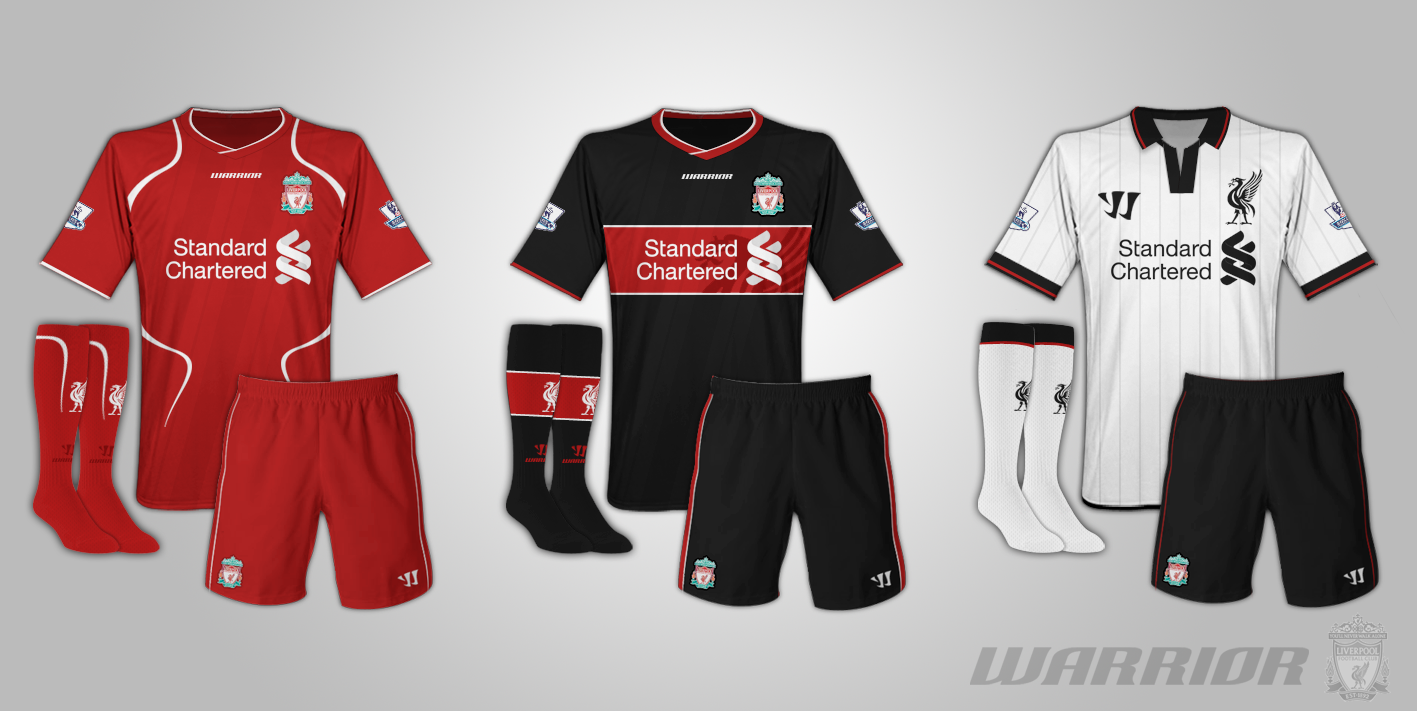
Liverpool Warrior Home Kit 12-13
- Category Football Kits
- Author: Steevo
- Hits: 4289
- wrote VSync32 on Monday, 30 November -0001 The best design Warrior can provide to Liverpool... Nice....
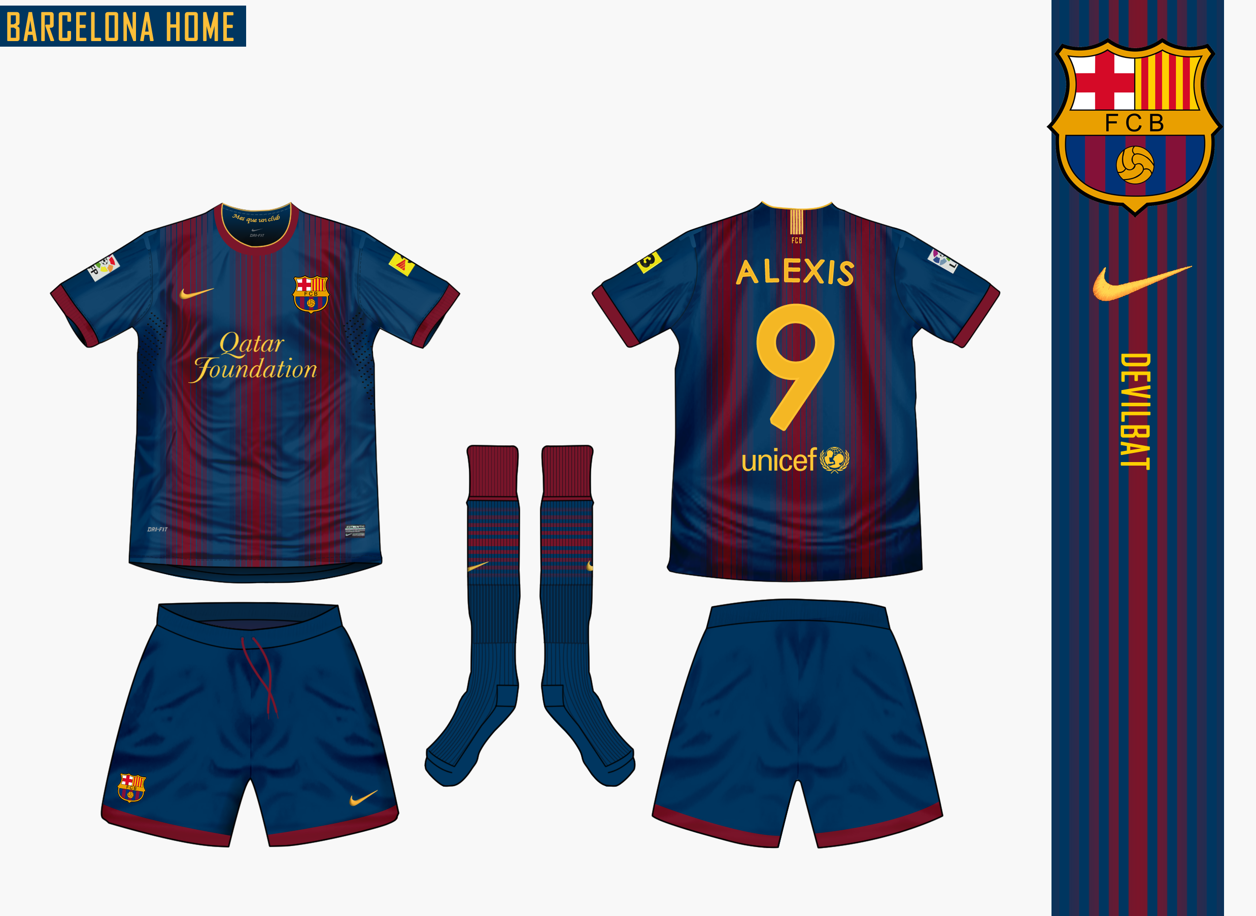
Barcelona Home Nike 2012/13
- Category Football Kits
- Author: Devilbat
- Hits: 5499
- wrote VSync32 on Monday, 30 November -0001 LIKE A BOSS
Barcelona Home Nike 2012/13
- Category Football Kits
- Author: Devilbat
- Hits: 5499
- wrote derry2000 on Monday, 30 November -0001 Very Unique! Me Gusta!

Barcelona Home Nike 2012/13
- Category Football Kits
- Author: Devilbat
- Hits: 5499
- wrote kifla6 on Monday, 30 November -0001 amazing
Barcelona Home Nike 2012/13
- Category Football Kits
- Author: Devilbat
- Hits: 5499
- wrote zeruch on Monday, 30 November -0001 jo jo totally better than the next barcelona's shirt... or the actual one or the last one or the one before that... you know XD I like so much :) with gradients but in a better way
Liverpool Warrior Home Kit 12-13
- Category Football Kits
- Author: Steevo
- Hits: 4558
- wrote DANUFC on Monday, 30 November -0001 I like the badge, much better than the current one. Also the trims don't over complicate the rest of the kit. Good design.
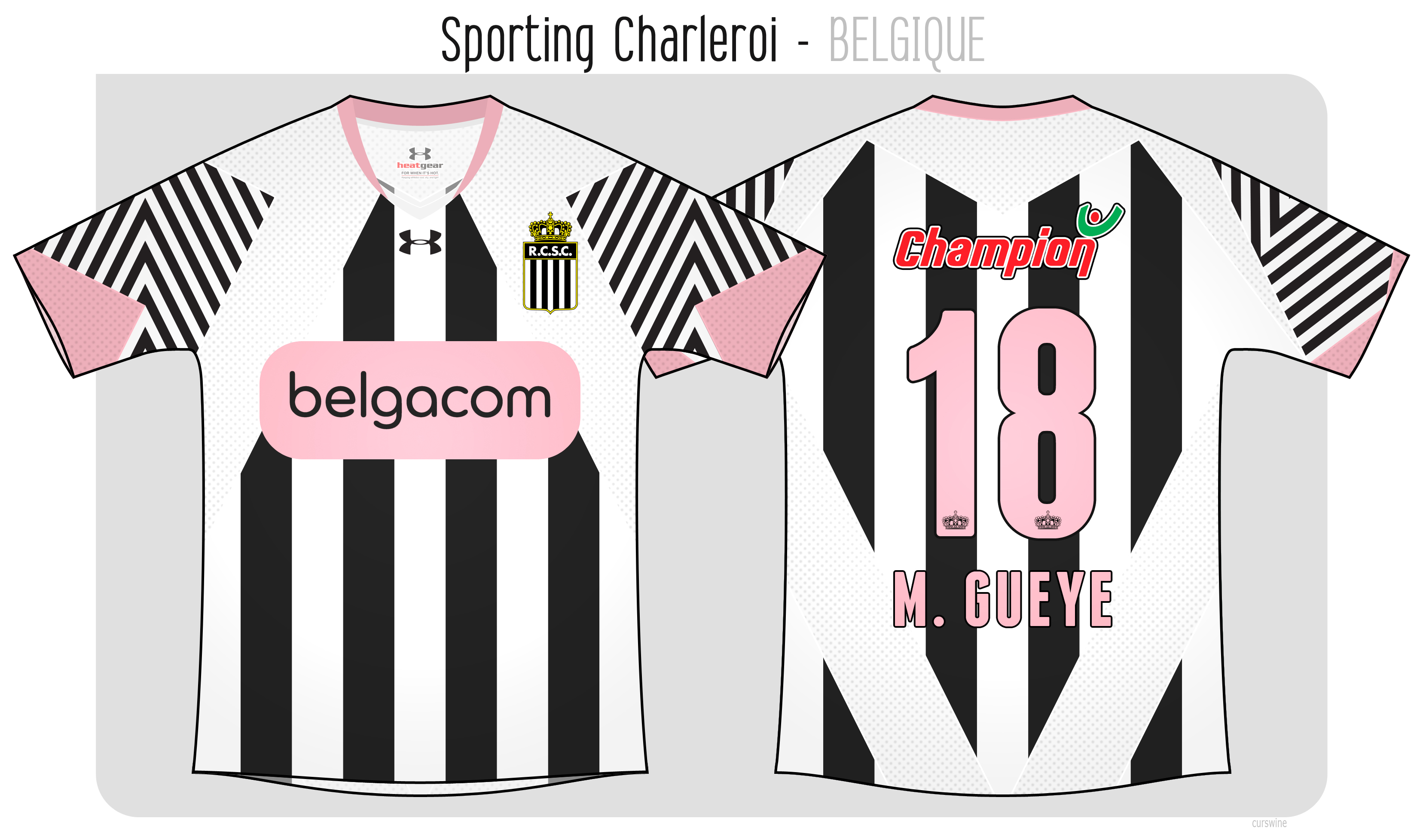
Sporting Charleroi
- Category Football Kits
- Author: curswine
- Hits: 4447
- wrote DANUFC on Monday, 30 November -0001 The zebra pattern is smart, and the inclusion of the pink too. I thought it was a bit complex at first but the ideas behind it make it a good design.
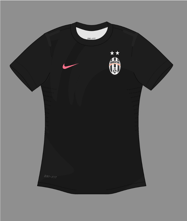
2012-2013 Nike Juventus Away Kit
- Category Football Kits
- Author: moom
- Hits: 4731
- wrote curswine on Monday, 30 November -0001 Looks great again, all I'd say, like the Malaysia kit is to maybe try and have more of a purpose behind the shape of the front of the shirt but keep the abstract nature, kind of like the 09-10 Marseille away shirt with the hidden OM.
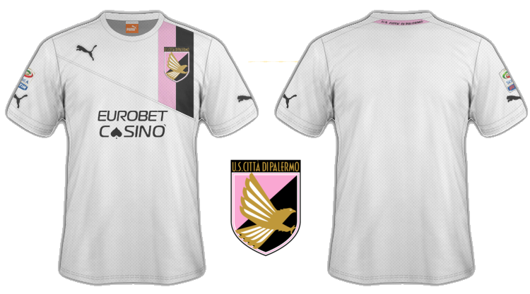
Palermo kit 2012
- Category Football Kits
- Author: Vengeance
- Hits: 3346
- wrote VSync32 on Monday, 30 November -0001 It is a very nice kit, well done mate...
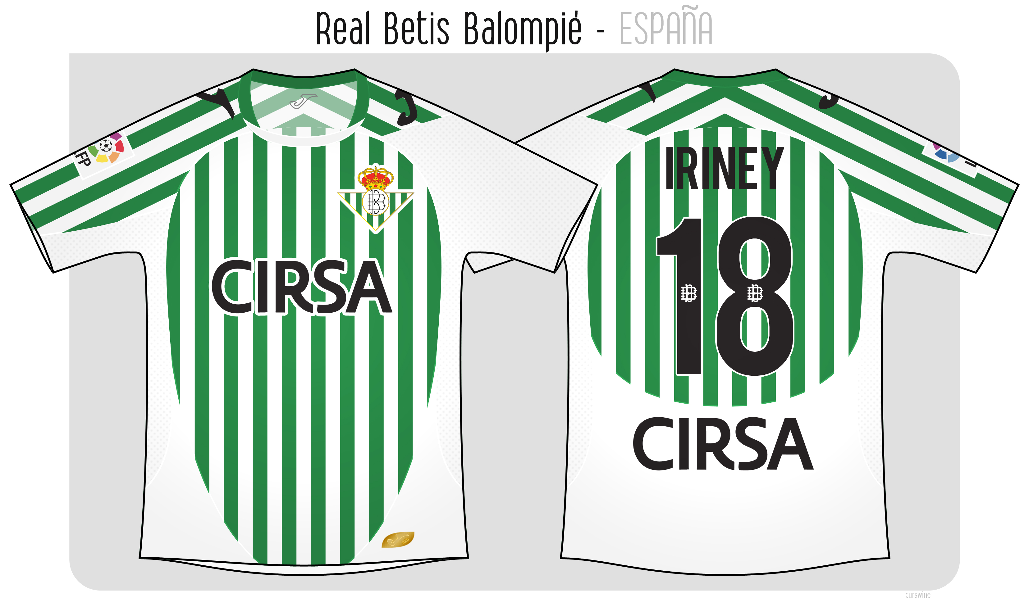
Real Betis
- Category Football Kits
- Author: curswine
- Hits: 3791
- wrote curswine on Monday, 30 November -0001 I've been trying to keep the sponsors/logos as per the real deal and the Cirsa logo is at the bottom of the back of that shirt too albeit with an ugly looking golden apple which I took off as it just looked too weird. Glad to hear that you think it looks like a Joma style though, really quite difficult to sit down with a goal to create something like that.
Real Betis
- Category Football Kits
- Author: curswine
- Hits: 3791
- wrote Donnypool on Monday, 30 November -0001 The kind of thing I'd expect from Joma/Betis - a bit of organised confusion. Is there not a second sponsor for the back? Why do Cirsa need their logo twice?
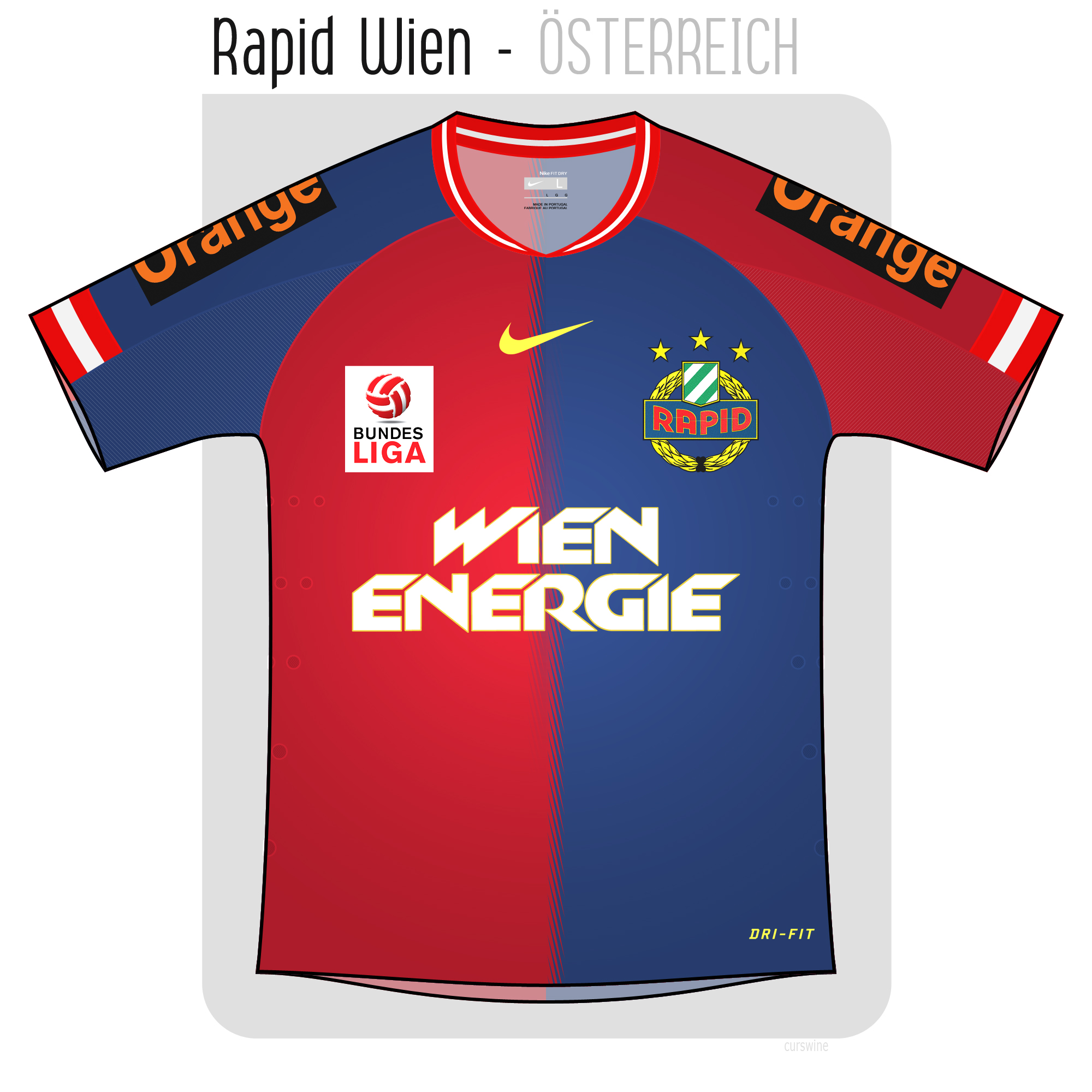
Rapid Wien
- Category Football Kits
- Author: curswine
- Hits: 3777
- wrote curswine on Monday, 30 November -0001 Ah crap I totally forgot Juve's home shirt had this style of spiky stripes, I thought this was slightly original at least. (Although the collar and cuffs are loaned from an old Nike Boca shirt too).
Rapid Wien
- Category Football Kits
- Author: curswine
- Hits: 3777
- wrote Donnypool on Monday, 30 November -0001 Well notices Steevo- that's a very nice detail. It's a level of sophistication over Juve's stripe detail from this season.
Rapid Wien
- Category Football Kits
- Author: curswine
- Hits: 3777
- wrote curswine on Monday, 30 November -0001 I think I probably should have made the colours a darker shade than they are as you're right it does look quite a lot like a Basel shirt. Would be quite easy to swap the Austrian flag in the collar and cuffs to a Swiss flag also.
Rapid Wien
- Category Football Kits
- Author: curswine
- Hits: 3777
- wrote Steevo on Monday, 30 November -0001 I like the join between the halves the way the gradients swap over. Very nice. Can imagine it would be something nike would do. Would make a class Basel kit
Barça home shirt 2011-12 - With Bottle
- Category Football Kits
- Author: Jay29ers
- Hits: 3579
- wrote curswine on Monday, 30 November -0001 Your version is certainly more pleasing to the eye. Although you have to squint so you can't see the paint marks :lol:
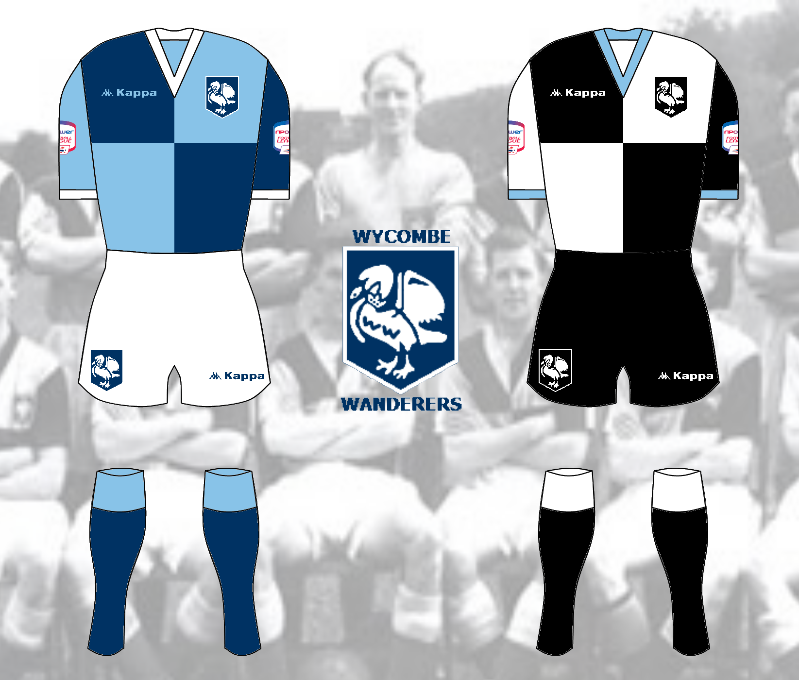
Wycombe Wanderers Kits
- Category Football Kits
- Author: DANUFC
- Hits: 5457
- wrote DANUFC on Monday, 30 November -0001 Thanks, something I don't like about it though, lacking in something possibly.
Wycombe Wanderers Kits
- Category Football Kits
- Author: DANUFC
- Hits: 5457
- wrote AvFc07 on Monday, 30 November -0001 very nice kit and its not ruined by the big kappa logos on the sleeves used in current designs. good job

Wycombe Wanderers Kits
- Category Football Kits
- Author: DANUFC
- Hits: 5457
- wrote DANUFC on Monday, 30 November -0001 thanks, I was going to make it a 125th anniversary kit but that is this year so I just made it. Probably should of included the sponser though.
Wycombe Wanderers Kits
- Category Football Kits
- Author: DANUFC
- Hits: 5457
- wrote Steevo on Monday, 30 November -0001 nice retro designs, like the badge as well
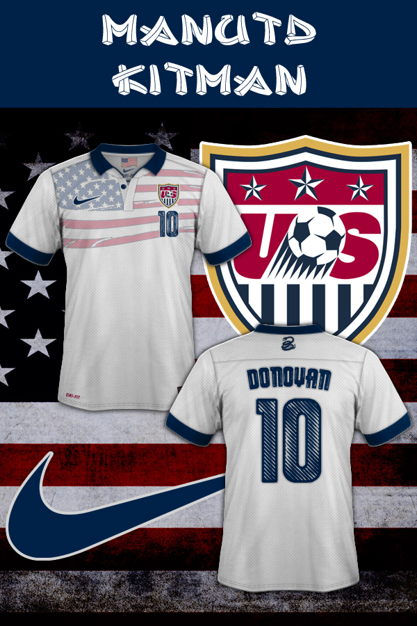
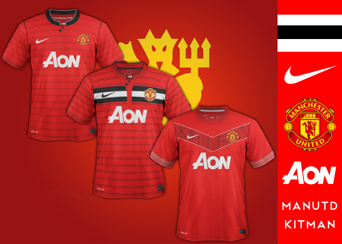
USA National Football Team New Home
- Category Football Kits
- Author: manutd_kitman21
- Hits: 3485
- wrote zeruch on Monday, 30 November -0001 ok XD too much american... but type is great :) I like it
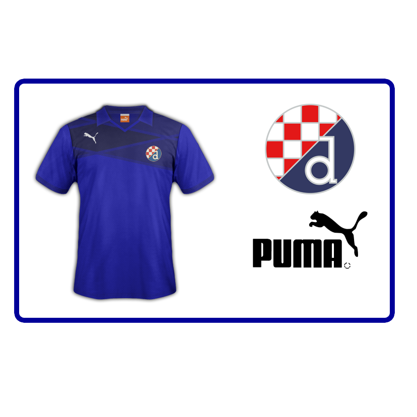
GNK Dinamo Fantasy kit
- Category Football Kits
- Author: kifla6
- Hits: 4735
- wrote kifla6 on Monday, 30 November -0001 Slazem se :)
GNK Dinamo Fantasy kit
- Category Football Kits
- Author: kifla6
- Hits: 4735
- wrote cgorac on Monday, 30 November -0001 Don't like the design but it's only Dinamo Zagreb so not 2 worry:lol: Hajduk split je bolji...
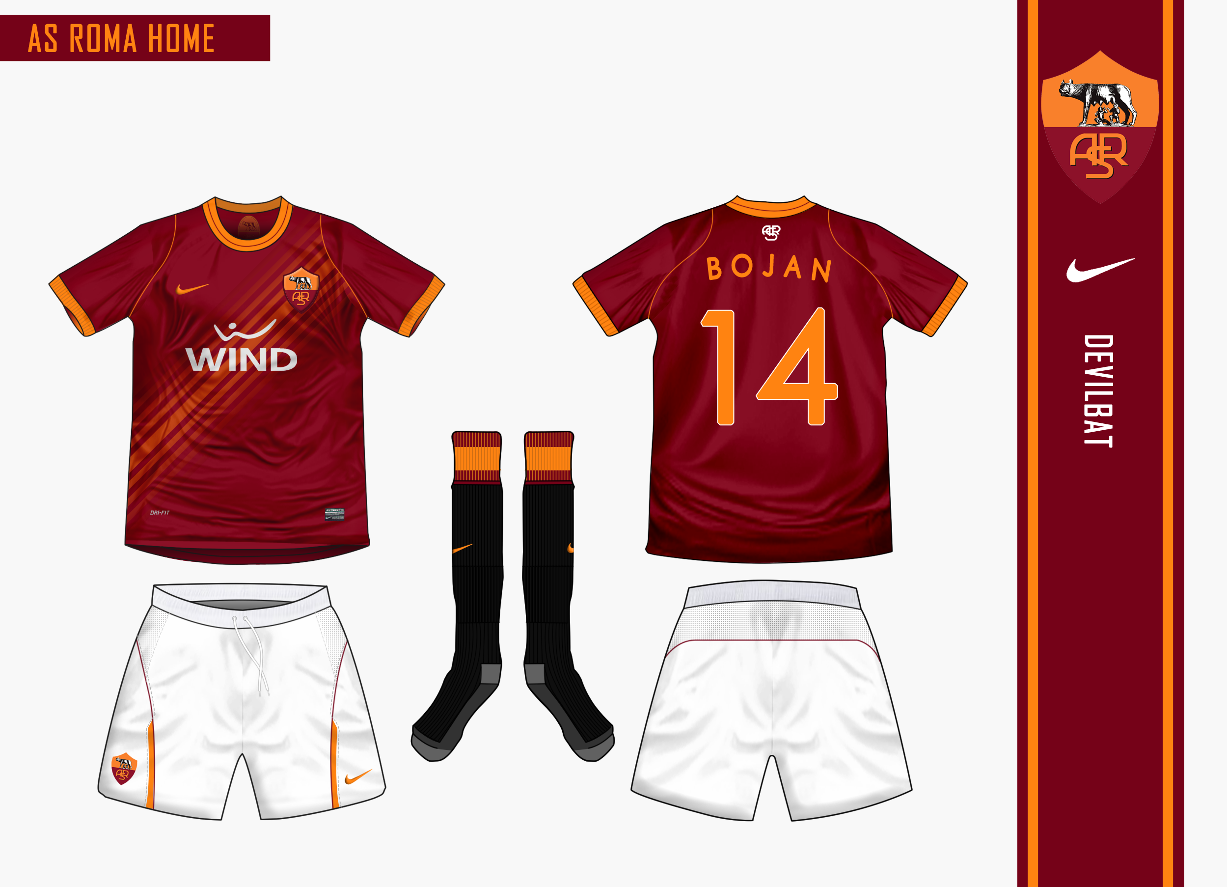
AS Roma Home
- Category Football Kits
- Author: Devilbat
- Hits: 3788
- wrote 1kit on Monday, 30 November -0001 there are many touch of class here...cant decide if the multi sash works or not. id say it does other users should say what they think for now id say 8
MUFC FANTASY HOME KITS
- Category Football Kits
- Author: manutd_kitman21
- Hits: 3811
- wrote zeruch on Monday, 30 November -0001 nice =D
MUFC FANTASY HOME KITS
- Category Football Kits
- Author: manutd_kitman21
- Hits: 3811
- wrote kaimat85 on Monday, 30 November -0001 AWESOME! :)
Liverpool Away Kit
- Category Football Kits
- Author: Donnypool
- Hits: 4265
- wrote Steevo on Monday, 30 November -0001 not sure if i'm keen on it as an away kit but it'd make a truly awesome GK kit.
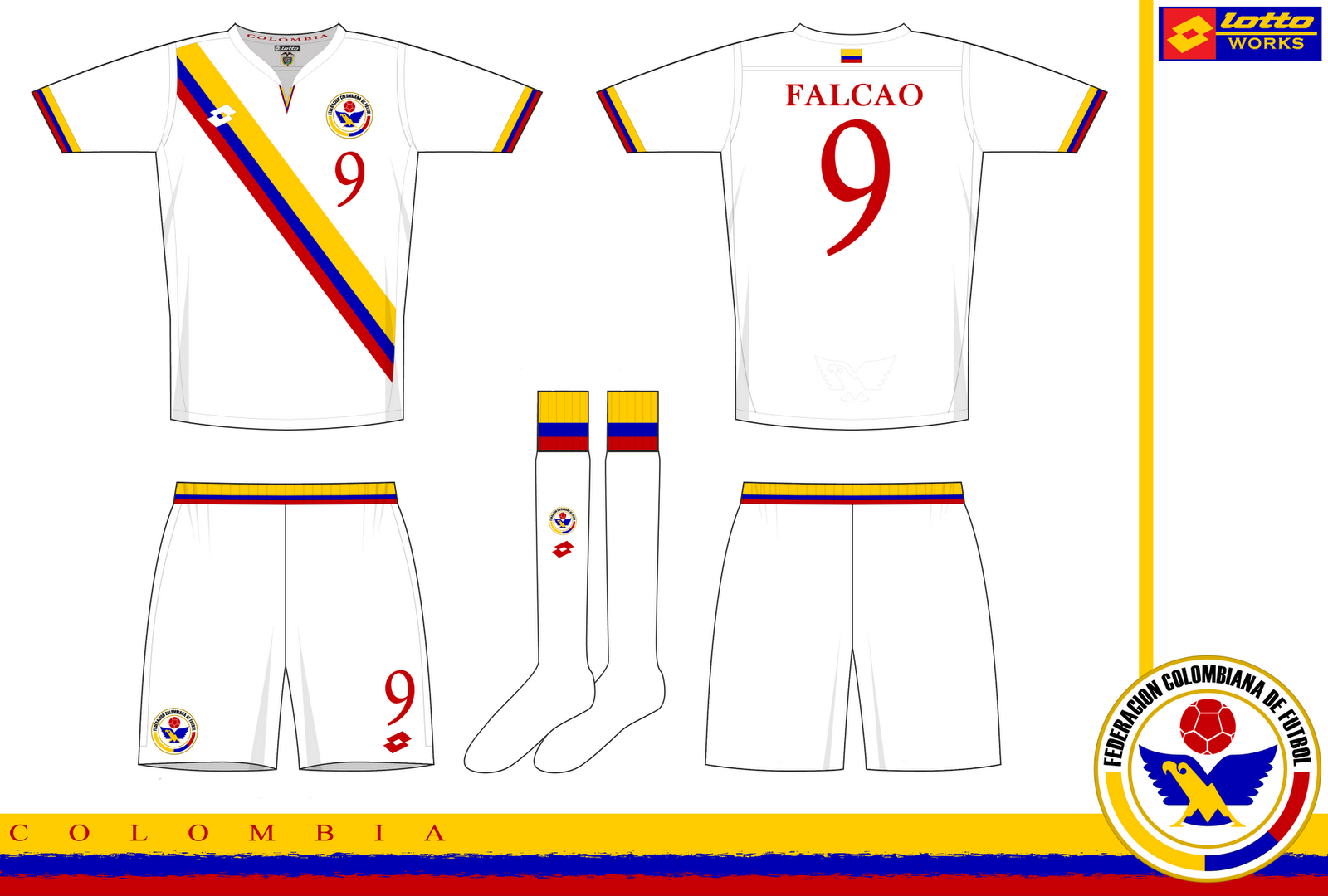
Colombia
- Category Football Kits
- Author: Spider
- Hits: 3322
- wrote Donnypool on Monday, 30 November -0001 I unconditionally love every kit with a sash. This is no exception. I like the cuffs too.
Liverpool Warrior Kits
- Category Football Kits
- Author: zhoohz
- Hits: 47465
- wrote zhoohz on Monday, 30 November -0001 I made som changes on the thrid, as seen in the update... som red striping on the sleeves, collar and socks :)

MarCeltiPool Gold Concept
- Category Football Kits
- Author: F3154L
- Hits: 3806
- wrote Steevo on Monday, 30 November -0001 nice design, I really like the DF logo. There has been a lot of thought gone into this design which is nice
Liverpool Warrior Kits *update*
- Category Football Kits
- Author: zhoohz
- Hits: 4598
- wrote brokr151 on Monday, 30 November -0001 really like the middle one not seen anything like that before as a lpool shirt.
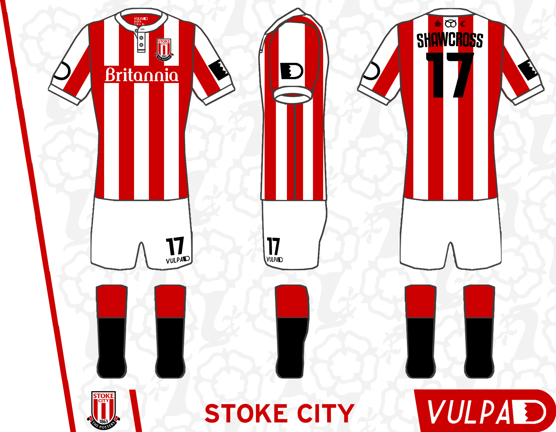
Stoke Home Kit
- Category Football Kits
- Author: Donnypool
- Hits: 3833
- wrote brokr151 on Monday, 30 November -0001 really nice shirts and design/template.. i dont like the real stoke shirts for next season at all!
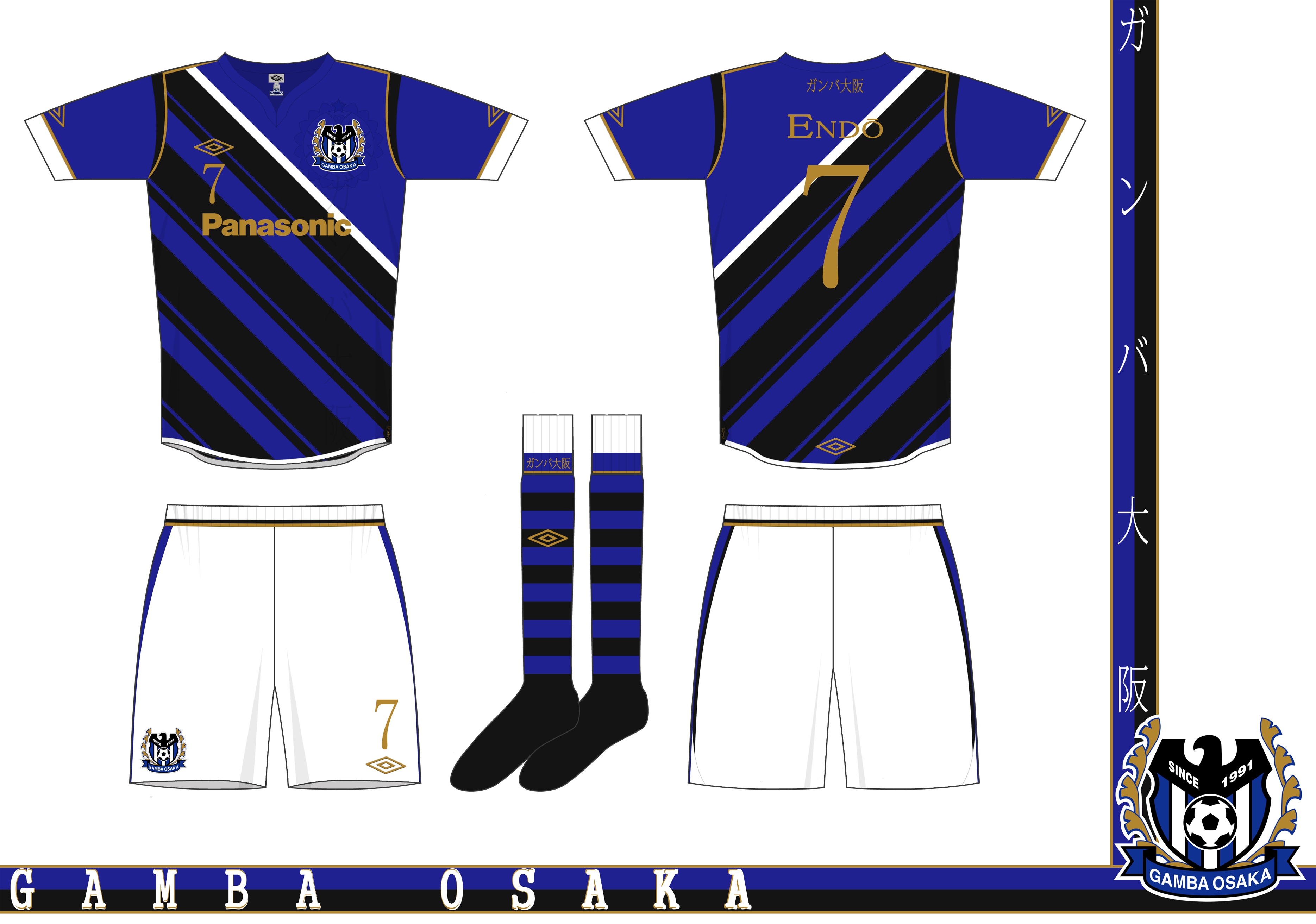
Gamba Osaka
- Category Football Kits
- Author: MW FROM WIDEOPEN
- Hits: 3963
- wrote Steevo on Monday, 30 November -0001 good work, like all the detail. good to see you posting kits on here now as well as on fsc.
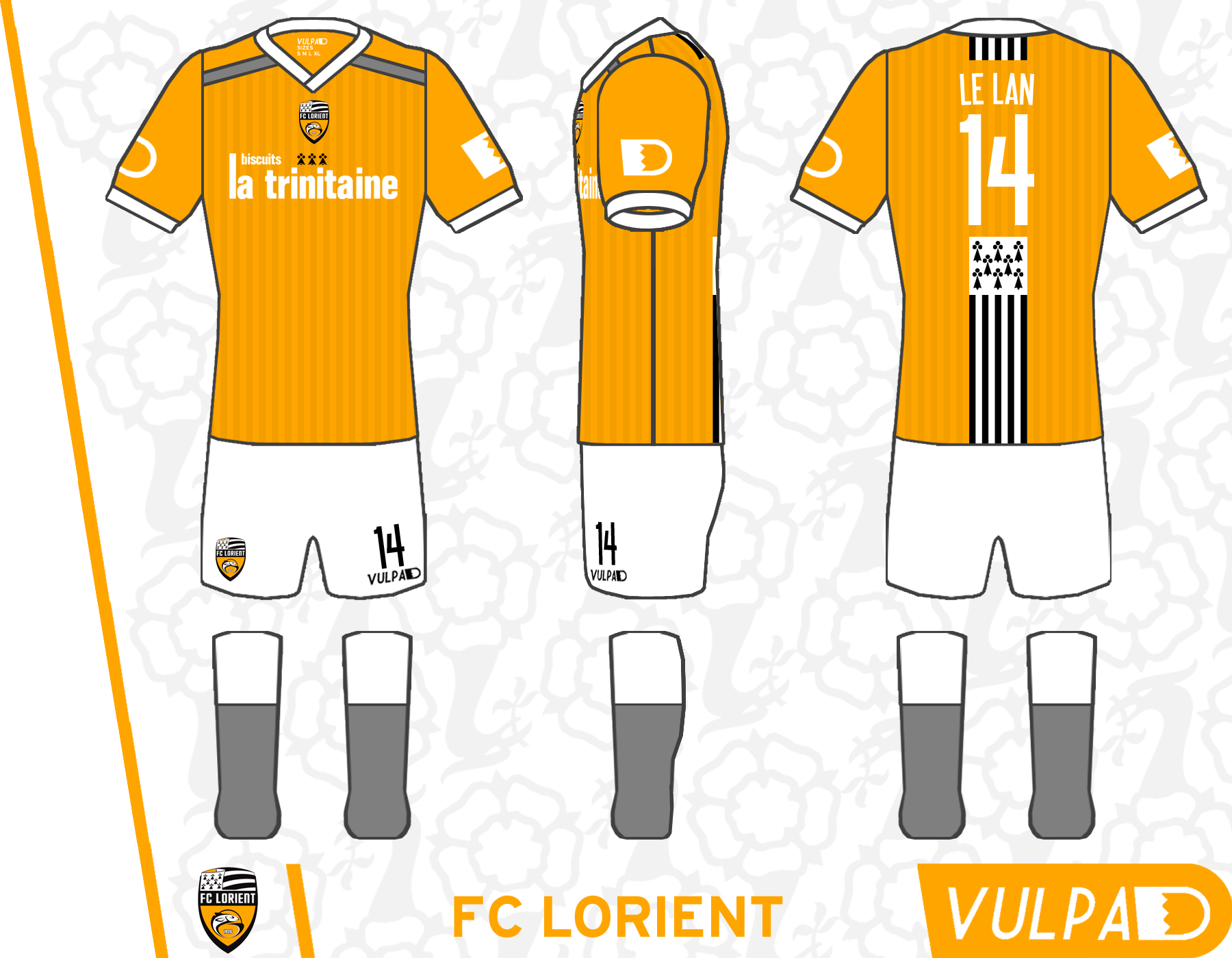
FC Lorient
- Category Football Kits
- Author: Donnypool
- Hits: 3859
- wrote MW FROM WIDEOPEN on Monday, 30 November -0001 Dig the flag detail on the back, looks really good, but not sure about the grey socks, black would have looked more imposing, and so would black socks. The shirt looks really good though.
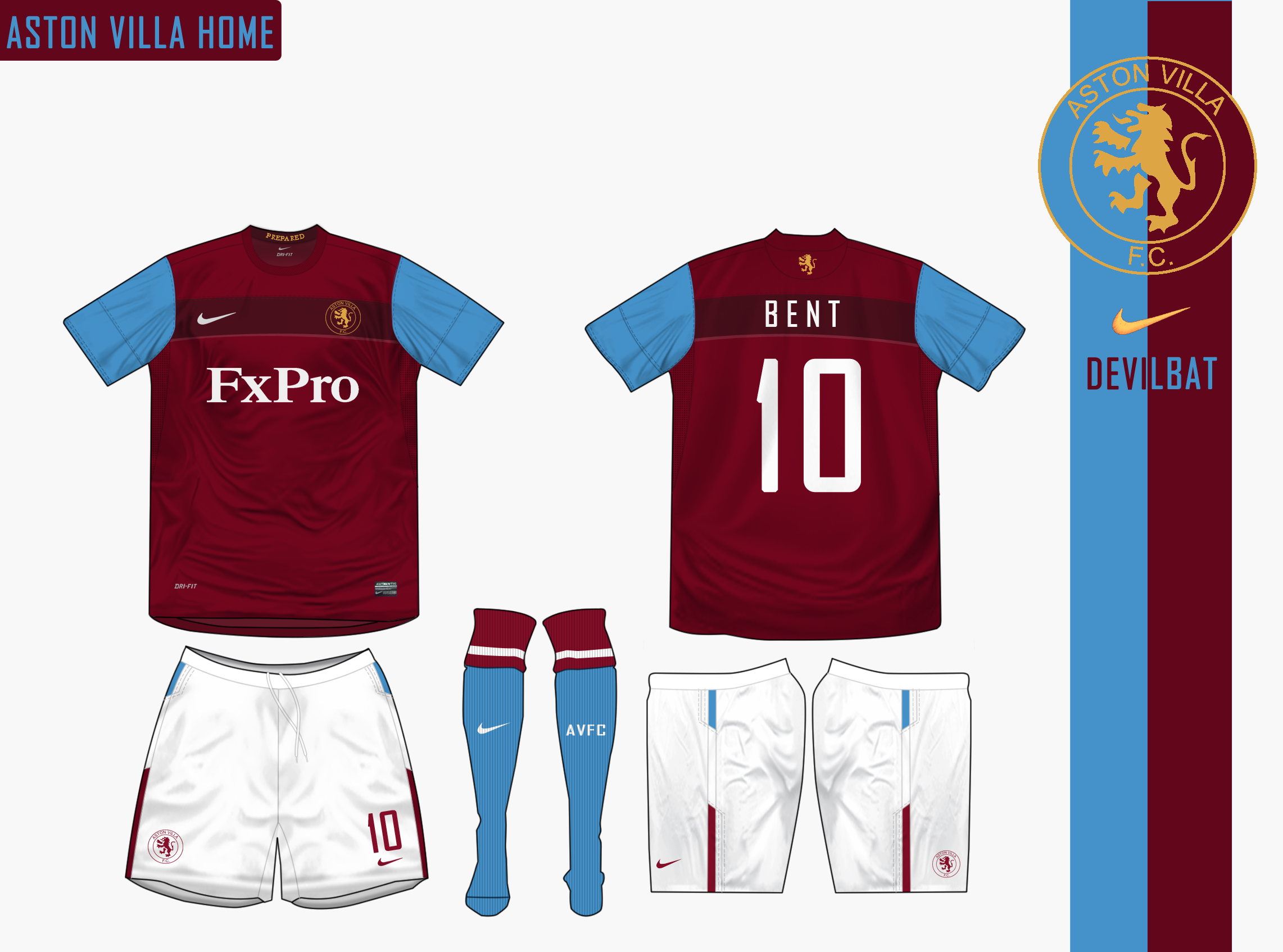
Aston Villa Home Nike
- Category Football Kits
- Author: Devilbat
- Hits: 4306
- wrote Tim1902 on Monday, 30 November -0001 Brilliant. Modern shirt with the classic 70s/80s Villa badge. Only negative is the expired and not particularly attractive sponsor (although it's better than the new one).

Vancouver Whitecaps
- Category Football Kits
- Author: MW FROM WIDEOPEN
- Hits: 3343
- wrote Rabbi on Monday, 30 November -0001 Good work my friend.
Vancouver Whitecaps
- Category Football Kits
- Author: MW FROM WIDEOPEN
- Hits: 3343
- wrote Donnypool on Monday, 30 November -0001 Not too sure about the condensed serif you've used but aside from that it's class. You do a great job making the kits look authentically Tailored by Umbro.
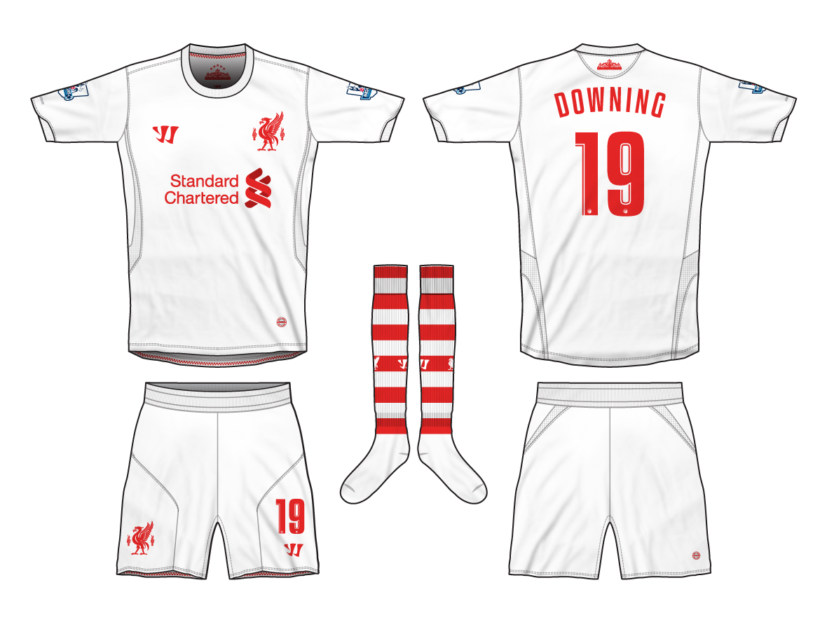
Liverpool Home Kit
- Category Football Kits
- Author: Donnypool
- Hits: 3995
- wrote Steevo on Monday, 30 November -0001 top work, love the sleeve ends with the shankly gates and eternal flames. you've added more detail into this than you have with previous kits which improves them massively. for balance i'd maybe have had the flames on both sleeves and the full gate design on the back of the collar.
Liverpool Warrior Away 12-13
- Category Football Kits
- Author: Steevo
- Hits: 4478
- wrote MW FROM WIDEOPEN on Monday, 30 November -0001 I do prefer the Warrior change with the watermarks and black shorts you did, but this is almost as good as that one. I like the hooped socks. nice.
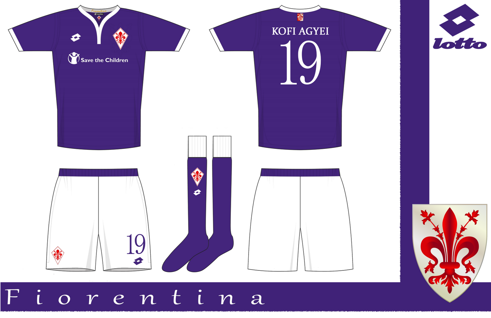
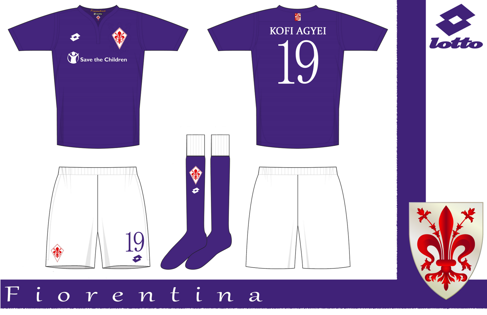
Fiorentina
- Category Football Kits
- Author: MW FROM WIDEOPEN
- Hits: 4304
- wrote Donnypool on Monday, 30 November -0001 Looks better with the crest in a kite again, but I can't tell which trim I prefer. What about old gold? That's looked quite good on Viola shirts.
Fiorentina
- Category Football Kits
- Author: MW FROM WIDEOPEN
- Hits: 4304
- wrote Donnypool on Monday, 30 November -0001 Looks better with the crest in a kite again, but I can't tell which trim I prefer. What about old gold? That's looked quite good on Viola shirts.
Fiorentina
- Category Football Kits
- Author: MW FROM WIDEOPEN
- Hits: 4304
- wrote Donnypool on Monday, 30 November -0001 Looks better with the crest in a kite again, but I can't tell which trim I prefer. What about old gold? That's looked quite good on Viola shirts.
Fiorentina
- Category Football Kits
- Author: MW FROM WIDEOPEN
- Hits: 4304
- wrote MW FROM WIDEOPEN on Monday, 30 November -0001 Yeah, Ill do one with gold trim, as well as a red and white halved kit for La Viola later.
Fiorentina
- Category Football Kits
- Author: MW FROM WIDEOPEN
- Hits: 4304
- wrote tanguyy on Monday, 30 November -0001 this is you spider? you changed username for this other site?
Fiorentina
- Category Football Kits
- Author: MW FROM WIDEOPEN
- Hits: 4304
- wrote Donnypool on Monday, 30 November -0001 As far as I know he was MW on here first (about a year ago as I remember), and then seemed to disappear but came back as Spiderbait on FSC and returned here about a couple of months ago. Is the name a reference to, imo, the best Australian band ever? The Flight Of Wally Funk is awesome.
Fiorentina
- Category Football Kits
- Author: MW FROM WIDEOPEN
- Hits: 4304
- wrote MW FROM WIDEOPEN on Monday, 30 November -0001 Spiderbait were pretty awesome, Black Betty is awesome. Tried to set up a new account under the name spiderbait on here, but it was too much hassle, so its MW on here.
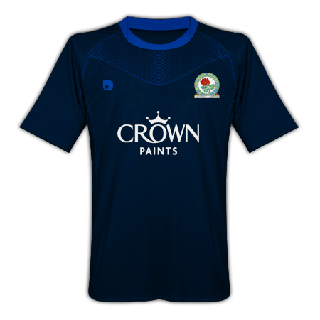
Blackburn Rovers
- Category Football Kits
- Author: Berhane
- Hits: 2975
- wrote brokr151 on Monday, 30 November -0001 nice. suits blackburn.
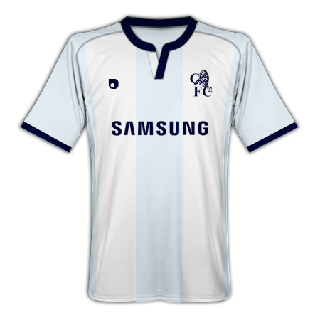
Chelsea
- Category Football Kits
- Author: Berhane
- Hits: 3001
- wrote brokr151 on Monday, 30 November -0001 looks too much like spurs imo
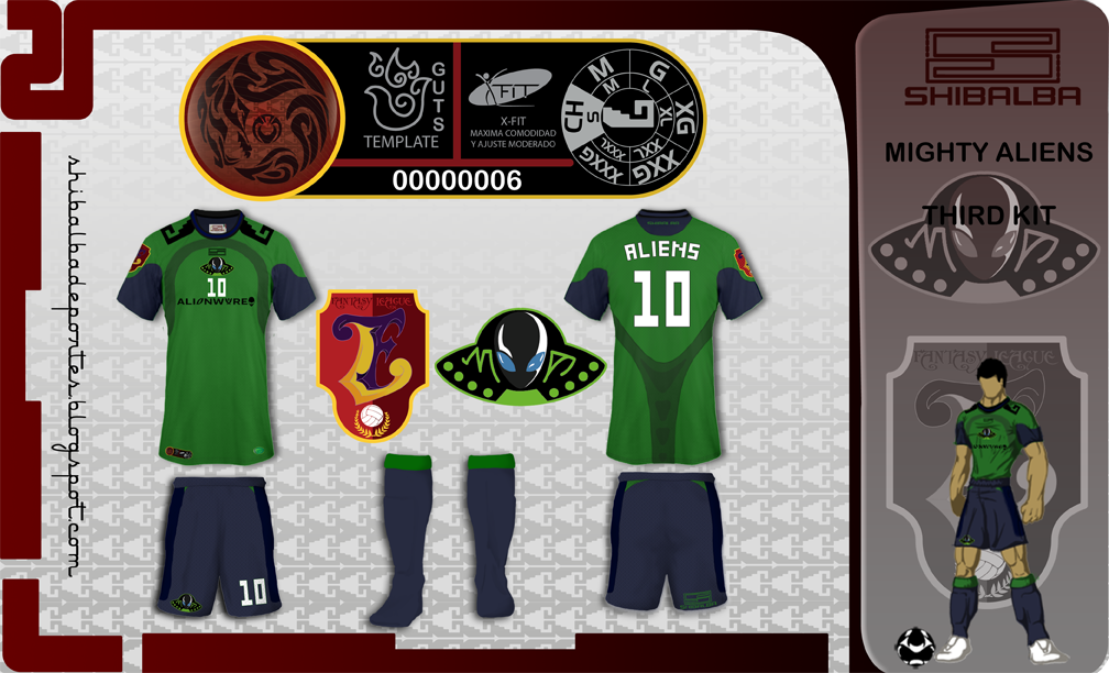
Mighty Aliens
- Category Football Kits
- Author: zeruch
- Hits: 3413
- wrote Spider on Monday, 30 November -0001 These are all pretty good, and I do like the cartoon style kit modeler, though there is no way he would pass an anti doping test :)
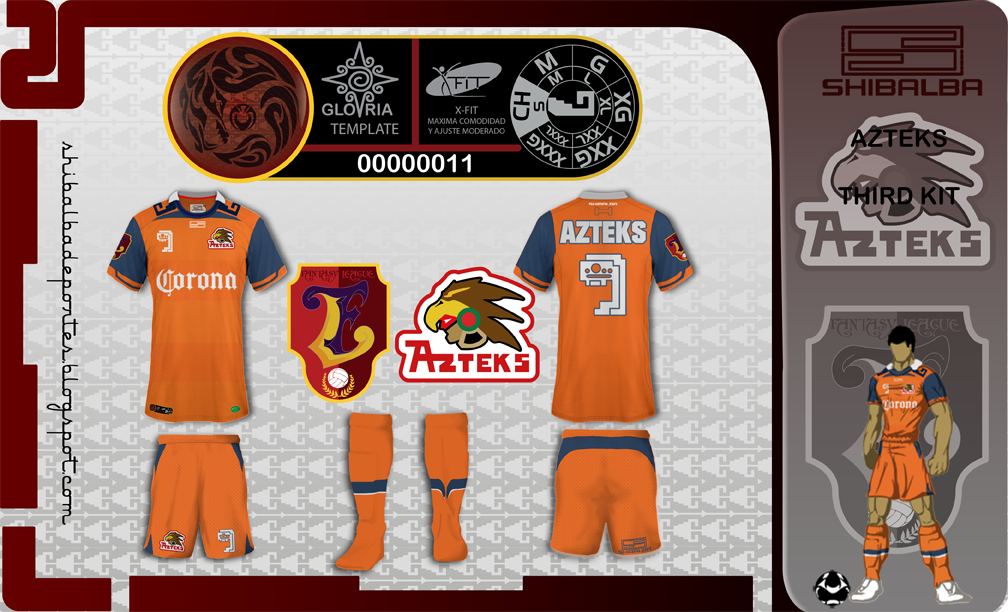
Azteks
- Category Football Kits
- Author: zeruch
- Hits: 3704
- wrote Amadeus Angelillo on Monday, 30 November -0001 I think these designs are great, really outlandish, but I like! I like crazy numbering and the fact you have created your own team, but most of all I love the numbering! abit ineligable, but Id like to see all of the numbers 1-10 designed! I want to see more!
Azteks
- Category Football Kits
- Author: zeruch
- Hits: 3704
- wrote Amadeus Angelillo on Monday, 30 November -0001 Also...love the cartoons! make some bigger!
Azteks
- Category Football Kits
- Author: zeruch
- Hits: 3704
- wrote zeruch on Monday, 30 November -0001 XD well... I'm really excited cos your comments n////n thanks!!! and if you want to see all the numbers :) here is the link http://i1128.photobucket.com/albums/m496- /shibalbadeportes/prehispanica_b.png - and again thanks n___n

San Francisco
- Category Football Kits
- Author: Spider
- Hits: 3196
- wrote Spider on Monday, 30 November -0001 And thanks to Rabbi for the kit redesign
San Francisco
- Category Football Kits
- Author: Spider
- Hits: 3196
- wrote Rabbi on Monday, 30 November -0001 It looks god Spider, and my pleasure to help.
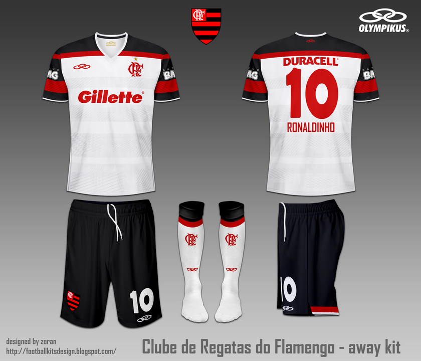
C.R. Flamengo fantasy home and away
- Category Football Kits
- Author: zoran
- Hits: 9960
- wrote zeruch on Monday, 30 November -0001 nice =D I like it
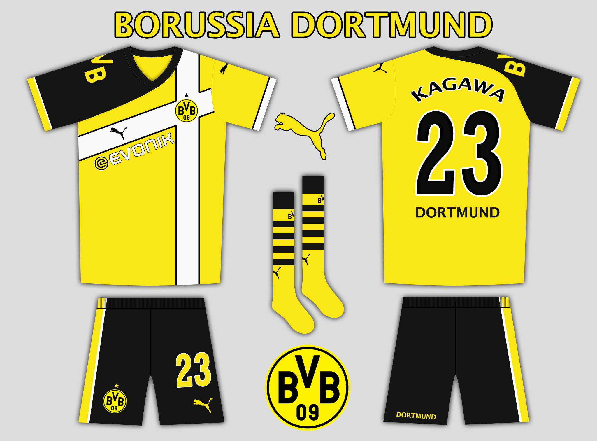
Borussia Dortmund Puma Home
- Category Football Kits
- Author: StarSky
- Hits: 3630
- wrote kaimat85 on Monday, 30 November -0001 i like it
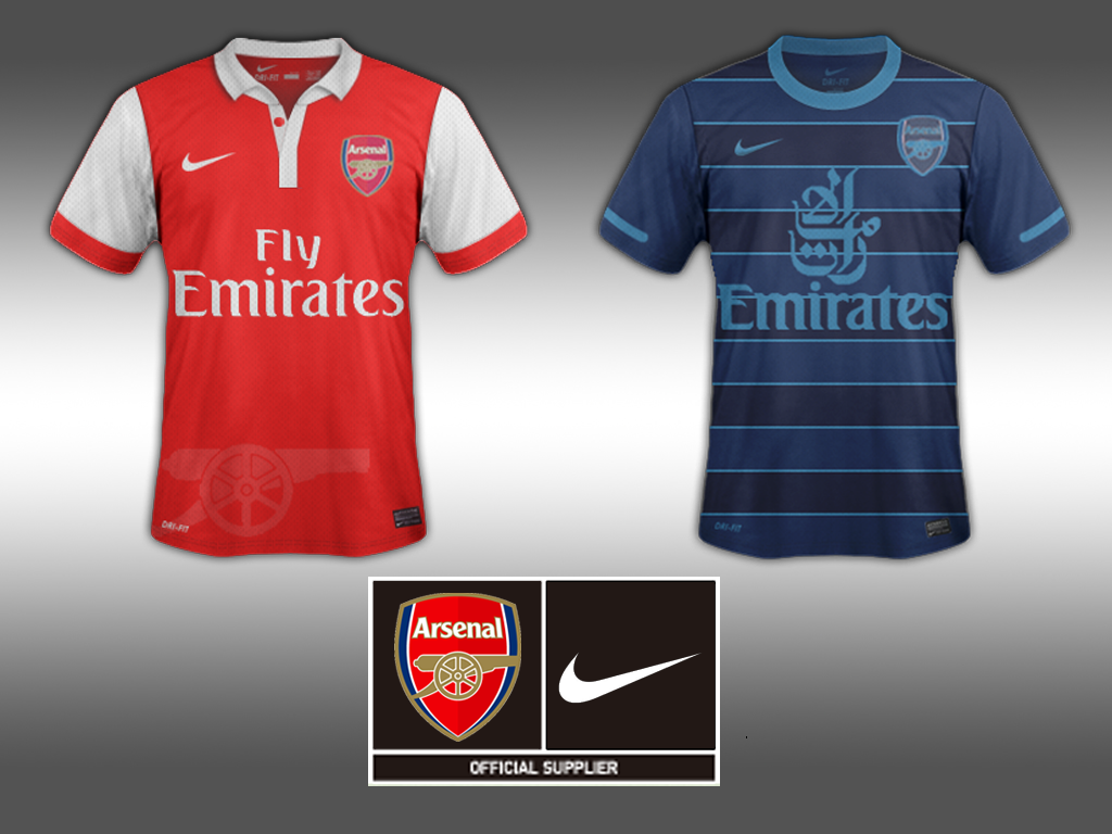
Home and Away Jersey-Arsenal
- Category Football Kits
- Author: gonzales
- Hits: 5232
- wrote gonzales on Monday, 30 November -0001 i have used photoshop to cahnge some templates i downloaded here:http://forum.fm-view.com/topic/1221- 4-ss09-12-template-thread/
Home and Away Jersey-Arsenal
- Category Football Kits
- Author: gonzales
- Hits: 5232
- wrote Tetsujin on Monday, 30 November -0001 Thank you so much, man! :D I will design some and show you mine
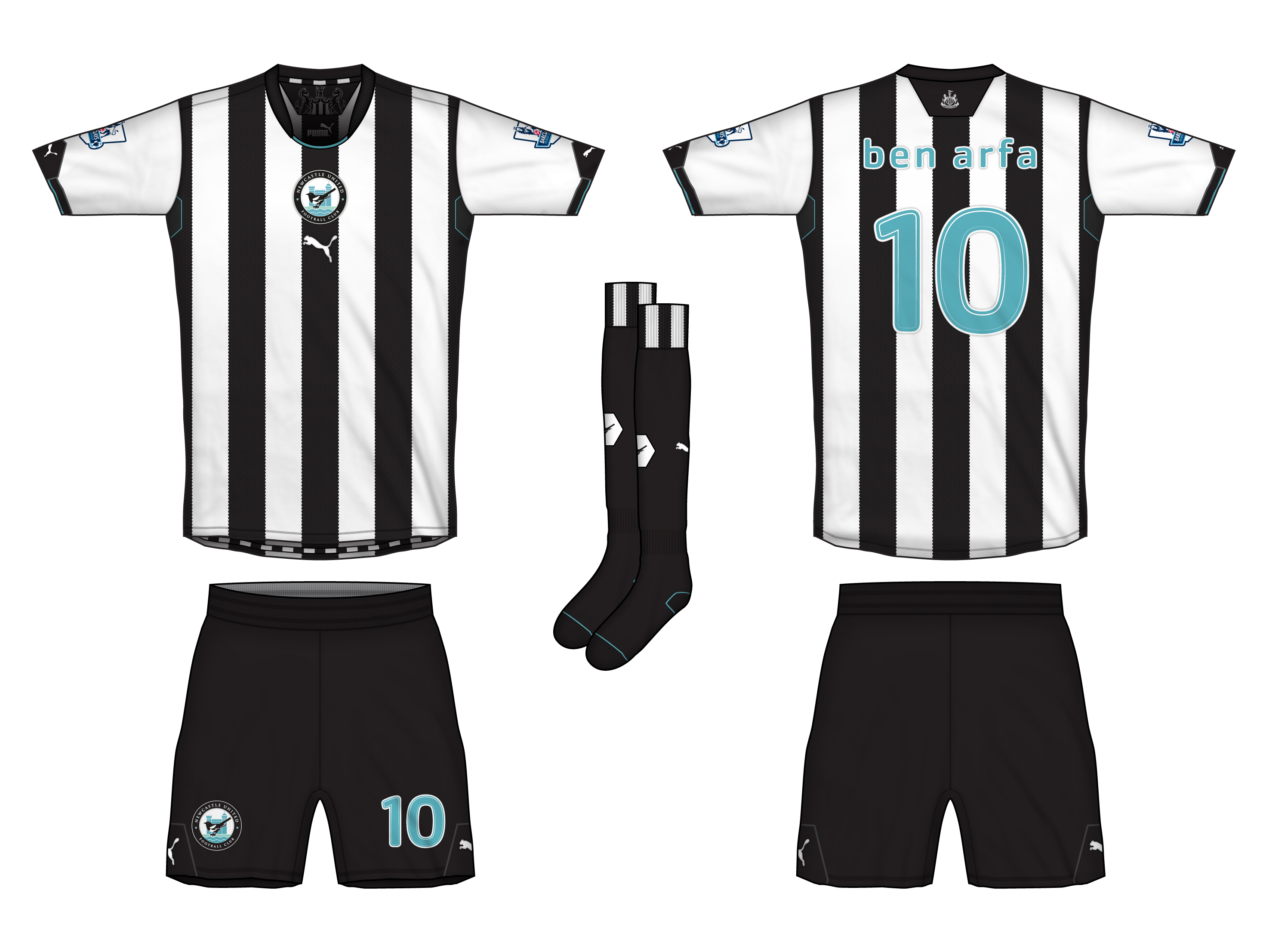
Newcastle United Home
- Category Football Kits
- Author: Steevo
- Hits: 5278
- wrote 1kit on Monday, 30 November -0001 very good both kits this one is better than the away maybe
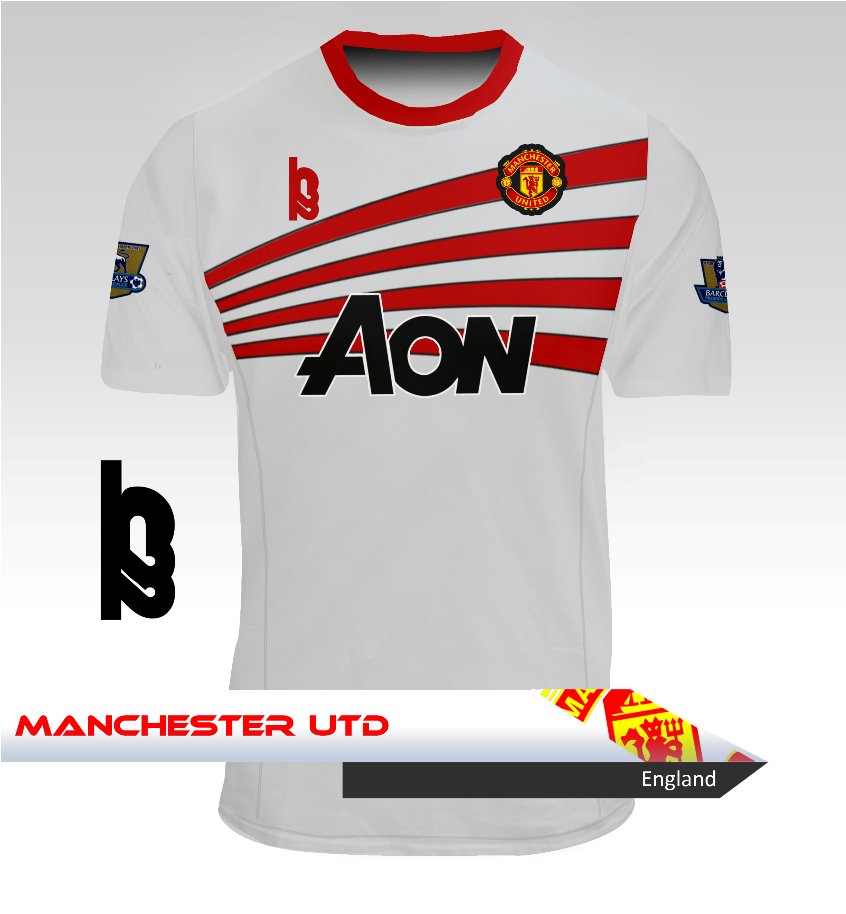
Manchester United Away Kit - H22
- Category Football Kits
- Author: h22
- Hits: 4110
- wrote kaimat85 on Monday, 30 November -0001 nice one
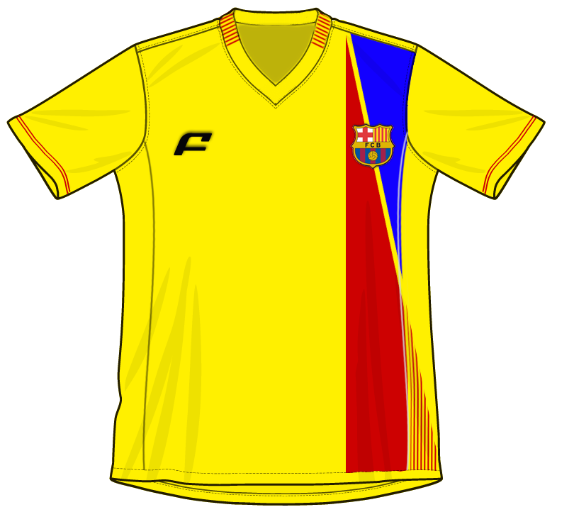
BARCELONA 2
- Category Football Kits
- Author: 1kit
- Hits: 3295
- wrote Steevo on Monday, 30 November -0001 this works well. collar is nice. the red/blue design going into the catalan flag design looks good as well.
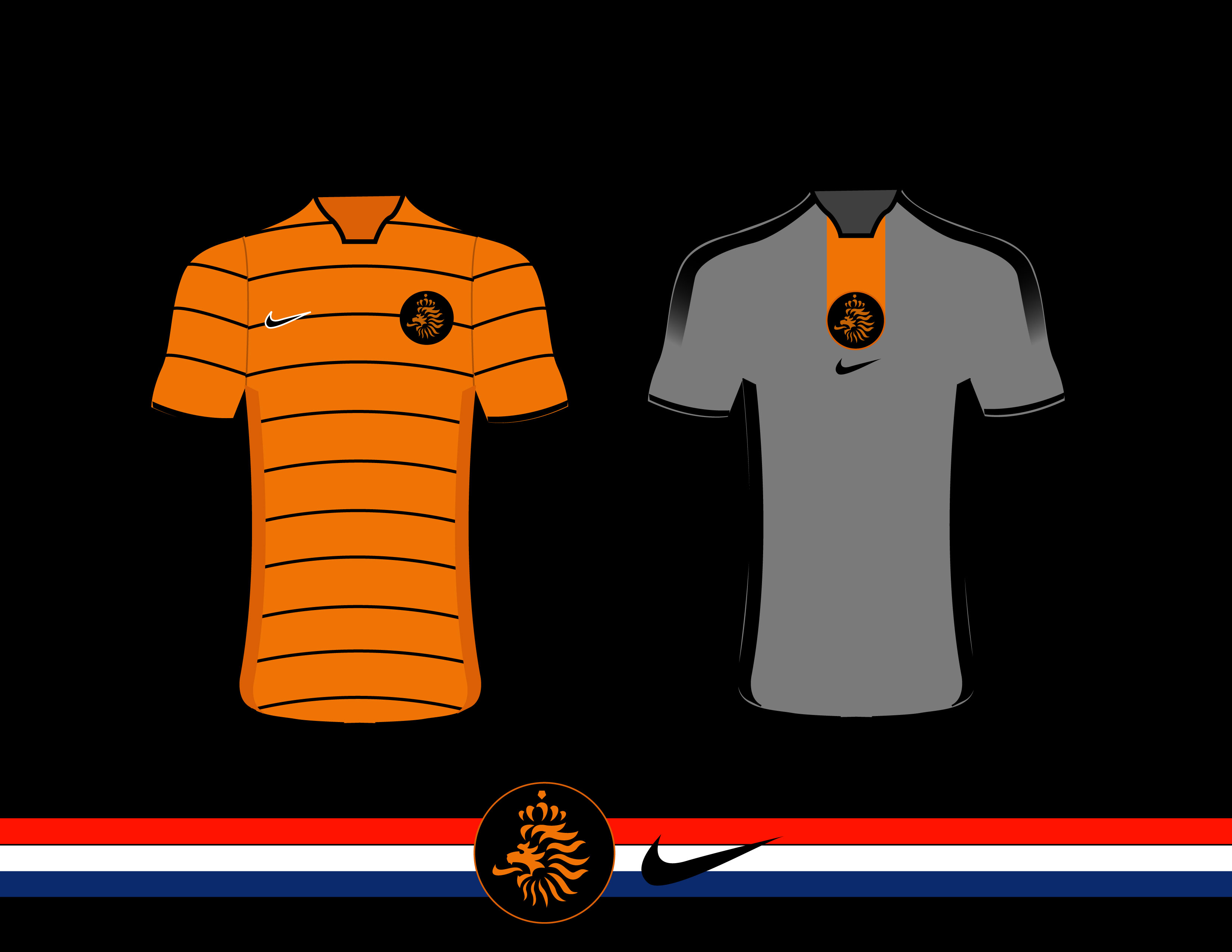
Netherlands kit
- Category Football Kits
- Author: kaimat85
- Hits: 3644
- wrote Steevo on Monday, 30 November -0001 i like the home, not so sure on the away. think its the gradient on the stripes on the arms
England Home
- Category Football Kits
- Author: Steevo
- Hits: 3383
- wrote 1kit on Monday, 30 November -0001 in all honesty...very well done...very plain and i mean dull
England Home
- Category Football Kits
- Author: Steevo
- Hits: 3383
- wrote Hendo on Monday, 30 November -0001 Would it be possible to send me a vector template?I need one and can't be arsed to create it form scratch.