Generic Description:
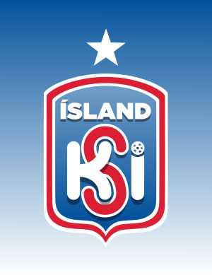
For this redesign I took many elements from Iceland as a country and the original 1947-1995 badge and current Iceland badge and blended them together to come up with this final design.
The shield takes the shape from the Icelandic Coat of Arms. Both the current and past badges do not feature any traditional elements or symbols which represent Icelandic pride so I added the Coat of Arms in there for this purpose. The colour scheme is in the colours of the Icelandic Flag which can be seen especially on the border. The fade effect on the shield and star above the main badge is meant to represent the Northern Lights which Iceland is famous for.
A modern KSI logo has been made in a bold curving font with the football from the current badge being the dot in the letter i. The title of Ísland in a bold and strong font have been used to convey Iceland's bold never say die warrior spirit.


You are a guest ( Sign Up ? )
Be the first to comment.