Latest Challenges

Netherlands FA Crest Redesign

  • Contest: Crest Redesign League - [CLOSED]
  • Submitted by: pineftbl
  • Generic Description: 
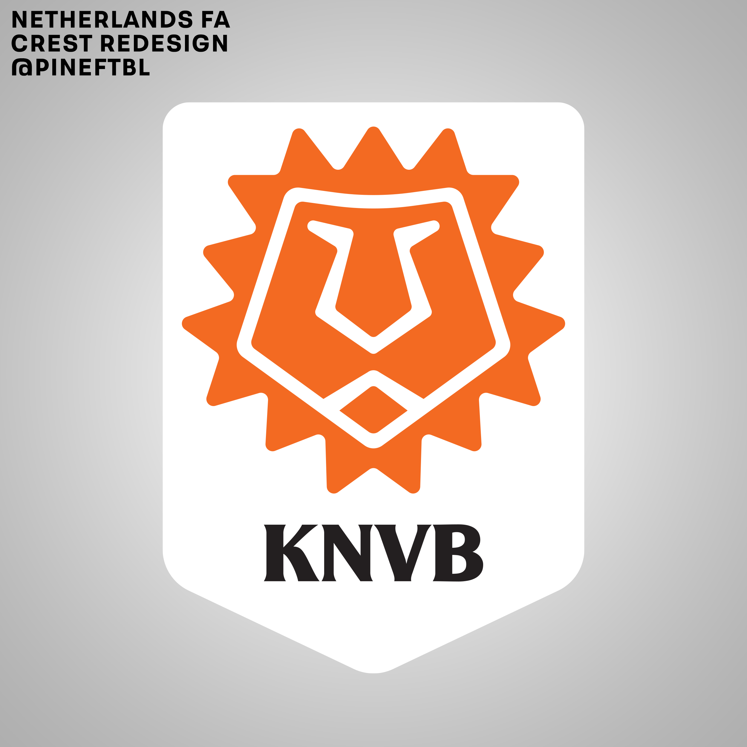
Taking inspiration from the lion and tulip as the country's symbols and also the recent Iceland logo rebrand, I came up with this redesign. It's a more modern and simplistic take, following the line of the country's logo rebrand (from Holland to NL). Hope you like it :)

You must login to post a comment.
You are a guest ( Sign Up ? )
Loading comment... The comment will be refreshed after 00:00.

Be the first to comment.

Latest Challenges

Image
Sign Up for Newsletter
Stay updated with the latest insights, tips, and success stories from our team.
Quick Links
Follow Us: