
Shimizu S-Pulse Rebranding (清水エスパルス)
Image information
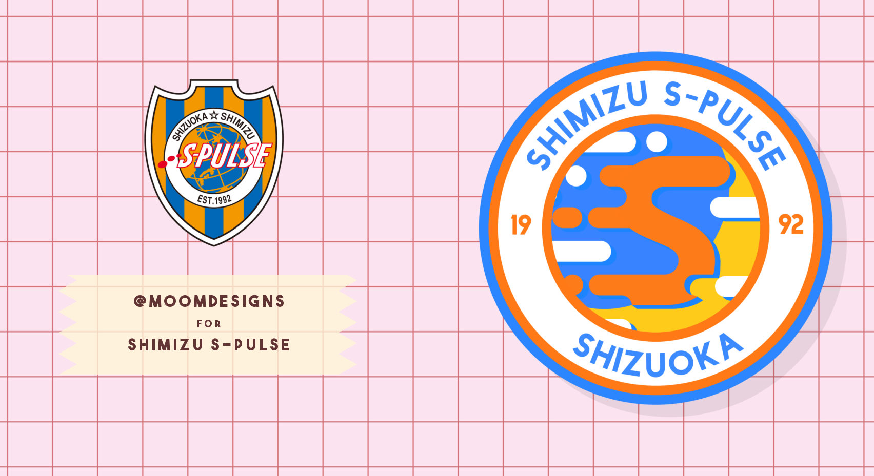
- Description
- Here's the rebranded crest on the previous kit I posted. Shimizu S-Pulse 清水エスパルス logo. Its supposed to be like clouds over the globe! (the center). The "S" is intended to be reminiscent of the dots in the current logo, just repurposed. Let me know what you think! @moomdesigns @Astroteamwear This email address is being protected from spambots. You need JavaScript enabled to view it.
- Date
- Tuesday, 24 May 2016
- Hits
- 3912
- Author
Comments
You are a guest
Loading comment... The comment will be refreshed after 00:00.
Be the first to comment.