• FootballShirtCulture.com

Login   Register 

Design Football Design Football The Community-Based Home of Concept Football Kit and Crest Designs
  • Home
  • Community
    • Community Stream
    • Your Profile
    • User Panel
  • Galleries
    • All Categories
    • Football Kit Designs
    • Football Crest Designs
    • Football Boot Designs
    • Stadium Designs
    • Miscellaneous
  • Challenges
    • Kit Of The Week
    • Loud Kits Challenge
    • TWT- Thursday Weekly Theme
    • 2022-23 Kit Predictions
    • Crest Redesign Weekly
    • New Kit Deal Challenge
    • All Challenges
  • Comments
  • Upload Designs
  • Podcasts
  • Blog
  • Contact
  • About us
Home » Football Kits » MK Dons - Home
MK Dons - Home
View full size
  • ← Previous
Image 18920 of 20648
  • Next →
Image 18922 of 20648

MK Dons - Home

Image information

Description
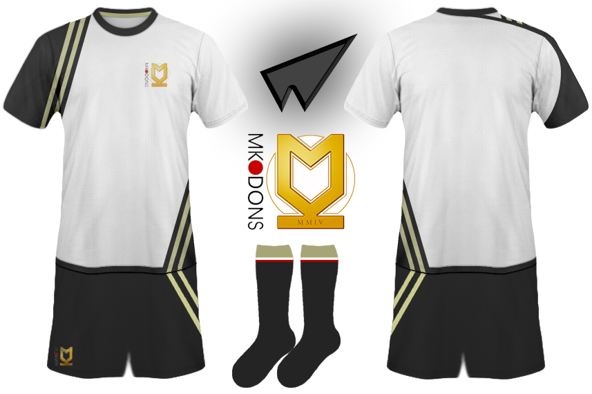
I know that the affectionately nick-named \'Franchise FC\' have used White as their primary colour since its formation and I feel that (barring their first kit with the gold trim which I really liked) their kits have looked very cheap and very bland. So, taking into acount that most of the promotional material (for want of a better word) that I\'ve seen has been primarily black, and that the majority of the clubs logo is gold, I\'ve tried to design a kit which keeps white as the primary colour, while featuring black and gold more prominently. I\'ve also noticed that the diamond shape on the lower left of the shirt could look a bit like the Umbro logo which wasn\'t intentional.
Date
Thursday, 08 August 2013
Hits
4299
Author
Ironbolt

Comments

  • 5 Comments
  • Login
  • Oldest
    • Best
    • Popular
    • Newest
    • Oldest
  • Collapse All Expand All
You must login to post a comment.
You are a guest
Loading comment... The comment will be refreshed after 00:00.
  • This commment is unpublished.
    tjaperd
    tjaperd · 2054 years ago
    what template you used?
  • This commment is unpublished.
    Ironbolt
    Ironbolt · 2054 years ago
    The base template I used was a Kappa one, because it has the Round collar, sleeve, and waist trim already in place.
    I made the awful shorts template from cutting a bit off the Shirt and I don't remember where I got the Sock shape from.

    The actual designs are all from scratch though.
  • This commment is unpublished.
    Guest
    Guest · 2054 years ago
    As a Dons fan myself, I have been waiting for a kit with a bit more black on it. Nike's kits are getting worse by the minute and no-one else wants to make our kit (no one likes us, no one likes us, no one likes us, we don't care. We are MK, super MK, we are MK Dons FC). Personally, I think that we should have stuck with our 06/07 kits. They were great.
  • This commment is unpublished.
    Guest
    Guest · 2054 years ago
    :smilewinkgrin: :D: :wink: :yes: :lol: :razz:
  • This commment is unpublished.
    Ironbolt
    Ironbolt · 2054 years ago
    Never liked the 06/07 kit. I was massive fan of the origonal 2004 kit with the Gold trim though.

    I think people would like you alot more if you get rid of the '-)ons' bit haha. I know why they did it but that doesn't mean I have to like it! Always had a soft spot for Wimbledon aswell.
Home » Football Kits » MK Dons - Home
  • HOME
  • KIT OF THE WEEK
  • CREST REDESIGN COMPETITION WEEKLY
  • CREST REDESIGN TOURNAMENT
  • CREATE ACCOUNT
  • SIGN IN