Image 19632 of 20643
Image 19634 of 20643
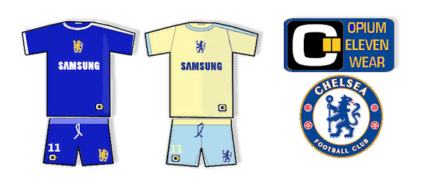
The Blues by Opium Eleven Wear (c)
Image information
- Description
- Chelsea´s home wear won´t let much room to play with,so i transformed the logo a bit.i also thought of a revival of the light blue shirts from 1905 to 1925,but it won´t work,the blues are wearing royal blue,period!the away shirt,the colours used by me aren´t new,being used in the 90s and they express at best,in my opinion the tradition of the club´s aesthetics.i am not a fan of the third shirts ,invented only by the sponsors and wear manufactures to get more money out of the sales. if i unintentionally offended somebody with my fantasy kit,please accept my apologies,i´ll do it better next time! don´t forget to vote and tell your opinion,thats the point of this community!Thank you!
- Date
- Thursday, 08 August 2013
- Hits
- 2862
- Author
- Adrian G.