• FootballShirtCulture.com

Login   Register 

Design Football Design Football The Community-Based Home of Concept Football Kit and Crest Designs
  • Home
  • Community
    • Community Stream
    • Your Profile
    • User Panel
  • Galleries
    • All Categories
    • Football Kit Designs
    • Football Crest Designs
    • Football Boot Designs
    • Stadium Designs
    • Miscellaneous
  • Challenges
    • Kit Of The Week
    • Loud Kits Challenge
    • TWT- Thursday Weekly Theme
    • 2022-23 Kit Predictions
    • Crest Redesign Weekly
    • New Kit Deal Challenge
    • All Challenges
  • Comments
  • Upload Designs
  • Podcasts
  • Blog
  • Contact
  • About us
Home » Football Crests » Lille OSC
Lille OSC
View full size
  • ← Previous
Image 3998 of 4406
  • Next →
Image 4000 of 4406

Lille OSC

Image information

Description
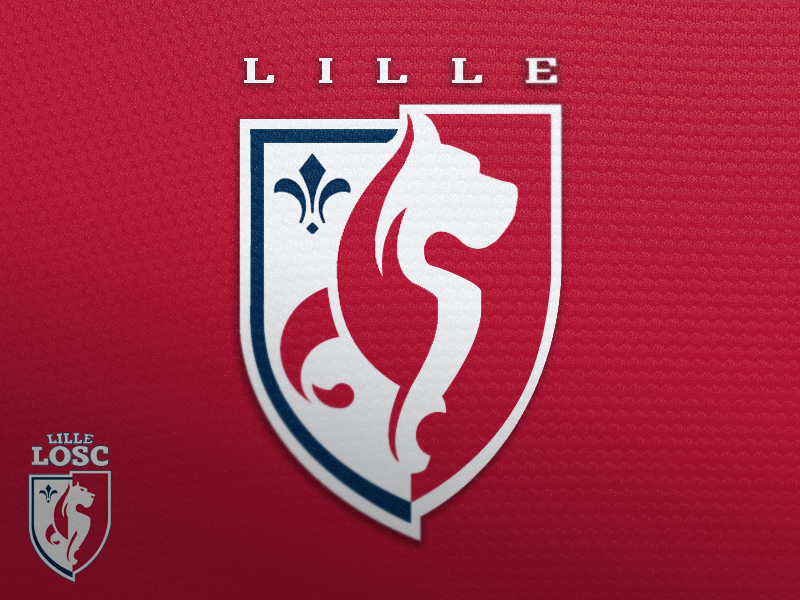
This is my tweak of LOSC\'s most recent crest update. I love the direction they went, but feel that a few tweaks can really make the logo world class. I streamlined the dog, made the flame work into the shape of the dog better, and changed the wordmark, among other minor tweaks.
Date
Thursday, 08 August 2013
Hits
6292
Author
mbingcrosby

Comments

  • 10 Comments
  • Login
  • Oldest
    • Best
    • Popular
    • Newest
    • Oldest
  • Collapse All Expand All
You must login to post a comment.
You are a guest
Loading comment... The comment will be refreshed after 00:00.
  • This commment is unpublished.
    Rabbi
    Rabbi · 2054 years ago
    Nice. Good improvement of the present crest Mark I like it a lot.
  • This commment is unpublished.
    mbingcrosby
    mbingcrosby · 2054 years ago
    Thanks Rabbi. Anyone else have comments?
  • This commment is unpublished.
    curswine
    curswine · 2054 years ago
    I'-) say add back in an eye because it's a little on the obscure side at the moment, I do prefer your version over the official version though even eyeless,
  • This commment is unpublished.
    Spider
    Spider · 2054 years ago
    There are many teams in France who need new crests, and Lille were not one of them. I prefer the current crest to the one youve updated, as the head on the Mastiff is more distinct and has more character, plus it looks more dynamic.

    I do like the new lettering youve added though.
  • This commment is unpublished.
    mbingcrosby
    mbingcrosby · 2054 years ago
    What do you mean by more dynamic, Spider?
  • This commment is unpublished.
    Spider
    Spider · 2054 years ago
    The way the current crest is sharply divided into two halves, and the eyes and nose make the crest look pretty sharp. The way youve made the division less succinct and the head more obscure has lessened that feeling I get.

    Lille used to play in white shirts with varying amounts of red as the first choice shirts, before changing to red as first choice in the 1990s. The current crest looks great on both a white shirt and a red one, and both white and red are equal, on yours, the red is dominant.

    Other French clubs could do with logo redesigns far more than Lille, for example Nice, who have a pretty awful crest, Ajaccio with their Barca aping crest, and Reims who had a great crest in the 1950s and 60s with a champagne bottle on it.

    I think the crest youve made is one step forward (the font on the crest), and two steps back (lessening the divide between the two crest sections and simplifying the Mastiff)
  • This commment is unpublished.
    Donnypool
    Donnypool · 2054 years ago
    I have a pretty much opposite opinion to Spider's.

    I think that this version is more dynamic and the mastiff is more defined by having its ear come to its point at the top of the crest. The blurring of the boundaries between the two halves of the crest unites it as a whole and brings the mastiff's strong shoulder into better definition. I also dislike the text - it looks squashed and overly tracked. There's something a bit hedge fund about it. Also the LOSC acronym should stay as it is the best known name of the club (something I found out when I saw 'F*** LOSC' graffitied by a motorway on the edge of the town).

    I do agree that facial features probably have to return but I think that they were misplaced/poorly executed in the current crest - it looked too anthropomorphic, a bit Scooby-Doo.

    Another thought is that the blue fleur-de-lys is a bit pointless, ans the whole idea of the crest is that it's half fleur-de-lys and half mastiff.
  • This commment is unpublished.
    mbingcrosby
    mbingcrosby · 2054 years ago
    Donnypool: Glad you like it. I'll be messing with the font a bit to see what I can do.

    I toyed with taking out the FdL, but left it because the crest needed some blue. I'll be playing with this a bit more.

    I'm a fan of the featureless mastiff, but I'll try adding something for Version 2.0
  • This commment is unpublished.
    Spider
    Spider · 2054 years ago
    @Donnypool - The dividing of the crest is to symbolise the two main periods, when Lille played in white as the main colour of their shirts, and red as the main colour today. The crest is supposed to be divided into two parts.

    If it ain broke, dont fix it.
  • This commment is unpublished.
    Spider
    Spider · 2054 years ago
    The only change that needs to be made is to the font, as that looks odd with the current crest. a more modern version would suit the crest better.
Home » Football Crests » Lille OSC
  • HOME
  • KIT OF THE WEEK
  • CREST REDESIGN COMPETITION WEEKLY
  • CREST REDESIGN TOURNAMENT
  • CREATE ACCOUNT
  • SIGN IN