• FootballShirtCulture.com

Login   Register 

Design Football Design Football The Community-Based Home of Concept Football Kit and Crest Designs
  • Home
  • Community
    • Community Stream
    • Your Profile
    • User Panel
  • Galleries
    • All Categories
    • Football Kit Designs
    • Football Crest Designs
    • Football Boot Designs
    • Stadium Designs
    • Miscellaneous
  • Challenges
    • Kit Of The Week
    • Loud Kits Challenge
    • TWT- Thursday Weekly Theme
    • 2022-23 Kit Predictions
    • Crest Redesign Weekly
    • New Kit Deal Challenge
    • All Challenges
  • Comments
  • Upload Designs
  • Podcasts
  • Blog
  • Contact
  • About us
Home » Football Crests » Olympique De Marseilles New Crest Idea
Olympique De Marseilles New Crest Idea
View full size
  • ← Previous
Image 3609 of 4404
  • Next →
Image 3611 of 4404

Olympique De Marseilles New Crest Idea

Image information

Description
Feel free to share and edit! I wanted to fit quite a lot into this crest, which is why it may look slighyly busy. The outline of the crest is meant to replicate an olympic 400m track. 1899 was the year the club was founded. Droit Au But is the team's slogan. So yes, there was a lot I needed to include, because I believe that the current crest doesn't show much club identity, although it may look nice. Maybe my version is a bit too complex... I don't know.
Date
Thursday, 16 October 2014
Hits
5103
Author
FH Logo Designs

Comments

  • 3 Comments
  • Login
  • Oldest
    • Best
    • Popular
    • Newest
    • Oldest
  • Collapse All Expand All
You must login to post a comment.
You are a guest
Loading comment... The comment will be refreshed after 00:00.
  • This commment is unpublished.
    john_eoti
    john_eoti · 10 years ago
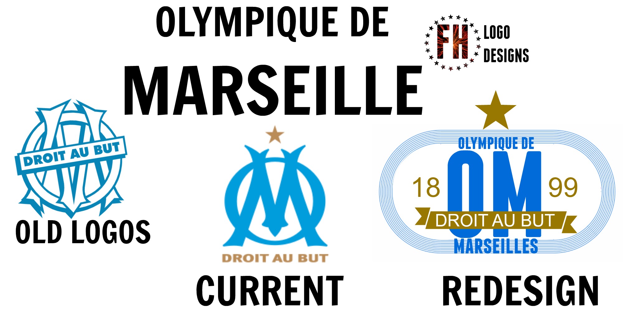
    Sorry FH, I know you put a lot of effort into your designs, but you almost always maximize the stuff you want to include just for the sake of it. You [b]don't[/b] have to. Some people might think that minimalistic crest design is just a fad, but I believe that the complete opposite, namely overloading it, makes it terribly clunky and impractical. Case in point, imagine sewing that crest onto a shirt. While the introduction of a running track might be neat in theory, it looks essentially like a striped rectangle with rounded corners and completely - unnecessarily - bloats your design.

    The reason why the current OM crest works is that it effectively conserves the old without looking old-fashioned. Your new design overcomplicates the meaning of the brand and makes it practically unrecognisable.

    I hope you understand that I mean to constructively criticise. :-) Keep on going, you'll continue to improve.
  • This commment is unpublished.
    cristiantodean
    cristiantodean · 10 years ago
    too busy...and unnecessary, because OM has a very good logo....take on some poor badges and maybe you'll have more succes..
  • This commment is unpublished.
    zeruch
    zeruch · 10 years ago
    I like, to usea in the inner collar, as a special graphic due to a special date, but for a crest redesign... I don't think would work, is too detailed, imagine sewing that :(
Home » Football Crests » Olympique De Marseilles New Crest Idea
  • HOME
  • KIT OF THE WEEK
  • CREST REDESIGN COMPETITION WEEKLY
  • CREST REDESIGN TOURNAMENT
  • CREATE ACCOUNT
  • SIGN IN