• FootballShirtCulture.com

Login   Register 

Design Football Design Football The Community-Based Home of Concept Football Kit and Crest Designs
  • Home
  • Community
    • Community Stream
    • Your Profile
    • User Panel
  • Galleries
    • All Categories
    • Football Kit Designs
    • Football Crest Designs
    • Football Boot Designs
    • Stadium Designs
    • Miscellaneous
  • Challenges
    • Kit Of The Week
    • Loud Kits Challenge
    • TWT- Thursday Weekly Theme
    • 2022-23 Kit Predictions
    • Crest Redesign Weekly
    • New Kit Deal Challenge
    • All Challenges
  • Comments
  • Upload Designs
  • Podcasts
  • Blog
  • Contact
  • About us

Gallery

Home » Football Kits » Estonia
Estonia
View full size
  • ← Previous
Image 16073 of 20646
  • Next →
Image 16075 of 20646

Estonia

Image information

Description
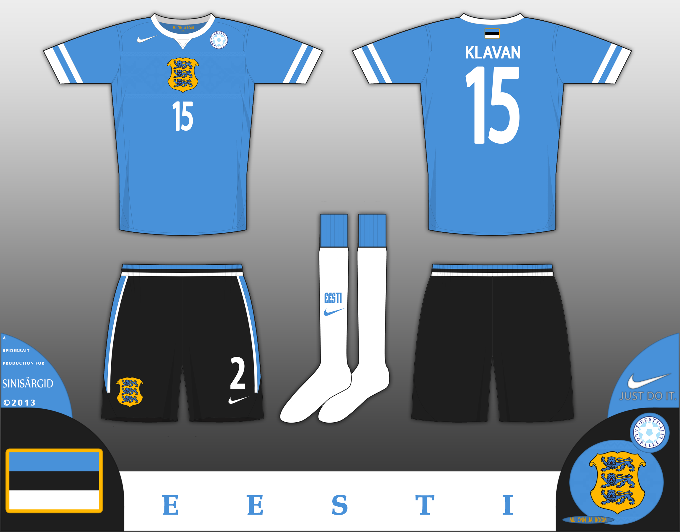
Home kit for Estonia, this uses the same shade of blue that is traditionally used for the flag, a light blue, with black shorts and white socks (Fuck FIFA's ruling on all light/all dark kits) The shirt has a chestband with patterns found on traditional Nordic sweaters, and on that chestband is the lesser coat of arms of estonia. On the inside of the collar is mu õnn ja rõõm, which translates to "My Joy and Delight", and is a line from the Estonian National Anthem. Please click on the zoom button to see in full detail. Comments would be cool
Date
Friday, 13 December 2013
Hits
3841
Author
Spider

Comments

  • 6 Comments
  • Login
  • Oldest
    • Best
    • Popular
    • Newest
    • Oldest
  • Collapse All Expand All
You must login to post a comment.
You are a guest
Loading comment... The comment will be refreshed after 00:00.
  • This commment is unpublished.
    moom
    moom · 11 years ago
    I think the colors are properly balanced but the overall shirt and the logo placement looks rather dated to me.
  • This commment is unpublished.
    Spider
    Spider · 11 years ago
    Thanks, I was wanting it to look 1998esque. The crest is placed there for a reason - its over the heart, and I wanted to make that the feature that draws the eyes the most. Hence the placement of the logos. Plus, its mean't to be slightly reminiscent of a nordic winter jersey.

    The shirt was inspired partly by Hockey shirts and some nike shirts from 1998.
  • This commment is unpublished.
    moom
    moom · 11 years ago
    Perhaps you could use logo placement similar to the 2012 Poland kit
  • This commment is unpublished.
    Spider
    Spider · 11 years ago
    @moom Poland kit 2012 - Shit Sandwitch. The Poland coat of arms was literally an afterthought on that shirt, this was designed around the crest.
  • This commment is unpublished.
    moom
    moom · 11 years ago
    Managed to look more organized than this setup , even if it was an after thought :p
  • This commment is unpublished.
    Spider
    Spider · 11 years ago
    @moom And worse
  • This commment is unpublished.
    moom
    moom · 11 years ago
    I'd disagree.

    But back to your shirt, I think it'd work better as a kappa shirt;seeing the nike logo anywhere but the left chest is awk
  • This commment is unpublished.
    Spider
    Spider · 11 years ago
    Probably, It does look a little strange up there on its lonesome, but in 2006, the nike logo was in a similar position. I admit, it could have been in a better place, but the chestband should really only have the coat of arms on it.
Home » Football Kits » Estonia
  • HOME
  • KIT OF THE WEEK
  • CREST REDESIGN COMPETITION WEEKLY
  • CREST REDESIGN TOURNAMENT
  • CREATE ACCOUNT
  • SIGN IN