• FootballShirtCulture.com

Login   Register 

Design Football Design Football The Community-Based Home of Concept Football Kit and Crest Designs
  • Home
  • Community
    • Community Stream
    • Your Profile
    • User Panel
  • Galleries
    • All Categories
    • Football Kit Designs
    • Football Crest Designs
    • Football Boot Designs
    • Stadium Designs
    • Miscellaneous
  • Challenges
    • Kit Of The Week
    • Loud Kits Challenge
    • TWT- Thursday Weekly Theme
    • 2022-23 Kit Predictions
    • Crest Redesign Weekly
    • New Kit Deal Challenge
    • All Challenges
  • Comments
  • Upload Designs
  • Podcasts
  • Blog
  • Contact
  • About us

Gallery

Home » Football Kits » PSG
PSG
View full size
  • ← Previous
Image 16271 of 20648
  • Next →
Image 16273 of 20648

PSG

Image information

Description
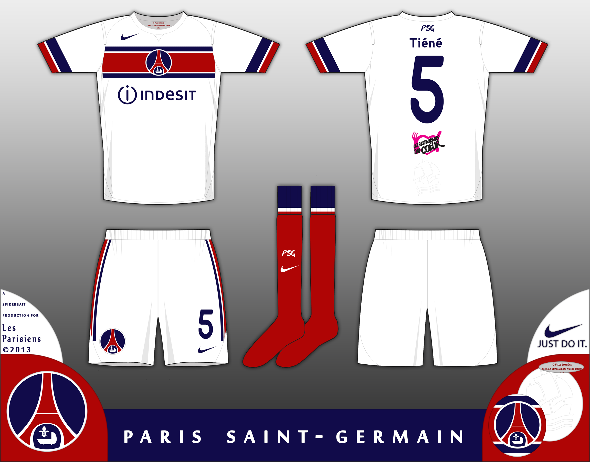
Home kit for PSG, Im not a fan of the new home and away shirts, mostly because they look pretty generic in a way I cannot put my finger on, but also because they move away from the Hechter shirt, which is a design classic and screams "PSG". This is my take on the second kit, in white with a Blue-white-red-white-blue chestband. The crest is the old crest, with just the Eiffel Tower, a new Fleur de-lis and the Sun King cradle. The crest has been worn without the lettering of the club, in the early 1990s, and is instantly recognisable as the PSG crest without lettering. The ship from the first PSG crest is embossed on the tail. On the inside of the collar are the first lines from Oh Ville Lumière, an anthem of PSG. Please click on the zoom button to see in full detail, Comments would be cool
Date
Sunday, 22 September 2013
Hits
2812
Author
Spider

Comments

  • 2 Comments
  • Login
  • Oldest
    • Best
    • Popular
    • Newest
    • Oldest
  • Collapse All Expand All
You must login to post a comment.
You are a guest
Loading comment... The comment will be refreshed after 00:00.
  • This commment is unpublished.
    julian121
    julian121 · 11 years ago
    I like these designs. But the font detracts from the overall view more than I've seen any font do so in a design. A shirt like this needs a nice, simple classy font, not something that looks like a bit of a knock off of comic sans.
  • This commment is unpublished.
    Spider
    Spider · 11 years ago
    Glad you like the design, and while I think its a bit harsh on the font, and I don't think it looks like a knock off of comic sans, I should have used a different font. The font used is nice and works well for a lot of designs, but some of the numbers look a bit odd, and I think I should have used a different design, especially on the BBN Third.
Home » Football Kits » PSG
  • HOME
  • KIT OF THE WEEK
  • CREST REDESIGN COMPETITION WEEKLY
  • CREST REDESIGN TOURNAMENT
  • CREATE ACCOUNT
  • SIGN IN