• FootballShirtCulture.com

Login   Register 

Design Football Design Football The Community-Based Home of Concept Football Kit and Crest Designs
  • Home
  • Community
    • Community Stream
    • Your Profile
    • User Panel
  • Galleries
    • All Categories
    • Football Kit Designs
    • Football Crest Designs
    • Football Boot Designs
    • Stadium Designs
    • Miscellaneous
  • Challenges
    • Kit Of The Week
    • Loud Kits Challenge
    • TWT- Thursday Weekly Theme
    • 2022-23 Kit Predictions
    • Crest Redesign Weekly
    • New Kit Deal Challenge
    • All Challenges
  • Comments
  • Upload Designs
  • Podcasts
  • Blog
  • Contact
  • About us

Gallery

Home » Football Kits » Santos 2010-12
Santos 2010-12
View full size
  • ← Previous
Image 20153 of 20648
  • Next →
Image 20155 of 20648

Santos 2010-12

Image information

Description
One of the greatest names in world football, and if you are going to tackle this team, better make a good kit. This is the all white one, with asymmetric trim on the shirt, to give it a fluid and fast look, nice and discrete Umbro logos (wanted nothing to take away from the badge, placed over the heart, and the retro seventies collar for a kit that harks back, but is modern as well, with baggy shorts and simple socks. Note the mascot and old umbro logo at the bottom right of the picture. this was posted in the gallery a while ago, but since then, its got a new collar, and different socks as well. I wiped the old one. Erry commented about not being sure about the collar, and he was right, it was the one part that let the design down, so a v-neck was better. Comments would be appreciated
Date
Thursday, 08 August 2013
Hits
3044
Author
MW FROM WIDEOPEN

Comments

  • Comment
  • Login
  • Oldest
    • Best
    • Popular
    • Newest
    • Oldest
  • Collapse All Expand All
You must login to post a comment.
You are a guest
Loading comment... The comment will be refreshed after 00:00.
  • This commment is unpublished.
    curswine
    curswine · 2054 years ago
    I like it, I think the highlighted black lines make it look quite modern especially couple with the unsymmetrical layout of the lines themselves.

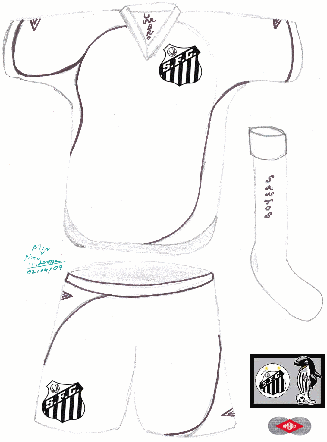
    I am actually starting to think that adding the logos on later is letting the drawings down as they just look far to much like an afterthought and stick out like a sore thumb.
Home » Football Kits » Santos 2010-12
  • HOME
  • KIT OF THE WEEK
  • CREST REDESIGN COMPETITION WEEKLY
  • CREST REDESIGN TOURNAMENT
  • CREATE ACCOUNT
  • SIGN IN