• FootballShirtCulture.com

Login   Register 

Design Football Design Football The Community-Based Home of Concept Football Kit and Crest Designs
  • Home
  • Community
    • Community Stream
    • Your Profile
    • User Panel
  • Galleries
    • All Categories
    • Football Kit Designs
    • Football Crest Designs
    • Football Boot Designs
    • Stadium Designs
    • Miscellaneous
  • Challenges
    • Kit Of The Week
    • Loud Kits Challenge
    • TWT- Thursday Weekly Theme
    • 2022-23 Kit Predictions
    • Crest Redesign Weekly
    • New Kit Deal Challenge
    • All Challenges
  • Comments
  • Upload Designs
  • Podcasts
  • Blog
  • Contact
  • About us

Gallery

Home » Football Crests » Celta Vigo
Celta Vigo
View full size
  • ← Previous
Image 3764 of 4432
  • Next →
Image 3766 of 4432

Celta Vigo

Image information

Description
Celta Vigo new logo proposal
Date
Tuesday, 19 August 2014
Hits
5905
Author
cristiantodean

Comments

  • 10 Comments
  • Login
  • Oldest
    • Best
    • Popular
    • Newest
    • Oldest
  • Collapse All Expand All
You must login to post a comment.
You are a guest
Loading comment... The comment will be refreshed after 00:00.
  • This commment is unpublished.
    irvingperceni
    irvingperceni · 10 years ago
    All of your designs are excellent and very interesting. Keep up the good work!
  • This commment is unpublished.
    Rabbi
    Rabbi · 10 years ago
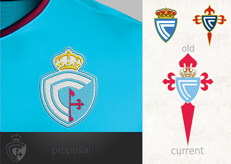
    cristiantodean. This is a good idea the only thing i don“t like is the red half of the fleur de lis if that is what it is, in toe of the old logos it prominent and I feel it should be so in the new one as well or at least all of it if you get what I mean. but part from that a good work if you ask me.
  • This commment is unpublished.
    joegillibrand
    joegillibrand · 10 years ago
    Ignore the haters this is sick!
  • This commment is unpublished.
    mumbai
    mumbai · 10 years ago
    the cross looks very bad cut in half, you have to add somewhere to complete by the crest is perfect.
    your designs amazing friend.
  • This commment is unpublished.
    Rabbi
    Rabbi · 10 years ago
    joegillibrand what are you referring to if I may ask?
  • This commment is unpublished.
    Rabbi
    Rabbi · 10 years ago
    I did a little research in to the cross in the present logo, it is not a fleur de lis as I thought it was, it is the cross of the Order of Santiago and has been in the club logo from 1928 and seams to be a important part of the logo, I only put this in here to explain why I felt it should still be in the crest redesign, by saying that I am in [u]NO[/u] way trying to undermine the quality of this in other part grate
    design. Do not read me wrong or something else in to my comment here. By pointing this fact out It was or is not my intention to degrade this design in any way. it was merely a observation of my part ;-)
  • This commment is unpublished.
    cristiantodean
    cristiantodean · 10 years ago
    you are right guys...the halfed cross was a bad idea and i knew it from the beginning...will be a version 2 ... :)
  • This commment is unpublished.
    joegillibrand
    joegillibrand · 10 years ago
    @Rabbi The badge obviously Rabbi/mumbai
  • This commment is unpublished.
    Rabbi
    Rabbi · 10 years ago
    Ok joegillibrand I just wanted to make sure it was not because of something I said, sorry.
  • This commment is unpublished.
    Rabbi
    Rabbi · 10 years ago
    cristiantodean I think that is a vise move, but I love most of your redesigns here, only small things I would have liked to see in another way but grate over all, good work my friend.
  • This commment is unpublished.
    TR84
    TR84 · 10 years ago
    I think if this had the full cross from v2 it'd be perfect
Home » Football Crests » Celta Vigo
  • HOME
  • KIT OF THE WEEK
  • CREST REDESIGN COMPETITION WEEKLY
  • CREST REDESIGN TOURNAMENT
  • CREATE ACCOUNT
  • SIGN IN