• FootballShirtCulture.com

Login   Register 

Design Football Design Football The Community-Based Home of Concept Football Kit and Crest Designs
  • Home
  • Community
    • Community Stream
    • Your Profile
    • User Panel
  • Galleries
    • All Categories
    • Football Kit Designs
    • Football Crest Designs
    • Football Boot Designs
    • Stadium Designs
    • Miscellaneous
  • Challenges
    • Kit Of The Week
    • Loud Kits Challenge
    • TWT- Thursday Weekly Theme
    • 2022-23 Kit Predictions
    • Crest Redesign Weekly
    • New Kit Deal Challenge
    • All Challenges
  • Comments
  • Upload Designs
  • Podcasts
  • Blog
  • Contact
  • About us

Gallery

Home » Football Crests » Everton re-designed badge
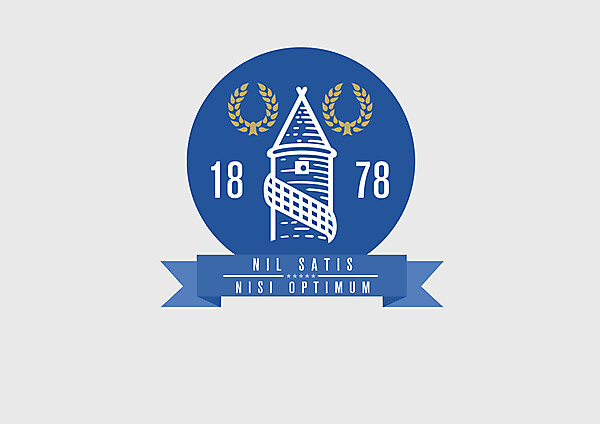
Everton re-designed badge
View full size
  • ← Previous
Image 4161 of 4409
  • Next →
Image 4163 of 4409

Everton re-designed badge

Image information

Description
please comment
Date
Thursday, 08 August 2013
Hits
4790
Author
erikwinterburn

Comments

  • 3 Comments
  • Login
  • Oldest
    • Best
    • Popular
    • Newest
    • Oldest
  • Collapse All Expand All
You must login to post a comment.
You are a guest
Loading comment... The comment will be refreshed after 00:00.
  • This commment is unpublished.
    Steevo
    Steevo · 2054 years ago
    It looks nice and clean, the issue I have with everton's badge is the 'Everton' under it as it makes it too much. I think it's recognisable enough without it. They manage for long enough without it there.

    For me the circle shape doesn't work. Think it would look better in the usual shield shape but I can see why you've not done that.
  • This commment is unpublished.
    Donnypool
    Donnypool · 2054 years ago
    http://hipsterbranding.tumblr.com/

    I prefer the current (since 1938) shield. The problems with the current one are, as Steevo said, the big Title Case Everton underneath, and the way it's currently rendered with a gradient seems wrong.

    You'-) also have to derive some kind of outline/one colour version where the banner works.
  • This commment is unpublished.
    Rabbi
    Rabbi · 2054 years ago
    I do agree with Donnypool you need to put an outline on this otherwise it will blend n with shirt color if it is to be in shield format, but not a bad effort at all, in my opinion, but it is just matter of taste if you are to use shield or circle form in your design. But it is nice to see more crest designs here on DF.:wink:
Home » Football Crests » Everton re-designed badge
  • HOME
  • KIT OF THE WEEK
  • CREST REDESIGN COMPETITION WEEKLY
  • CREST REDESIGN TOURNAMENT
  • CREATE ACCOUNT
  • SIGN IN