• FootballShirtCulture.com

Login   Register 

Design Football Design Football The Community-Based Home of Concept Football Kit and Crest Designs
  • Home
  • Community
    • Community Stream
    • Your Profile
    • User Panel
  • Galleries
    • All Categories
    • Football Kit Designs
    • Football Crest Designs
    • Football Boot Designs
    • Stadium Designs
    • Miscellaneous
  • Challenges
    • Kit Of The Week
    • Loud Kits Challenge
    • TWT- Thursday Weekly Theme
    • 2022-23 Kit Predictions
    • Crest Redesign Weekly
    • New Kit Deal Challenge
    • All Challenges
  • Comments
  • Upload Designs
  • Podcasts
  • Blog
  • Contact
  • About us
Home » Football Crests » Everton
Everton
  • ← Previous
Image 3891 of 4410
  • Next →
Image 3893 of 4410

Everton

Image information

Description
Everton FC Crest 2014/15 Modified Design
Date
Sunday, 27 October 2013
Hits
26477
Author
gpetko

Comments

  • 6 Comments
  • Login
  • Oldest
    • Best
    • Popular
    • Newest
    • Oldest
  • Collapse All Expand All
You must login to post a comment.
You are a guest
Loading comment... The comment will be refreshed after 00:00.
  • This commment is unpublished.
    Matt Burgess
    Matt Burgess · 11 years ago
    I really like this! A nice subtle update to a strong club emblem.
  • This commment is unpublished.
    gpetko
    gpetko · 11 years ago
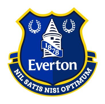
    Thanks Matt. I sent it to Everton FC as a proposal for 2014/15 crest design (selected one is really terrible imo). but they said that 10.000+ fans voted for it and they wouldn't change it.
  • This commment is unpublished.
    DANUFC
    DANUFC · 11 years ago
    This is so much better than the version they've picked. It is appalling, it looks like some terribly designed badge from the 70s. I thought this seasons crest was bad but imo the one they selected for next year is far worse.

    One the other hand this would be an excellent replacement. Although I really don't see what was so wrong with the original one that they and to replace it in the first place.
  • This commment is unpublished.
    gpetko
    gpetko · 11 years ago
    thanks DANUFC. They needed to modernized their crest (mostly to make it more simpler and to place all the elements in more optimized way) but they done bad job and people was furious. Then they came up with that design that indeed looks like bad design from 70's.
  • This commment is unpublished.
    Spider
    Spider · 11 years ago
    There were just three changes that the old crest needed - the removal of the 1878 and Everton script, and a reduction in the size of the scroll and motto to make it the same width as the shield.
  • This commment is unpublished.
    gpetko
    gpetko · 11 years ago
    I think present crest (13/14 season crest) concept is fine, just poorly made (especially the tower). if present crest was designed well, I don't think people will complain and asking that motto and the wreaths to be back again. now it is too crowded.
Home » Football Crests » Everton
  • HOME
  • KIT OF THE WEEK
  • CREST REDESIGN COMPETITION WEEKLY
  • CREST REDESIGN TOURNAMENT
  • CREATE ACCOUNT
  • SIGN IN