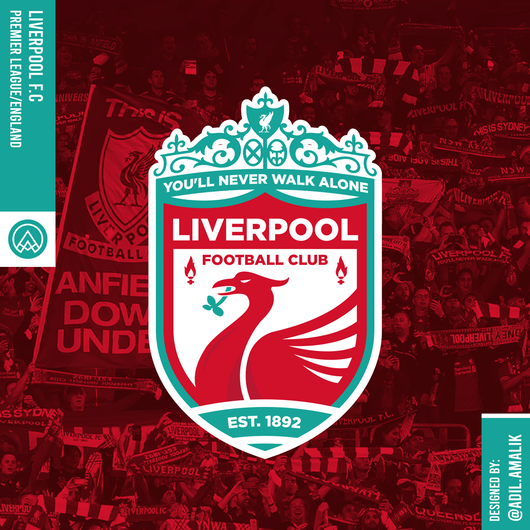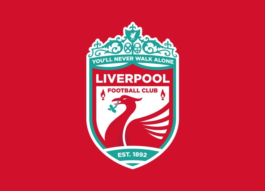
Following on from Barcelona, Liverpool Football Club were the featured fantasy client in the 302nd Crest Redesign Competition Weekly (CRCW) stage.
While Barça’s crest was tweaked, Liverpool’s corporate logo is polarising - the move to the simple liver bird on the shirts has been welcomed - so the entries were more drastic deviations in this case.
Perhaps somewhat surprisingly, the top three in the voting all featured a multitude of features - like the current version - with Aegon denied a, er, four-peat with their red-yellow-and-white number and AdilAmalik’s red-green-and-white creation edging out Corinth’s.
Congrats to AdilAmalik. Could a change to another style of complex club badge see Liverpool players’ chests carrying the full shebang again?