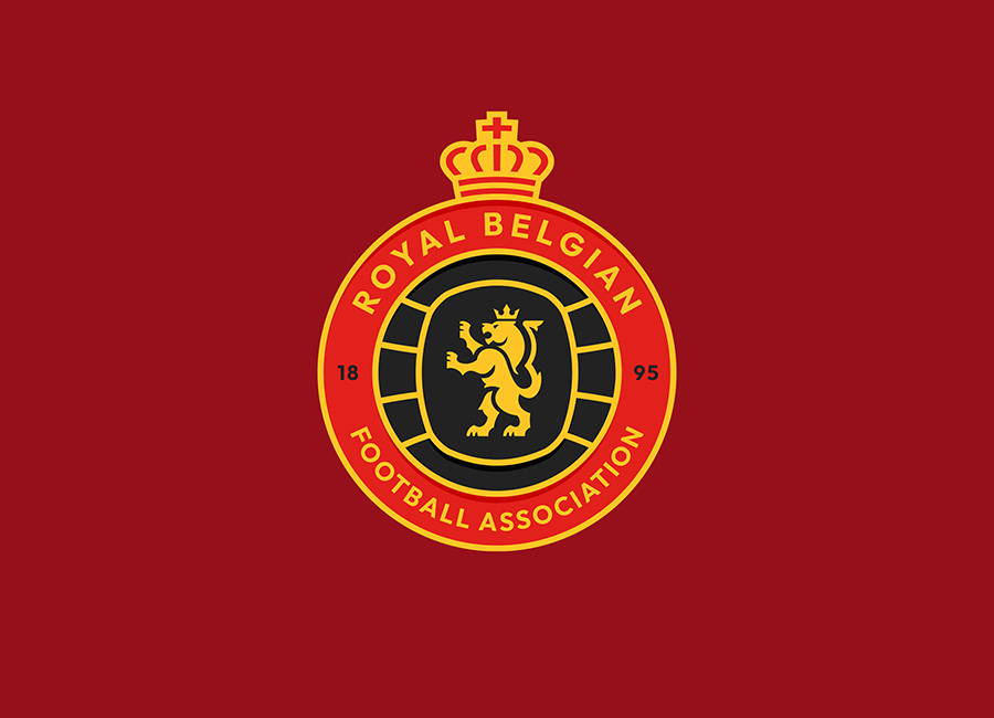
Belgium’s current crest, complete with English-language national association billing, has been around for a few years now, but not everyone’s on board.
Here comes the Crest Redesign Competition Weekly (CRCW) to, sort of, save the day, and the 397th stage provided several superlative alternatives to the international side.
The whole array is worth a look - the voting page is your friend where that’s concerned - but we’ll focus on the podium here, where Rabbi earned a bronze metal with a work of art that seems to include an effectively disturbing red-devil-lion hybrid, OTHYcreative came second with another classy effort, and winner MVdzn put together a lovely creation that would certainly look the part on Belgian chests.


