
This was a fun one. The Kit of the Week (KOTW) challenge focussing its attention on Hammarby IF Fotbollförening, of Sweden’s Allsvenskan, and delivering some great shirts.
Perhaps the most interesting aspect, for those with no skin in the game, was the use of the three green bands of the crest/flag on white entries. This was fun in the case of ONI’s Craft-branded submission, and fun-and-then-some with kunto’s Nike-Swoosh-carrying creation. Never the twain shall meet? They just did.
And, as it was Hammarby, devotee Cydental_kits had to get involved. Their fauxback adidas number made sense - the banding, remember? - whilst also suggesting mid-1990s releases from the brand with the three stripes in said central portion (Newcastle United Away, Olympique de Marseille Home…) and the centrally placed shield with vertical stripes (Liverpool, Spain…). The skyline detail on the sleeves was also lovely.
ArmorKuma even gave us a Meyba entry, which surely seems a good marriage of styles should Hammarby ever be on the lookout for a new technical partner, and TRIDENTE’s vertically-striped-and-gradated design was a mind-bender.
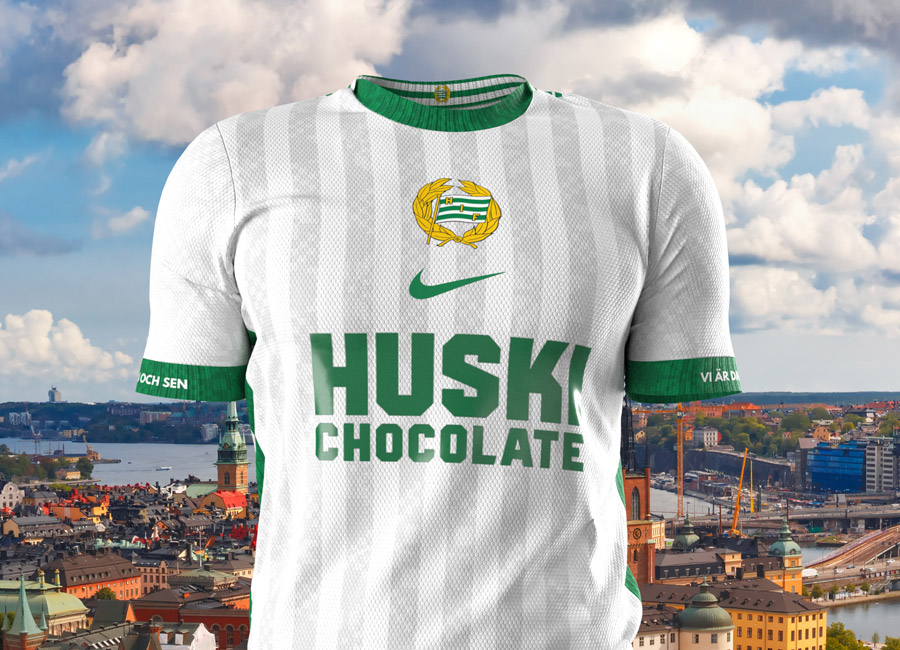
But it was a second Nike-branded effort - complete with Swedish script on the cuffs - which won the day. The votes went that way and SOXXER_ID was victorious. No meat feat, considering the field.


