
Football Club København - FC Copenhagen - are hugely decorated and the Danish Superliga’s top side currently, despite being relatively young in their present guise.
They’ve packed a lot into their 30 years and were well deserving of the Kit of the Week (KOTW) treatment they received from DF members - even if it wasn’t necessarily an aspiration.
The stage didn’t disappoint. Plenty went for the classic look that a primary fill of white lends itself to - and more power to the members who went down that route - but it was also nice to see the creativity beyond that.
FMKG and Sithuralom, for example, went for the graphical in a big way, which may have flirted with overkill but still made for very attractive shirts with - look away Liverpool fans - red Carlsberg logos (thanks to FCK opening the door to that colouring a couple of years ago).
In an alternative vein, Corinth’s submission features the lion from the club crest blown up and was futureproofed with the latest adidas branding. That’s a shirt we’re pretty sure would be coveted by a lot of collectors were it a reality.
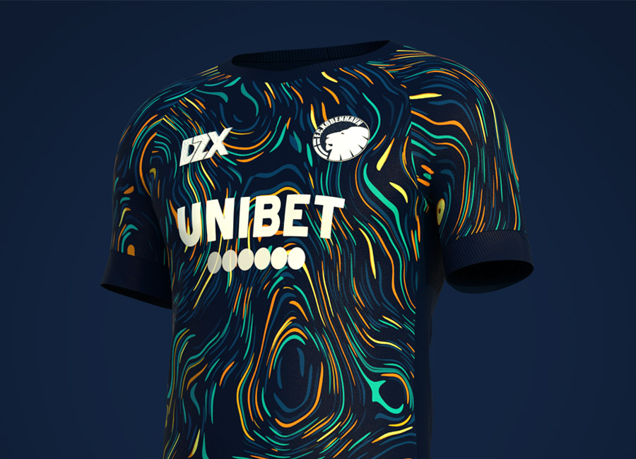
And, of course, the winning design by DlszDesign - billed as an Away - carries an allover pattern nodding to Copenhagen’s lighting at night. Bold, with a hint of Van Gogh and Munch, perhaps, a worthy winner and a treat of a chapter in the Kit of the Week story.


https://www.designfootball.com/design-blog/9-kit-design-news/634-dlszdesign-wins-kit-of-the-week-kotw-246-football-club-kobenhavn-copenhagen-fck#sigProIdf5827d431b


