
The 257th edition of the Kit of the Week (KOTW) challenge was centred on New Zealand’s Wellington Phoenix, of Australia’s A-League (Isuzu UTE A-League).
The striking combination of yellow and black was embraced by the members, with some fascinating designs ending up in the running when it came time for the vote.
ONI applied an interesting twist to stripes, also forming a yoke/chevron effect, and while what seemed to be Vancouver’s Harbour Centre (?) was inexplicably included on _n78_’s offering, it was still a lovely concept.
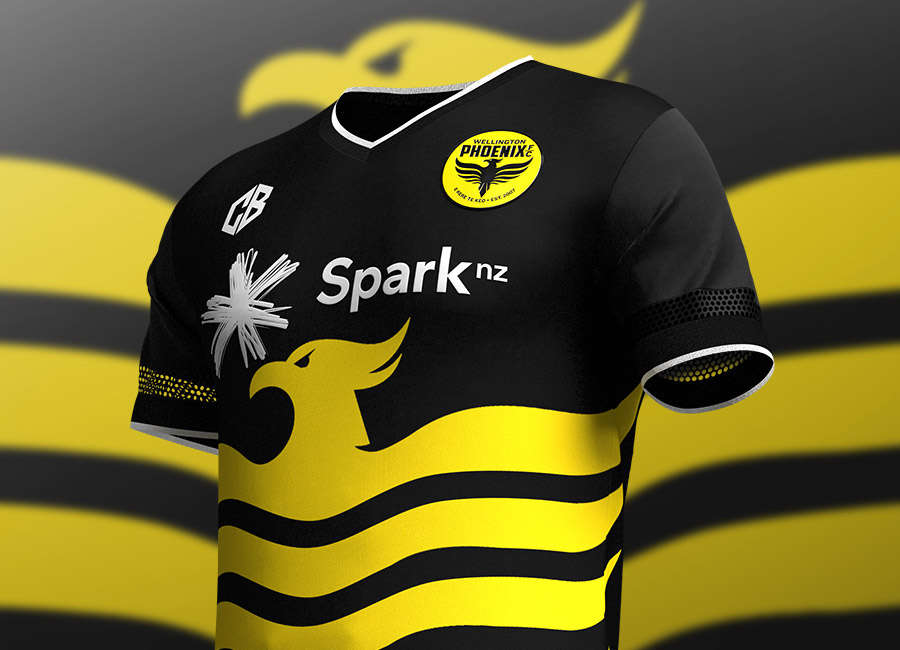
But the best fantasy Wellington Phoenix shirt on this occasion was, according to democracy, CBDesign12’s entry and its blowing up of the mythological-bird crest. No one can claim it's not impactful...


View the embedded image gallery online at:
https://www.designfootball.com/design-blog/9-kit-design-news/657-cbdesign12-wins-kit-of-the-week-kotw-257-wellington-phoenix-fc-football-club#sigProId43aec06251
https://www.designfootball.com/design-blog/9-kit-design-news/657-cbdesign12-wins-kit-of-the-week-kotw-257-wellington-phoenix-fc-football-club#sigProId43aec06251


