
Feyenoord Rotterdam are one of the biggest teams in the Netherlands and the current champions of the Dutch Eredivisie.
They more than warrant a stage in the Kit of the Week (KOTW) challenge, of course, and the entries more than did their stature justice.
To name but (quite) a few, OSB Design went super-classic with non-contrast logos (aside from the star that celebrates the European Cup win, naturally), giannakakis did lovely things with contrasting panels - presumably celebrating the 20th anniversary of the 2004-05 Kappa shirt - Corinth wonderfully combined a gorgeous neck and cuffs with a sublimated map of Rotterdam (which also appeared on LordGraphic’s stylish-yet-arguably-useless Fulham-like Away) and KitKong had equally pleasing neck and cuffs framing a bravely patterned base.
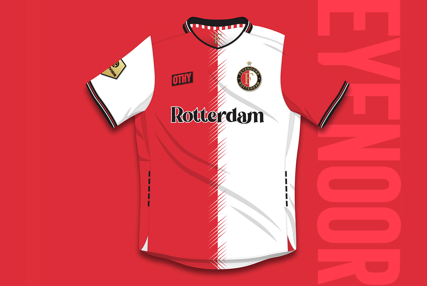
The pleasures matthewfootball delivered are unknown (we think the Joy Division-esque wavy look is actually a nod to Rotterdam’s standing as Europe's largest seaport), ArmorKuma demonstrated what Nike’s current stylings would do for Feyenoord - one to add to Museum of Jerseys’ #FantasyKitFriday output? - and, when all the votes were counted, OTHYcreative bagged the win with understated trim and little fuss beyond an embellished bisecting line running vertically. It reminded us of, despite being very different to, adidas’s handling of the shirt in 1997-98 - a good thing!


