Image 3425 of 4406
Image 3427 of 4406
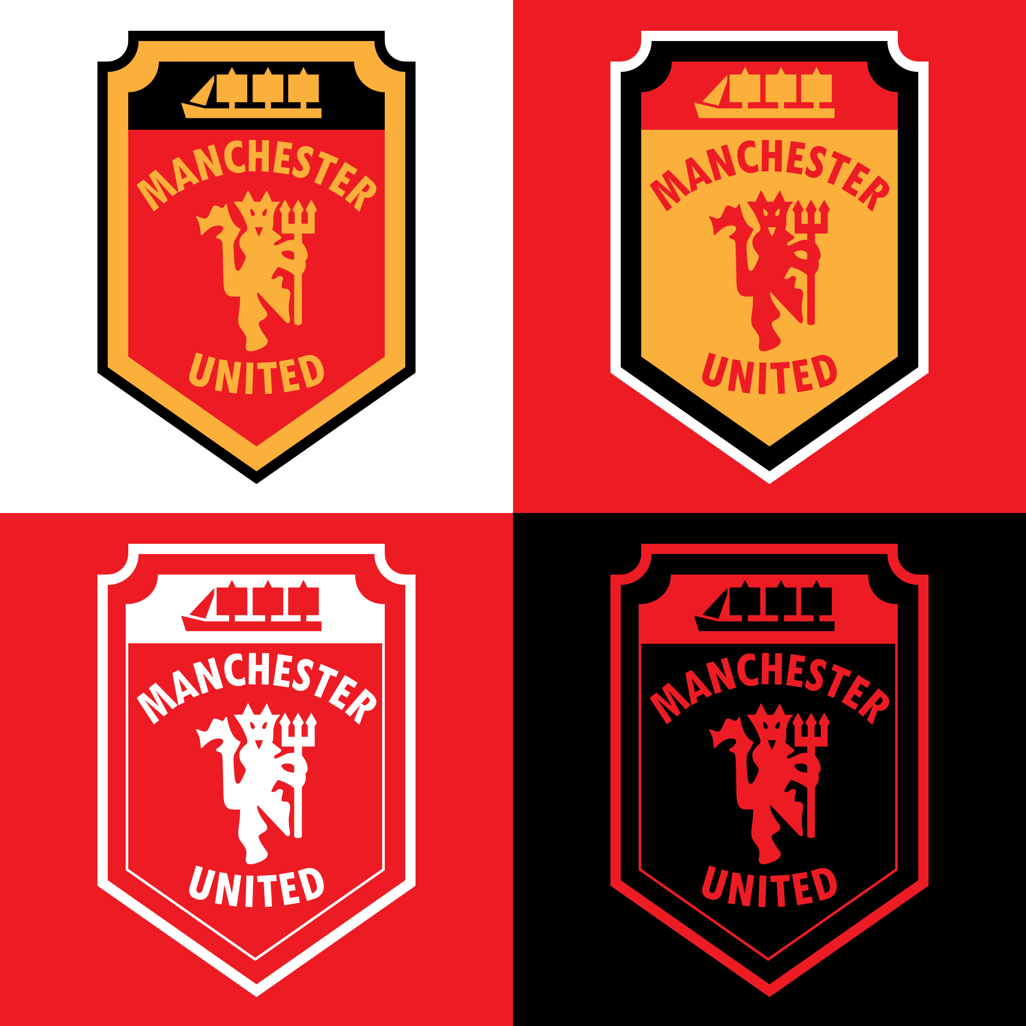
Manchester United - New Crest
Image information
- Description
- There's been many attempts at a new crest for Man Utd on this site and across the internet. The majority of these stick with the basic round shape of the current badge so I thought I'd try something a little different and more modern.
- Date
- Sunday, 03 May 2015
- Hits
- 10338
- Author
- Smn Jms Dsn