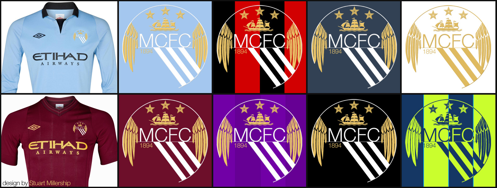
Generic Description: I\'ve taken influences from the old round style crest and the latest crest to create a more modern design.
There is no solid background to it and so incorporates the colour of the shirt. The idea is that the colours can be slightly altered depending on what colour the shirt is.
I\'ve taken the wings from the eagle and modified them to fit in with the incomplete circle that edges the crest. This creates a classic \"shield\" shape within the crest, more noticeable when smaller.
The year the club was formed is back, the three stripes representing the river more prominent, the boat present as ever and the three \"decorative\" stars remain albeit smaller and less dominant. MCFC is in a more modern sans serif font and much larger.
You are a guest ( Sign Up ? )
Be the first to comment.