Generic Description:
the Whitecaps had a makeover when they joined the MLS, but all of the history was seemingly ignored when the kits and the crest were designed, the iconic chestband and the wave crest from the 1970s and 80s were ignored when the new kits were released, which was a shame, as the \\\'caps had one of the best crests in the old NASL which was begging for a better update than the one that was used in the noughties. Rabbi did a new version, my gratitude to him ;
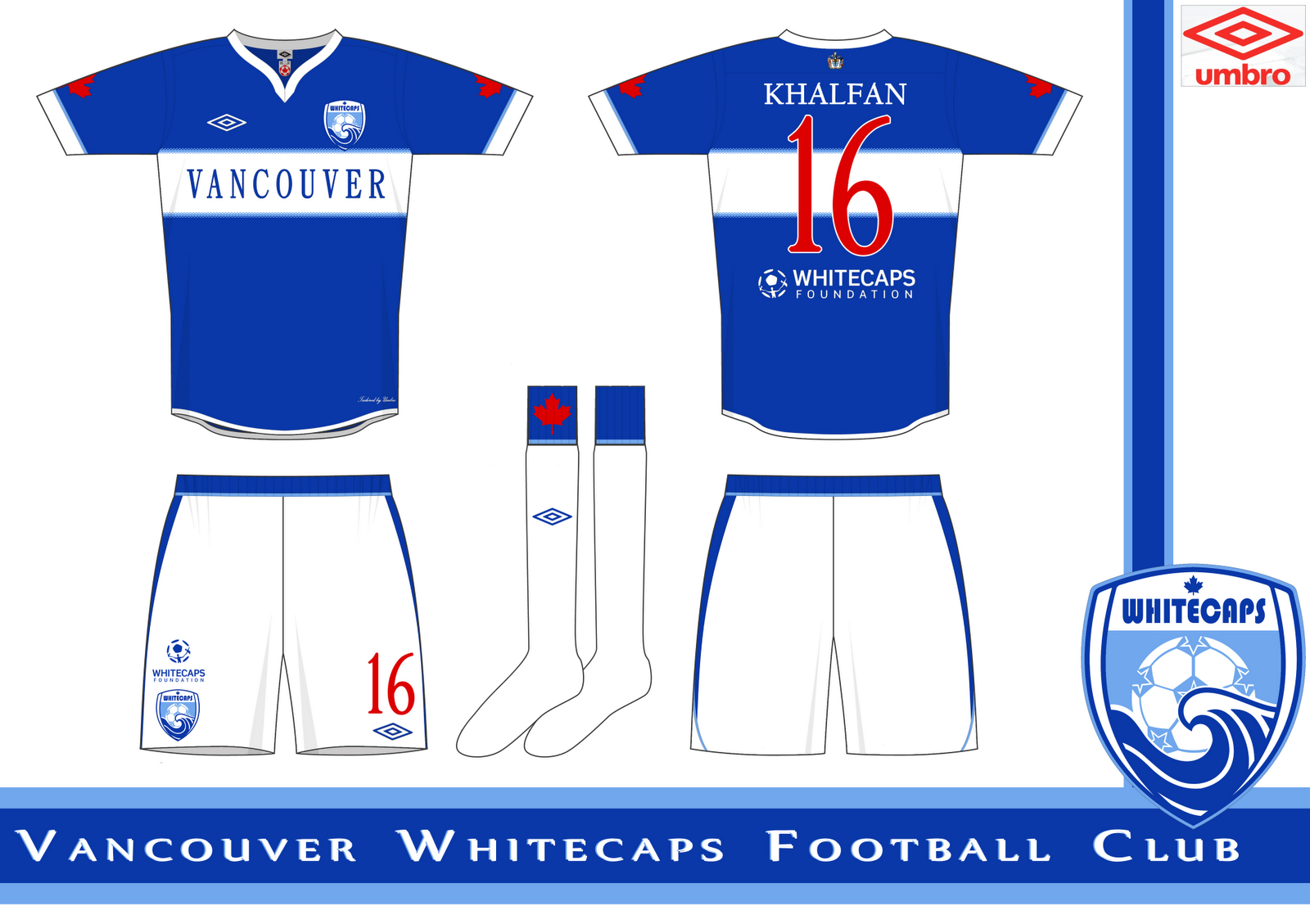
The colours were picked off an old Whitecaps shirt, and on inside of the collar is the first Whitecaps crest. On the back of the shirt is the coat of arms of Vancouver, and on the sleeves and sock turnover are maple leaves, a feature of Whitecaps kits in the NASL and USL.
You are a guest ( Sign Up ? )
Be the first to comment.