Image 16563 of 20646
Image 16565 of 20646
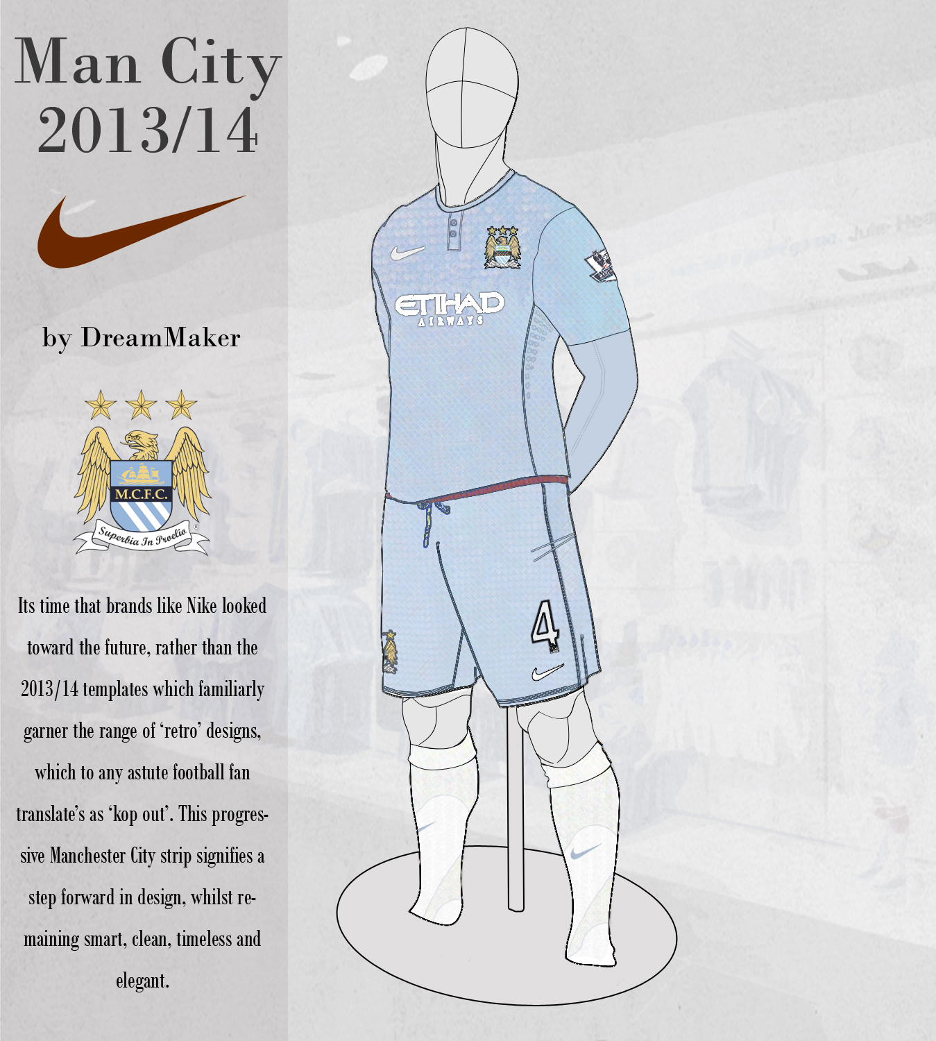
Manchester City 2013/14
Image information
- Description
- It’s time that brands like Nike looked toward the future, rather than the 2013/14 templates which familiarly garner the range of ‘retro’ designs, which to any astute football fan translate’s as ‘kop out’. This progressive Manchester City strip signifies a step forward in design, whilst remaining smart, clean, timeless and elegant.
- Date
- Thursday, 08 August 2013
- Hits
- 8187
- Author
- DreamMaker