• FootballShirtCulture.com

Login   Register 

Design Football Design Football The Community-Based Home of Concept Football Kit and Crest Designs
  • Home
  • Community
    • Community Stream
    • Your Profile
    • User Panel
  • Galleries
    • All Categories
    • Football Kit Designs
    • Football Crest Designs
    • Football Boot Designs
    • Stadium Designs
    • Miscellaneous
  • Challenges
    • Kit Of The Week
    • Loud Kits Challenge
    • TWT- Thursday Weekly Theme
    • 2022-23 Kit Predictions
    • Crest Redesign Weekly
    • New Kit Deal Challenge
    • All Challenges
  • Comments
  • Upload Designs
  • Podcasts
  • Blog
  • Contact
  • About us
Home » Football Kits » New Design Look ( Please Help ) !
New Design Look ( Please Help ) !
View full size
  • ← Previous
Image 14841 of 20671
  • Next →
Image 14843 of 20671

New Design Look ( Please Help ) !

Image information

Description
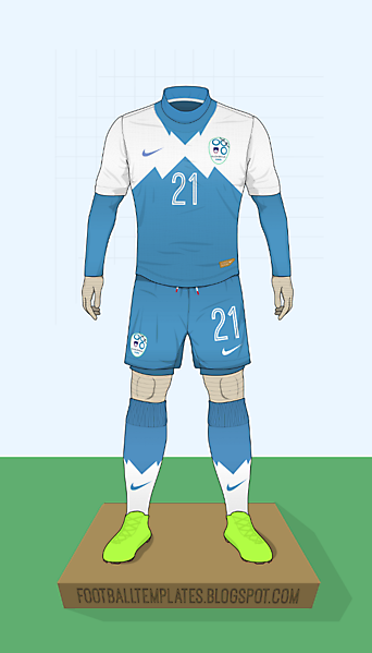
Hey guys, i'm going for a new look for my design and site promos. I'd like to get your opinion on this as my main design template. The action ones are nicer in my opinion but sort of difficult and time consuming to work with. Please let me know if you dont like anything about this template, hand size etc whatever, just let me know so I can perfect it :-)
Date
Tuesday, 29 July 2014
Hits
3282
Author
moom

Comments

  • 9 Comments
  • Login
  • Oldest
    • Best
    • Popular
    • Newest
    • Oldest
  • Collapse All Expand All
You must login to post a comment.
You are a guest
Loading comment... The comment will be refreshed after 00:00.
  • This commment is unpublished.
    irvingperceni
    irvingperceni · 10 years ago
    Looks good, man.

    Maybe add the head to make it look like a store manikin. Also, the shorts look not the right size and the lower legs look a bit husky.

    It is a good change to your presentation!
  • This commment is unpublished.
    BP
    BP · 10 years ago
    Nice presentation, I think it looks good as is. but if you want it looking perfect then I think the body looks a little out of proportion for a footballer, the thighs look too skinny compared to the calves and something, not sure what, doesn't quiet look right in the upper body.
  • This commment is unpublished.
    moom
    moom · 10 years ago
    Are you assuming the shirts tucked in? You can't see all off the shorts. Thanks for the feedback, will surely change it up!
  • This commment is unpublished.
    joegillibrand
    joegillibrand · 10 years ago
    perspective's wrong on either the podium or the boots. Looks like the whole mannequin is leaning back and about to fall over.

    Either tilt the boots down
    or
    the podium up (advised)

    and it should sort it :)
  • This commment is unpublished.
    Steevo
    Steevo · 10 years ago
    Proportionately it looks fine to me, the bit that looks odd is the perspective of the plinth. Probably doesn't need it. just some shadow under the feet to ground it. Maybe a neck would help but not necessary. Have you used anything as reference or traced it?
  • This commment is unpublished.
    moom
    moom · 10 years ago
    @Steevo I just whipped up the stand in haste late last night ^^; Definitely going to fix that.

    Thanks for the feedback! In editing it right now, i'm just slightly bringing in the inner knee and I lowered the shorts a bit.
  • This commment is unpublished.
    Nueve9
    Nueve9 · 10 years ago
    I love it the way it is. The only thing I don't like is the neck, it's just my perspective, to me looks like a turlte neck. Anyway this is awesome stuff:)
  • This commment is unpublished.
    moom
    moom · 10 years ago
    @Nueve9 It is! Its a baselayer, my friend, hence the sleeves! Cheers!
  • This commment is unpublished.
    Nueve9
    Nueve9 · 10 years ago
    @moom Holy! Didn't noticed until you said so. Now it's just perfect for me, amazing work moom:)
  • This commment is unpublished.
    moom
    moom · 10 years ago
    @Nueve9 Thank you! I'll be making this available though my website soon!
  • This commment is unpublished.
    fjmh
    fjmh · 10 years ago
    I'd rate as a mannequin head,
    the thighs thicker and thinner would put the twins,
    and shorts would put it a little longer.
    for everything else perfect, great job.
  • This commment is unpublished.
    John Valor
    John Valor · 10 years ago
    The arms look a bit short to me, and there isn't a clear definition of the wrist. It sort of looks like the forearm immediately continues into the hand.
  • This commment is unpublished.
    moom
    moom · 10 years ago
    @John Valor I think they look a bit short too. The reasoning behind the no wrist definition is just a thing only I would get, being the person who made it. I didn't want to make the baselayer skin tight, so it just loosens up a bit around the wrist as most garments do. With that being said, i'm still going to fix it and define it ^^'

    Cheers for the feedback!
  • This commment is unpublished.
    JCPierola
    JCPierola · 10 years ago
    To me its perfect. And nice design too
Home » Football Kits » New Design Look ( Please Help ) !
  • HOME
  • KIT OF THE WEEK
  • CREST REDESIGN COMPETITION WEEKLY
  • CREST REDESIGN TOURNAMENT
  • CREATE ACCOUNT
  • SIGN IN