• FootballShirtCulture.com

Login   Register 

Design Football Design Football The Community-Based Home of Concept Football Kit and Crest Designs
  • Home
  • Community
    • Community Stream
    • Your Profile
    • User Panel
  • Galleries
    • All Categories
    • Football Kit Designs
    • Football Crest Designs
    • Football Boot Designs
    • Stadium Designs
    • Miscellaneous
  • Challenges
    • Kit Of The Week
    • Loud Kits Challenge
    • TWT- Thursday Weekly Theme
    • 2022-23 Kit Predictions
    • Crest Redesign Weekly
    • New Kit Deal Challenge
    • All Challenges
  • Comments
  • Upload Designs
  • Podcasts
  • Blog
  • Contact
  • About us
Home » Football Kits » Wycombe A/B test concept
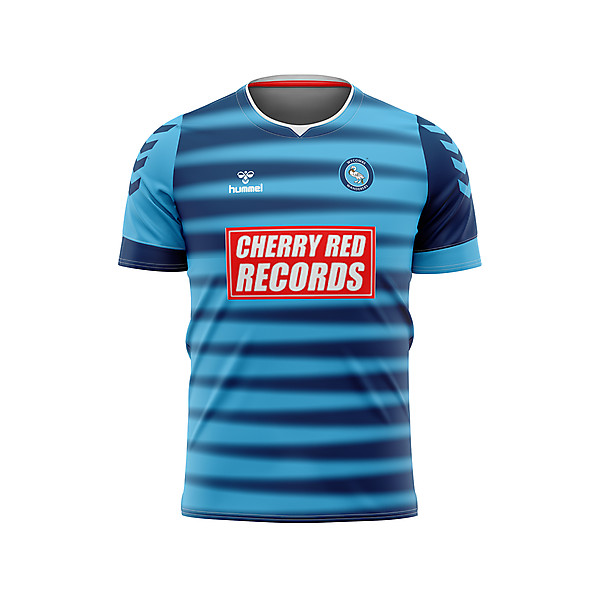
Wycombe A/B test concept
View full size
  • ← Previous
Image 6242 of 20656
  • Next →
Image 6244 of 20656

Wycombe A/B test concept

Image information

Date
Wednesday, 27 May 2020
Hits
2944
Author
Skyebaggie

Comments

  • 4 Comments
  • Login
  • Oldest
    • Best
    • Popular
    • Newest
    • Oldest
  • Collapse All Expand All
You must login to post a comment.
You are a guest
Loading comment... The comment will be refreshed after 00:00.
  • This commment is unpublished.
    Skyebaggie
    Skyebaggie · 5 years ago
    I'm not sure I explained very well my concept on my KOTW entry. This is my "interlacing fingers" attempt at pushing the concept of quarters. I felt it was not "quarters" enough, so I added the quarters overlay on the other one. I'd be interested to hear your thoughts on whether this works as quarters or not? It's not about which one you prefer, although you are free to say that, more whether this is still considered quarters?
  • This commment is unpublished.
    Oakleighman
    Oakleighman · 5 years ago
    @Skyebaggie I've just attempted it. Not easy to do unless you have tiny finger joints and an almost white, but slightly blue background.
  • This commment is unpublished.
    hacobcem
    hacobcem · 5 years ago
    I dislike that ugly sponsor on the front - it kills the jersey for any team, regardless. That is why I refused to purchase the jersey over at o'neills shop online, as that ugly sponsor slapped over a very well done design of the swan. This garment looks awesome - good job, skybaggie! Hummel is one of my favourite brands, by the way.
  • This commment is unpublished.
    hacobcem
    hacobcem · 5 years ago
    I'm surprised that no one is attempted to draw and enlarge that chain with a crown from the crest to place on the front of the garment between two halves ???
  • This commment is unpublished.
    Skyebaggie
    Skyebaggie · 5 years ago
    @hacobcem it could look cool, give it ago. Thanks for your comment. As for sponsors making or breaking a shirt, we could discuss that for hours. In an ideal world the sponsor would be chosen to go with the kit. I'm sure Cherry Red Records like that their design is very noticeable on this kit.
  • This commment is unpublished.
    raffe
    raffe · 5 years ago
    The shirt looks great, and I really like how you've used the "interlacing fingers" to create a unique look. However, I agree that the quarters design is more difficult to see in this version. Maybe this aspect of the shirt would be more visible if the transition between the darker and lighter colors was more abrupt, but I'm not sure.
  • This commment is unpublished.
    Skyebaggie
    Skyebaggie · 5 years ago
    @raffe thanks for taking the time to comment. I think we are in agreement and that I made the right decision by emphasising the quarters with the overlay.
Home » Football Kits » Wycombe A/B test concept
  • HOME
  • KIT OF THE WEEK
  • CREST REDESIGN COMPETITION WEEKLY
  • CREST REDESIGN TOURNAMENT
  • CREATE ACCOUNT
  • SIGN IN