
· 3 years ago
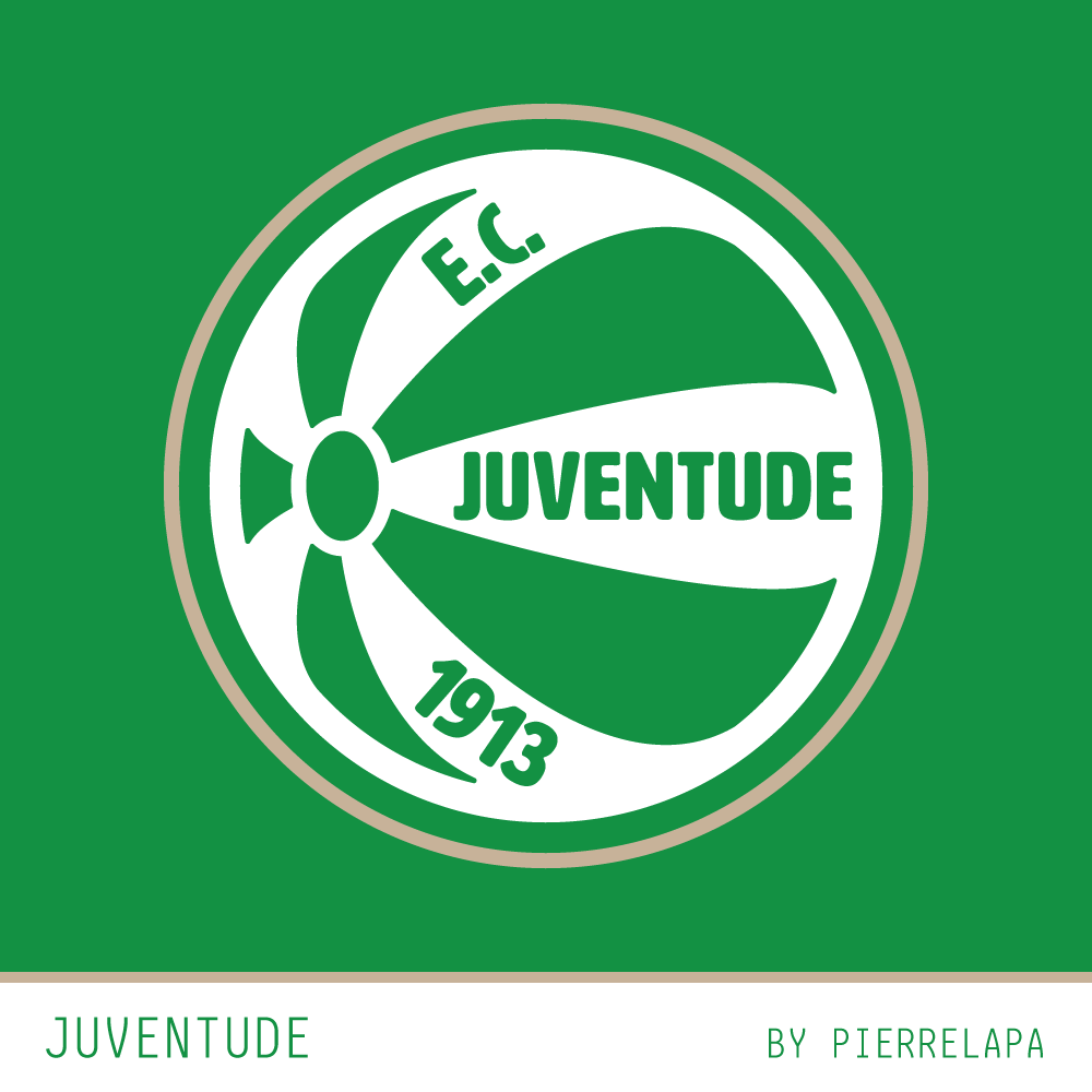
I don't like the current crest of Juventude (and its look-a-likes São José and Gaúcho de Passo Fundo) because it isn't a perfect spherical ball, but a bad drawing of it.
So I learned a few basics of blender to draw a spherical ball with 10 segments, to find the shape of the perspective of the ball from Juventude's crest:
[img]https://i.imgur.com/JWi3XRf.jpg[/img]
For CRCW my submission ([url]https://www.designfootball.com/design-galleries/crcw/ec-juventude-redesign-52401[/url]) I didn't chose to write the club's name inside the ball, because I don't like the idea. But I get that is a design that supporters are connected to, so I did try to make a cleaner version of the current concept. This is the result.
I did apply the ball segment distortion to the "Juventude" word, but I personally didn't like it. But here it is in case anyone is curious about it:
[img]https://i.imgur.com/IAshxnU.png[/img]