FootballShirtCulture.com
Login
Register
Design Football
The Community-Based Home of Concept Football Kit and Crest Designs
Home
Community
Community Stream
Your Profile
User Panel
Galleries
All Categories
Football Kit Designs
Football Crest Designs
Football Boot Designs
Stadium Designs
Miscellaneous
Challenges
Kit Of The Week
Loud Kits Challenge
TWT- Thursday Weekly Theme
2022-23 Kit Predictions
Crest Redesign Weekly
New Kit Deal Challenge
All Challenges
Comments
Upload Designs
Podcasts
Blog
Contact
About us
YOU MUST ENABLED JS
Home
»
Football Crests
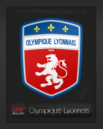
» Re-designed logo of Olympique Lyonnais
Search gallery...
← Previous
Image 4211 of 4410
Next →
Image 4213 of 4410
Re-designed logo of Olympique Lyonnais
Image information
Description
Inspired on the flag of Lyon city http://commons.wikimedia.org/wiki/File:Flag_of_Lyon.png?uselang=es Rosette Designs!
Date
Thursday, 08 August 2013
Hits
8040
Author
fers94/fersolari
Comments
Comment
Login
Oldest
Best
Popular
Newest
Oldest
Collapse All
Expand All
You must login to post a comment.
You are a guest
Login Now
Loading comment...
The comment will be refreshed after
00:00
.
This commment is unpublished.
Spider
·
2054 years ago
Very nice, much more modern looking than the current crest, and the addition of the Fleur d'lis and the lion being the main focus of the crest makes it look much better. a great job here.
empty
YOU MUST ENABLED JS