Kit Design Tutorial for BeginnersHere

Whilst I make no apology for being opinionated, it occasionally becomes necessary for me to qualify my remarks.  For example, I recently railed against the use of sublimation in football shirt manufacture, only to have it pointed out to me that major sportswear manufacturers utilise the technique to create stripes, hoops, sashes and other integral patterns.  I was, of course, aware of this and merely hadn't been explicit enough in outlining that I was referring to sublimation's use when adding finer details such as single, double or triple striping on sleeves, manufacturers' logos, crests and sponsors.

Ah, sponsors.  Even more recently I wrote a piece taking aim at football clubs and associations - FAI, this means you - which allow shirt sponsorship to impact negatively on a design or reputation.  What I didn't make quite clear enough, it seems, is that I actually like football shirt sponsorship.

In fact, the right sponsor can make a football shirt.  Cork City/QPR with Guinness, St Pauli with Astra, Scarborough with Black Death Vodka (really!).  In my last article I referred to Liverpool's association with Carlsberg - as opposed to Standard Chartered - as being one which was celebrated by the fans, but I'm more of a Candy man (ha) myself, with a fondness for Crown Paints and, naturally, Hitachi.  In fact, befitting someone born in Kettering - home of the first British club to wear a shirt sponsor - I am keen to embrace brand logos appearing on shirts, if it's the right brand and the right logo, and the bigger the better.

CR Smith was a particular favourite with Celtic - though the larger player style rather than the downsized version used on the replicas.  And, whilst I understand the desire to get one's hands on a rarity, Uefa's limiting of the size of shirt sponsors is generally to the shirts' cost, even considering Borussia Dortmund's dispensing of the Die Continental wording on their run to Champions League glory in 1997, and creating a perpetually out of reach version of their 97-98 shirt in the final.

On the other hand, the Uefa rule that teams in opposition cannot wear the same sponsor - seemingly now defunct - has thrown up some great one-offs, as has the barring of alcohol and gambling sponsorship in certain countries.  Arsenal imploring people to visit Dubai paired up, in a cross-generational illustration of the UK's north-south divide, with Newcastle recommending a more modest outlay on a trip to Center Parcs.   Blink and you'll miss them but they attain legendary status.

Equally, an increased quantity can be as effective as an increased size.  The French - also prone to cross-competition sponsorship rotation - and, even more notably, South and Central American team's football kits are covered in logos.  It's cluttered and it must detract from from the original design but a large-sized main sponsor surrounded by smaller indicators of more modest deals, short sponsors - and here I do prefer sublimation, and will forever regret lending my 1994-95 l'OM shorts to a teammate, never to see them again - and even iconic sponsors on socks just, somehow, looks cool.  Like a Nascar or Piccadilly Circus, nay, Tokyo in football kit form.

If I haven't demonstrated my love for football kit sponsorship enough then I should point out that I've dreamt, for many years, of my own staccato-fixtured football team Marceltipool wearing an Away or Third kit displaying a whole array of sponsors.  How many?  Let's just say I have a number in mind...


Follow Jay29ers on twitter


"Ruined by the sponsor(s)" is an oft-repeated refrain on football shirt websites, particularly FootballShirtCulture.com, generally expressing disappointment at a warmly-received design carrying an organisation's logo which is to its detriment.

Football clubs need to make money.  More than ever before, any potential injection of funds into a team's progress has to be considered, even with significant drawbacks.  Chelsea took money from a Russian oligarch with a shady past in order to stop going out of business (and he won them the European Cup), Llansantffraid FC became Total Network Solutions for a time and Manchester United, through maximising fund-raising efforts by floating on the stock exchange, left themselves open to being taken over by debt-laden owners.

For most clubs, however, putting the name of a business on the front of the shirt is the major compromise of ideals.  The most crudely symbolic in recent times are those of short-term loan companies such as Wonga.com on the Hearts and Blackpool shirts and the-pawn-broker-it's-ok-to-like Cash Converters on Hull City's torsos.  These are indicative of recession-hit Britain and, like many others, are included on playing and replica wear much to the chagrin of supporters.

Sponsors' logos are not always disliked; Carlsberg became popular with Liverpool fans, and I've always greeted larger profiled designs on French kits - not least Montpellier carrying 'Sud de France' to represent in stopping PSG winning the French title whilst l'OM fiddled - but what to do for the many logos which don't stir the heart so expertly?

Well, sometimes allowing the fans the option of purchasing a sponsorless shirt acts as a PR olive branch.  Celtic - currently sponsored by Tennent's - retail their shirts with and without the brewers' logo.  In the cases of gambling and alcohol sponsorship, kids' shirts must be devoid of that kind of advertising so this is occasionally extended to the adult wear too, with pleasing results.  One other approach is to offer an alternative to the sponsor, such as Swansea City putting their date of establishment on the kids' shirts, though this is rarely offered as an across-the-board option due to the potential of the paying publicity seekers' branded shirts being eschewed.

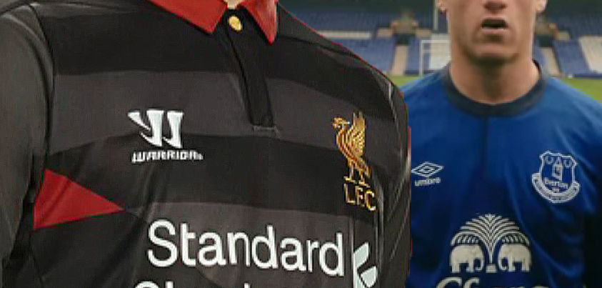
But these are the exceptions rather than the rule.  Most fans are forced to both wear and watch their team carrying a logo which they may dislike aesthetically - l'OM's Intersport sponsor, in royal blue and red, is a sartorial faux-pas on a shirt of white, lighter blue and orange - or hold deeper rooted resentments against, such as, in my own case, Liverpool's Standard Chartered.  The latter belongs to a company, as if being a bank wasn't bad enough, which has spent its association with one of the world's most famous and decorated clubs shooting its mouth off and trying to engineer Anfield-policy with an arrogance and lack of discretion which can only be located in the finance sector.  But hey, at least the logo's not too ugly.

There are, still, other encouraging signs.  Both Celtic and, "The Rangers" will wear shirts in 2012-13 which carry much smaller Tennent's logos below the crest, rather than broadly across the body, with Celtic still allowing the removal of this if preferred.  Quite why the so-called "Old Firm" blanket polices still need to be in place is beyond me but, regardless, it's a tactic which has been employed in hugely popular Manchester City and Inter Milan shirts in recent history and long may it continue.

Sadly, for every company which agrees to reduced visibility - such as on the new Coventry kit - there'll be a team which signs with a company whose logo immediately renders their shirt cheap and nasty (equally true in the DF gallery where one minute you get a beautifully subtle Real Madrid kit and the next a nauseating Colchester United shirt).  Even Barcelona have let their shirts be sullied by not one but two sponsors.

But why do I choose this moment to rail against shirt sponsors?  We are, of course, in the midst of an international football tournament where shirt sponsorship does not feature.

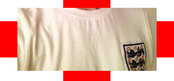
If only that were true.  The FAI, reprehensibly, still sign deals which allow sponsorship to appear on Ireland replica shirts.  As iconic as the Opel sponsor became, and despite being blessed with the historically and enduringly brilliantly-sponsored Cork City, the fans want sponsorless shirts.  With there only really being one place that generally offers them - and only previous styles at a far from Irish recession-friendly price - the fans are often forced to think outside the box with their purchases, inevitably impacting on replica shirt sales.  In 2012 it was the turn of the gorgeous training shirt to be a popular surrogate - pictured here sandwiching a pretty girl with a player issue unsponsored long-sleeved Italia '90-era example - to the point where it sold out.  Is the extra revenue received from association sponsors genuinely calculable to cover the amount lost in shirt sales?  Would relocation of the partner's logo be so hard to insist upon?

We, as football fans, deserve the choice - none more so than the sea of green.


Follow Jay29ers on twitter


di·vest   [dih-vest, dahy-] 
verb (used with object)
Commerce .
a. to sell off: to divest holdings.
b.to rid of through sale: The corporation divested itself of its subsidiaries.

Me neither.  Put simply, Nike are going to try to sell Umbro as they're losing money.

Now, I'm about to argue pretty convincingly that I saw this coming, quoting myself seemingly spotting warning signs and melodramatically prophecising.

Don't believe a word of it.  It came as as much as a shock to me as it did anyone.  What I actually predicted, wrongly, was that Nike (the brand) would take the England contract from Umbro - something that the FA may or may not have vetoed - and whilst I was somewhat vindicated by Manchester City going down that route, along with some Brazilian sides, and did question "whether or not Nike have had enough of allowing Umbro to continue..." it was solely in reference to the Three Lions.

My main worry was not business-related.  My fear that Umbro had "jumped the shark" was from looking at the company from a design standpoint, particularly in light of the recent England Home kit release, which disappointed.

And, we have to assume, the sales of that shirt have been disappointing too.  Umbro, and particularly the Tailored By direction, have been unfortunate in presiding over a period which has seen their England poster boy, John Terry, tear up his own image - repeatedly - and the team perform at best underwhelmingly and at worst shambolically.  The recession wouldn't have helped much either.  Nontheless, if you'll forgive the CJ-ism, Nike haven't got to where they are today by shirking ruthlessness.  Perhaps the England release in the lead up to Euro 2012 was the last chance.  With JBB and Sports Direct currently selling the dilophosaurus-styled shirt for around £25, it seems Umbro didn't take it.

There couldn't be a worse time to lose direction in design and, particularly, marketing.  The current England Away kit release focused on the David Haye launch - a brash approach which seemed at odds with the thoughtful design process which was brilliantly based on the England cap.  The shirt currently retails, with Euro 2012 only a few days away, at £15.  In the Home shirt, to take one of the most heartening elements Tailored By gave us, the beautifully embroidered and coloured England crest, and replace it with monotone red smacks of one temporary campaign making way for another.  Maybe people saw through it.

With Under Armour rumoured to be a contender for the place in the Nike family which Umbro will vacate, it could also be that Nike are shifting away from the timeless and traditional and towards the scientific and technological.  (The irony would be that, whilst not a specialist like UA, Umbro actually produce excellent baselayers which, almost uniquely, are made with pale badges and gaping necks so as not to interfere excessively with the external look of the playing shirt.)

Whatever the reasoning, here's hoping there is light at the end of the tunnel.  The industry and football shirt-buying public should forever be indebted to the shift Umbro created across the board via Tailored By and, with their 2011-12 Athletic Bilbao Away shirt bettered by no one, some of their releases remain on a par with the best of adidas and Nike.  If they can restore that direction to design and marketing they'll surely live on, thrive, and raise the bar again.


Since I started writing this blog some four years ago a common theme has been recurring.  That is the desire to see football fans involved in the design process, either by way of consultation, kit votes or simply allowing the fans to design the kits themselves in competitions.

Well now I'm done.  We've got the input, we've had our say, the manufacturers and clubs have moved on the information we've given them and we've been greatly rewarded.  Now it's time to allow designers to design.

This about-face is is purely due to the kits we're seeing now being, on average, by far the superior of those of any period in the past.  Seriously.  I used to comment on the irony of being such a football shirt obsessive when I only really liked about 10-15% of the new releases I saw when I visited Football Shirt Culture.  Now that percentage is closer to 40; maybe even half the new shirts actually impress me.

We have one company to thank for this: Umbro.  They took a look at kit design when they were bought out by Nike - probably taking advantage of the enhanced resources - and decided it needed stripping back and reassembling.  They embraced social media, not simply as a way of getting their message across but also inviting (design) fans to give opinions on past and future kits.  They checked what people were saying on FSC and were happy to meet with the commentators.  The result was the 2009-10 England Home kit and their rapidly improving Tailored By range.

The parent company, who had admittedly shifted somewhat to a more understated, classic style in 2006, followed suit, immedately adapting the cut and effect of their kits which, season on season, became more akin to the Umbro approach.  They, similarly, have become more popular.

What we have now is a new stage in the evolution of kit design. The manufacturers are not listening to us anymore. Not through arrogance or disregard, but simply because they have learnt what we want. There's no need to consult fan groups anymore, even if they still do, because there is a mutual understanding born of consistently well-received kits.  It now seems so finely-tuned that it must be almost a visceral sensation to judge the mood so efficiently.

All of which is great for us.  To take the example of the teams I support, Celtic have just launched Home and Away kits which demonstrate an understanding of the desires of the fans whilst also, crucially, giving us finished designs which we would have been hard-pressed to come up with ourselves.  Faithfulness and originality are often awkward bedfellows.  Nike nailed it.

Likewise the new Olympique de Marseille kits.  adidas took a while to get up to speed but the last couple of years have shown they've reined in their approach and are back to doing what they do best: classic, timeless designs which make the most out of their prevailing three stripes.  In the case of l'OM, they've attempted to engage the supporters groups by including the colour orange and, whilst controversial, the Home kit will grow on most.  The Third shirt is simply one of the most innovative football design pieces in history - even allowing for the inclusion of a minor grammatical error (via adidas incorrectly editing the words of IAM rapper Akhenaton) - and despite it being yet another nod to the South Winners, it will be popular through respecting and revisiting traditions but not sacrificing creativity.

This is where the manufacturers can fall down.  Pay too much attention to what the fans want and creativity will be compromised.

The new Liverpool kit is fine.  It has brought back the simple Liver Bird crest - by popular demand; it has a collar, ugly shame notwithstanding - by popular demand; the overall look is uncluttered - like the fans had demanded; the Hillsborough flames have been augmented with the number 96 and relocated to just below the collar on the back - via consultation with the family group which the club are prepared to deal with.  It's very nice but very safe.  Warrior didn't want to rock the boat with their first Home kit, and they've done ok.  But they've bottled it.  They didn't create a kit, they engineered by commitee.

(Incidentally, the goalkeeper kit doesn't get off so lightly.  It's retro to the point of being unacceptable as a 2012 product and will leave Pepe Reina looking like an out of shape Ray Clemence after an extreme trip to the barbers.)

Saleability will always influence the design process.  Anything too extreme will be jettisoned if it alienates the buying public, but the more out-there designs can often bring in revenue from the neutral or more fairweather fan markets.  It's a difficult balance and Cardiff City found that if news of a drastic change to a (especially home-) shirt is communicated in a clumsy and poorly managed way then there will be a backlash.

In the case of the Welsh club, the thinking was that if they had changed their home colours from blue to red then they would have increased merchandising revenue, via the Far East, to such an extent that they would have easily assembled a squad capable of winning The Championship at a canter.  Perhaps the change should have been accepted.  Cardiff have failed to become a worldwide recognised brand in their blue shirts - which would surely have remained in the guise of an away kit anyway, possibly even worn in a percentage of home games - and with even the popular template of this season returning average figures it seemed many were bemoaning the loss of a basic tradition which they didn't even purchase.

We live in a time when we can trust the club, manufacturers, designers and marketeers to provide something that will both please the fans and generate revenue.  If we like something then we should put our money where our mouths are.  If we don't then someone else might.


Follow Jay29ers on twitter


Dave Woods paused for effect immediately after delivering the dramatic news. With Channel 5 having hit the jackpot with their serendipitous adoption of Athletic Bilbao's Uefa Cup campaign - and reclaiming the formerly mocking "Thursday Nights on Channel 5" chant with all stigma banished - the commentator now had the opportunity to consolidate this success with a surefire winner. News had come through that Atletico Madrid were through to the Final and should Bilbao get past Sporting Lisbon to meet them then they would be nominally the away team and, wait for it, be required to wear their green away shirt.

When a football shirt has even got the commentators onboard you can say with some confidence that the design's hit the spot. In the case of Athletic Bilbao, the shirt benefits from being coupled with a successful side playing football regarded in a similar bracket to Barcelona and Swansea City and with a ruthless attacking flair akin to that displayed by Tottenham Hotspur in the first half of the season.

So the connotations of the shirt are sound, what about the aesthetics?  When the kit was first released the admiration was resounding and as time has gone on it has grown on even those who were unmoved.  If you look for a purpose in a shirt's makeup then the lifting of the Basque Country's Ikurrin's (flag) colours, a local company's classy logo as sponsor and the standard inclusion of the local coucil's oak leaf logo on the sleeve should suffice; its obvious resemblance to the Basque national team's shirt (combined with the club's status as a national team by proxy) was always going to catch the eye as a handy bonus.  Throw in a touch of fraternité with Irish/Celtic fans sympathetic to the separatist region's cause - and always on the lookout for new and exciting ways to contribute to their own seas of green - and popularity is almost guaranteed.

But there is one key element included that has translated across (and in spite of?) teams, colours and connotations and been the standout design feature of the 2011-12 season.  The chest bar/stripe has appeared on some of the best releases of the season and its effect is demonstrated perfectly on the Bilbao shirt, where its continuation onto the sleeves makes for an instantly recognisible kit and the perfect interpretation of a club's most treasured flag.  The same approach (for that read "template") was used on the Rangers Away shirt and, although the Union Jack is not as obvious, the block colours are equally striking.

The feature also tasted victory on Wednesday night when, adorning the white kits of Chelsea in their formidable defeat of Barcelona, it may have shoehorned its way into the London club's folklore - not least through being carried by Fernando Torres when he executed and celebrated one of his few goals for the side.  This beautiful Third shirt has been criminally underused this season - which is especially confusing when we consider that their Away kit is black and Birmingham City binned their own similarly coloured second strip because it failed to provide an adequately non-clashing alternative when playing against teams in darker shades of blue.

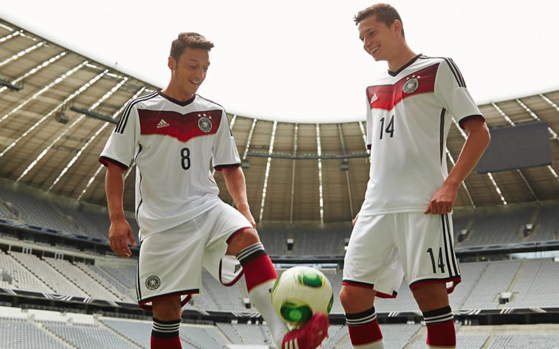
So the feature could almost be regarded as synonymous with European competition success and its appeal spreads far and wide.  If we go back to Euro 2008, Germany wore a back chest bar with gold and red trim which included their player numbers in white - in contrast to the numbers on the back of the shirt in black - and this was one of the shirts of that tournament.  Go back even further and we come across thinner stripes horizontally on France shirts in the Eighties and one of the most iconic England shirt designs made so by a coloured bar across the chest/shoulders.

There are variations - Spurs' popular Puma shirt of 2010-11 featured a shoulder/chest bar at an angle - but as a general component it usually seems to work however it is applied.  Brazil's "loading bar" shirts didn't last long and may have pushed the concept to its limit in demonstrating a lack of unity between the bar and the rest of the design but it could well be the exception that proves the rule.

Personally, I think the feature has made 2012 its own, which is why I chose kits including a chest stripes to represent DF on the League of Blogs Wallchart.  With the possibility of the aspect contributing to the winning of both European club trophies this season, Poland - who with the Ukraine host this summer's European Championships - or Italy, via their away kits, could even give it a hattrick.


The geniuses at Nike have done it again. If you are not aware, they were responsible for the recent debacle of releasing a pair of trainers for St Patrick's Day, which were described in the clumsiest of Guinness-referencing adjectives, and named, I kid you not, after the moniker given to the horrendously vicious British paramilitary unit which tortured and murdered Irish people in the early 1920s, the Black and Tans.

The only explanation for this PR disaster must be that a little word association popped into the mind of a marketeer and a quick Google of "Ireland black tans" gave enough - unchecked - results to apparently vindicate the now full-steam-ahead development of this project. Despite the obvious offence caused, the notion of this campaign being discussed in passing at an office water cooler in Portland, Oregon, leading any employee with a modicum of knowledge of Irish history to feel the blood drain from their face, offers a comical subtext to the farce.

And, as I say, they've done it again. This time the consequences are far less offensive and far less perversely misguided but they do again concern a lax grasp of details relating to history, in this case that of Liverpool Football Club.

LeBron James, the American basketball player, has had a pair of signature shoes made in his honour and these are decorated with graphics relating to Liverpool's history - via Nike's peculiar twisting of the facts.

I like Mr James. It's fun to see his enthusiasm for his business concern in the North West of England - he is a partner of Liverpool's owners Fenway Sports Group - and his carrying of non-adidas-branded club shop tat that would otherwise go unsold but for his contractual eschewing of Nike's rivals. The smile is wiped from our faces, however, when we see Nike produce trainers in his name, in a questionable colourway, which carry depictions of 18 Premier League trophies - denoting the club's English league titles, all won before the inception of the Premier League - and a heel detail "inspired by" the Liver Bird but looking more like a griffin defecating.

Despite the Liver Bird not being trademarked it would obviously be beyond audacious - and bound to provoke legal action nonetheless - if Nike had used an intrinsic part of the Liverpool crest on a pair of shoes which references the club, but for me this is easily resolved. Just don't make the trainers. And had Nike run the designs past fans of the club then they would never have been put into development.

Nike have had a welcome impact on football design and are now, with a little help from their subsidiary Umbro, receiving regular plaudits for their drawing board approach and for their ethics. In fairness, the indiscretions outlined - and the latter is not the first involving LeBron James - are unrelated to the Nike Football section of the company, which has again boosted its own reputation with its Euro 2012 releases and the new Celtic kit, but a brand is a brand and when you begin to risk the sales of Ireland shirts (Umbro) and, for similar reasons, the aforementioned Celtic shirts, not to mention your entire sportswear range in Ireland and in the sportswear-loving East End of Glasgow and Merseyside, it may be time to put a little more R into your R&D.


Latest Comments

5 - Dan8083 - giannakakis1 - Phichaya.sut
5-Giannakakis3-Pointstick1-Oakleighman
Other views:
3 image(s)
5 - Aegon3 - Tombot1 - Rabbi
5 - Oni3 - Dan8081 - Oakleighman
transparent
1 image(s)