Not my words. Let me make that very clear. Above are the feelings of a visitor to FootballShirtCulture.com who shall remain nameless. But it does represent, if nothing else, the strong feelings that surround this brand.
Puma. The brand worn by greats such as Pelé, Eusébio, Johan Cruyff, Enzo Francescoli, Diego Maradona, Lothar Matthäus and Kenny Dalglish. But a great brand? Today? The jury is well and truly out.
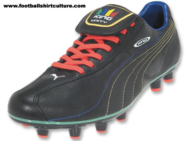
During my formative years in the world of football (design), Puma was the company that went about their business quietly and assuredly. Puma King boots were the benchmark. When the Craig Johnston-designed adidas Predator was dived upon by every aspirational northern European creative midfielder wanting 30% more curl and 10% more power, much of South America looked on and scoffed. They didn’t need a boot that could make you do things you couldn’t do before, they could do everything. They just needed a boot that looked classy, felt comfortable and allowed their feet to work the magic. That boot was the Puma King.
Puma back then barely registered on the football kit design radar. The odd German or eastern European kit hardly set the world alight, but they progressed. Classy kits followed for the likes of Leeds and then Everton, amongst others, and along the way they sparked controversy with Cameroon sleeveless shirts and all-in-one kits. Overall, seemingly steady and consistent improvement in quality even led to the first pink shirt in Scottish football and a nice retro home kit for Partick Thistle, with a compromised logo.
So what to do for their next trick? I kid you not: “Scottish football’s first ever camouflage kit – also believed to be the first camouflage strip in world football which features pink.” You don’t say. Some things haven’t been done because everyone who thought of it before knew it would be awful. Respect your elders.
This was around the same time as the Feyenoord marketing disaster/masterstroke when pressure from fan groups led to the changing of already presented kits. Another reason why this kit was significant was that it showcased the new shoulder/chest V template. Before long this inexplicable feature was present on virtually every new Puma shirt released, occasionally hitting the spot with the likes of Bordeaux (who always carry a V design) but more often creating monstrosities such as the current Tottenham Hotspur white, blue and yellow-on-white number (what’s that rule about things not being done before…?).
So to this year. Are Puma hitting the spot or wide of the mark? A mix perhaps but that seems par for the course with Puma now. So much that they create puzzles whilst the odd exception excites.
One interesting but somewhat bizarre idea is the Africa Unity away kit. A noble cause, no doubt, but I’m not sure every African nation turning out in the same strip is altogether empowering for patriotic players. If that’s not your bag, Puma have given Italy a kit with a pair of boxing shorts, a drawing of C3PO’s torso on the front of the shirt and a collar that evokes images of Lisa Simpson’s head turned inside out but with added national flag overkill. If you think this may not befit the World Champions then also consider that they unveiled the Italy kits in front of a backdrop covered in African flags. Apparently they had some boards left over from the Unity kit launch.
In fairness to them, one shirt that actually works in a somewhat mid-naughties guilty pleasure way is the new Uruguay Home. But they’ll need a bit more than a striped underside to a collar to claim back their reputation. Next up is creating kits and apparel for Newcastle United that under no circumstances should feature a black cat. They won’t manage it. I look forward to receiving the first photographic evidence of any sock/sweatshirt/t-shirt/pair of shorts/tracksuit bottoms that carries the famous emblem in the standard colour. Template-by-numbers sportswear design leads to mistakes that wouldn’t get made if the designers genuinely cared about the teams they were designing for. If nothing else then a Sunderland fan under their employ will make it happen. But if they can put a white cat on a modern twist of a black and white stripes (perhaps taking inspiration from their African Nations Cup shirts) then maybe people will be won over. If the superb Spurs shirt doing the rounds is the real deal then maybe that points to Puma getting it right next season.
Or maybe not. Puma seem a little bit desperate just now and arranging football matches against adidas in the name of peace smacks a little bit of getting leg ups from little brother. The once great brand just doesn’t seem to cut it at the top table anymore. Remember the Puma King boots I talked about earlier? Well, even South America’s top talent has moved over to Nike and adidas and no wonder when, good cause notwithstanding, below is how the manufacturer thinks that once wonderful boot should now look. Good luck, Puma.