Football design to me, for the most part, means football shirts, and has done for as long as I can remember. Football Shirt Culture is not my homepage for nothing. I can occasionally have my head turned by other examples, such as a new pair of boots, but I don’t fawn over these new releases like devotees of Footy-Boots.com. No, for me the fruits of a creative labour can be found on the cut, colour, watermark (or lack thereof) on the top that’s carried by our favourite team or even, grudgingly, an opponent.
But as the years start to tell and the cut of the newer styles less flattering to the older gentleman, there’s less cause for wearing shirts. Football training is mostly a thing of my youthful past and now the only times I kick a ball in anger are in five-a-side or the occasional 11-sided game for Marceltipool (no time to explain, just Google it). In both of these endeavours, shirt selection is dictated by the requirements of a collective rather than a matter of taste. Perhaps for Mc’ool I can wear a white shirt of my choice at least until we have the green hooped-left sleeved bespoke design we crave but when wanting to express oneself this can be a restriction too far – especially after a few weeks. In the Powerleague I can have few complaints about the player issue Milan away shirt I am “forced” to wear and I at least had something of a choice of number (I plumped for a #16) but still suffer at the hands of monotony.
At waist level, however, the shackles are removed. To continue the use of Marceltipool as an example, shorts offer endless opportunity to experiment and wear one’s heart on one’s, well, backside. Do I wear Celtic 2005-07 homes with #29 in official SPL print (a gift from a past lover)? Or perhaps the 2008-09 Marseille equivalent? As long as they’re white they’re acceptable and whilst this may sound like a similar tale of woe that I referred to with the shirt it is definitely not so. With the latter, should the wardrobe offer no options which quench the thirst for individualism then a new item can cost up to £60-70 if going the whole hog with long sleeves, naming and numbering (or as I prefer, “flocage”) and league/tournament patches. But a new pair of shorts? Anything from £5 to £25 for the full – personalised – monty. Not the small fortune of its torso-covering sibling. When we add to this the fact that the in small-sided leagues a colour consistency is only a matter for shirts/bibs this opens up whole new avenues for expression.
History has provided us with a plethora of options in shorts. The image of wee Gordon Strachan so bravely attempting to surmount the advertising hoarding after scoring at Mexico ’86 is stamped on many a Scotman’s memory, as is the navy hoop that adorned Strachan’s shorts. A brave man would wear these tiny examples – assuming an adult size can be located – but all the same they will wow a co-equipper on a Thursday evening. Certainly, a friend who I managed to procure a pair of 1991-93 Spurs shorts for told me that only seconds after his arrival at training wearing these classics a teammate had offered kudos of the highest order.
One of my own personal favourite styles of shorts were the adidas variety from 2006-07, worn by Ajax and my beloved Marseille away from home (a pair of which I wear to this day) – a main colour with a curve of a secondary on one thigh. Liverpool had a similar style but I’m not sure whether I feel pride or shame in the fact that I know that was in fact a different template with less obscurance of the adidas three stripes.
The list goes on: Silver England 2002 World Cup away – owned, France 2006 home #10 (as worn by Zidane as he destroyed Brazil and, well, other things…) – still hoping, Milan 2008-09/2009-10 home, away or third #32 (Beckham) – fingers crossed they could be mine before too long. In 2007 I even created (via the now arthritic hands of my significant other of the time and a plain purchase from Toffs) a #29 carrying pair of Celtic ’67 shorts in which to run the London Marathon.
With this level of artistic licence at one’s disposal and the mixing and matching seen so regularly by clubs (Liverpool’s red shorts and grey shirts versus Arsenal two years ago being a notable example) it beggars belief that Cameroon and Puma once conspired to create a one-piece strip. That said, I do subscribe to the belief that no side should have anything more than one example of shorts in each required colour – interchangeability ftw! Umbro and England, this means you!
Of course, we find ourselves only at knee level (barely hip level in some cases, Gordon) and the socks are where individualism has even greater freedom. Hooped socks to confuse the opposition (so said Herbert Chapman), over the knee unfurling by Henry and John Terry, 70s number tags which resurfaced briefly over the last decade, I could go on and on. Unfortunately, I’m sure you’ll agree I’ve gone on long enough but for between £2 and £15 we can wear the pink-cum-orange of Barça, the (nodding to Celtic?) hooped current Republic of Ireland socks or, if you can find them, my ideal style for Marceltipool in the Liverpool 1993-95 homes by adidas (the brand with the three hoops?).
Should you ever doubt that individualism in shorts and socks is synonymous with amateurism then note that in the 1990 World Cup Diego Maradona - no less – wore Napoli socks in Argentina’s Quarter Final against Yugoslavia. And I’ll leave you with this: When it comes to socks, if what history has to offer (or indeed what the current replica market, eBay and Classic Football Shirts have available) doesn’t quite hit the spot, I found a way to just design your own.
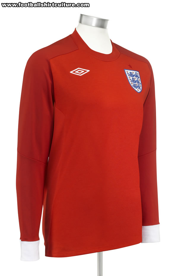 The new England away shirt has been available for quite a while now but this afternoon the side will turn out in all red against Slovenia and the combination’s supposed talismanic qualities (1962 World Cup etc) will be put to the test. By the time you read this you’ll probably know how they fared – dare I say it, maybe even whether or not England’s World Cup 2010 has been a success. About time myself and fellow DesignFootball.com reviewer curswine put it through its paces…