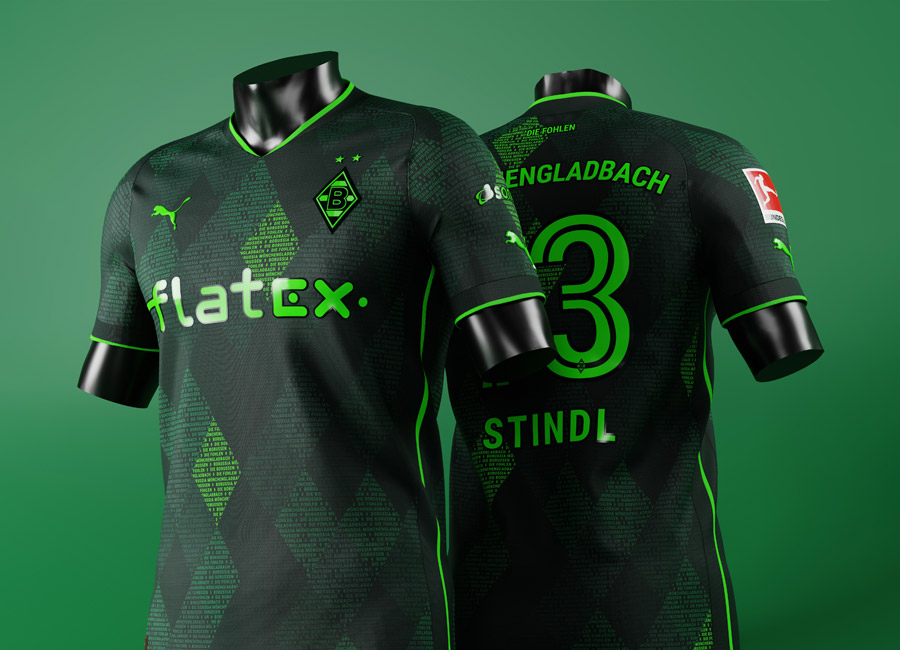
Kit Design Tutorial for BeginnersHere

Real Betis Balompié have been favourites of football kit aficionados for quite a while, in no small part due to the spells the Seville-based side have had in the Kappa stable.

Accordingly, many of the entries into our 251st Kit of the Week (KOTW) stage had the Spanish La Liga team’s shirt bedecked in the Italian brand’s “Omini” logos, including sterling efforts from matthewfootball, NiGarCas and kunto.

Football shirts don’t get too much more iconic than - while we’re sure we’ve used that phrasing before - the style worn by Porto-based Portuguese side Boavista Futebol Clube.

With that in mind, they had to at some point feature in our Kit of the Week (KOTW) challenge, and it was the 249th stage that ended up being the one.

The 300th edition of the Crest Redesign Competition Weekly (CRCW) was a little different, but the result was very similar to the previous: Aegon winning a stage involving a side known by their four-letter initialism.

Los Angeles Football Club - let’s face it, LAFC - are inadvertently subject to the current backlash towards black-and-gold football kits, having the overused colourway as their first-choice look, but the relatively young MLS team certainly have a striking identity, which our challenge embraced.

Latest Comments

5 - Cukun3 - Fiasco_Football1 - OTHYCreative
5 - OTHYcreative3 - giannakakis1 - HiK4L
Other views:
3 image(s)
Transparent Background
1 image(s)
transparent
1 image(s)
5 - Cukun3 - Hik4l1 - Oakleighman